What's new
Photoshop Gurus Forum

Welcome to Photoshop Gurus forum. Register a free account today to become a member! It's completely free. Once signed in, you'll enjoy an ad-free experience and be able to participate on this site by adding your own topics and posts, as well as connect with other members through your own private inbox!

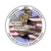
be part of the making of the new marine coprs command logo *MUST READ


paul i really like how you blended the wings to the flag. it gives it a really good effect.

I like the effect too, but what about what it does to the flag? It doesn't seem right. What if the rest of the flag were there but at a lower contrast, a shadow mode? Just thinking.

I know I haven't submitted anything, but I may give it a try. It isn't my kind of art, though I find this very interesting to follow. Still, I feel honored that you came to us. Thank you polhamus.
 
no, thank you guys . you are the ones that are helping us out. we didnt want to let just some pvt try this out cause he would give us a doodle and some finger paintings of a logo lol
 
I like the effect too, but what about what it does to the flag? It doesn't seem right. What if the rest of the flag were there but at a lower contrast, a shadow mode? Just thinking.

I know I haven't submitted anything, but I may give it a try. It isn't my kind of art, though I find this very interesting to follow. Still, I feel honored that you came to us. Thank you polhamus.

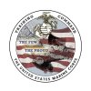
I thought the wing edges with flag gave it a meaning not meant as disrespectful - wheres your version gone clare?
 
U.S. 310 (1990), has ruled that due to the First Amendment to the United States Constitution, it is unconstitutional for a government (whether federal, state, or municipality) to prohibit the desecration of a flag, due to its status as "symbolic speech." However, content-neutral restrictions may still be imposed to regulate the time, place, and manner of such expression..
I do see where Paul was going with his idea in fact it is pretty cool but maybe have the American flag in the background slightly faded so it matches up with the 1 used in the wings maybe it wouldnt look torn then. I only pasted the wiki law on it as a point to take into consideration I am sure that you wouldnt want the marines new logo to look unconstitutional


There probably would have been at least 2 British contributions had questions been answered in a full manner, instead of just saying they are the best. To us, that's like the S.A.S saying they want us to design a new logo for them!

S.A.S. = Better than anything!
 
I like Pauls design and I assume the OP does as well but has not indicated any improvements or adjustments to add to Pauls. I also feel I do not know enough of the subject to do anything without offending but will be happy to have a go over the weekend just been busy the last few days making plans for monday Big Surgery once I am caught up with stuff I will have a go hopefully before monday.
what are well known education sybols ??
 
Last edited:
Here are the kind of things he was on about, I would presume is a protractor, compass, calculator, test tube, that sort of thing.
 
U.S. 310 (1990), has ruled that due to the First Amendment to the United States Constitution, it is unconstitutional for a government (whether federal, state, or municipality) to prohibit the desecration of a flag, due to its status as "symbolic speech." However, content-neutral restrictions may still be imposed to regulate the time, place, and manner of such expression..
I do see where Paul was going with his idea in fact it is pretty cool but maybe have the American flag in the background slightly faded so it matches up with the 1 used in the wings maybe it wouldnt look torn then. I only pasted the wiki law on it as a point to take into consideration I am sure that you wouldnt want the marines new logo to look unconstitutional


That was what I meant in my response to it, that I thought it could work if the flag were continue just as you said Hoog.
 
Here is a proposal from me. I am still waiting to find out what you mean by education symbols and if you wait till 5 December to let us know, it may be difficult to get a logo done on such short notice. Also, do you want it to say: Training & Education Command?

I am very happy to continue to work on this. Clare

TheFewTheProud_3.jpg]

Here is with the insignia colored in and a blue field:

TheFewTheProud_5.jpg
 
Last edited:
This was my original, edges are all rough - but like i said this was the original idea
 
Are there any symbols with special meaning aside from the original Marines logo that would be nice to include in this design? For instance, the stars on the original one. I do find symmetry to be the best bet for a symbol that's going to be around for a long time.. Folks who just threw up some layered roster images, rather than making a vector image aren't doing the prospect of printing in various mediums (coins, shirts, patches, etc.) very much justice.
 

Back
Top