What's new
Photoshop Gurus Forum

Welcome to Photoshop Gurus forum. Register a free account today to become a member! It's completely free. Once signed in, you'll enjoy an ad-free experience and be able to participate on this site by adding your own topics and posts, as well as connect with other members through your own private inbox!

Using Layer Masks


Status
Not open for further replies.
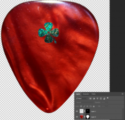
Here's the latest. I was able to drag and drop the Shamrock onto the red pick. Now, however, I cannot move the Shamrock around. I also change click on it and change the size.

The yellow text below does allow me to both change its size and move it around.
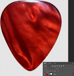
Thank You,
WTH

3 Overlay image red pick.jpg
 
Almost the instructions I receive are in images and flow-charts. I literally cannot understand these things. It's like Egyptian to me.
I assume this is referring to my instructions. I'm not at all sure how else we can explain as the instructions are simple and direct. There is language as well as written text. To write more would only lend itself to confusion in most circumstances. When I personally offer help, I fully expect that you will ask questions if you don't understand something.

I have also viewed numerous YT vids and get stuck at the same place. May I post one of those vids and then give you the time split where I get stuck?
Yes.
 
Here is what I get when I try to follow instructions online.
OK
Here's another. Why is this Shamrock so huge, and why can't I resize it?
I see that it's huge. I don't know why you cant resize it........not enough information.
Here's the latest. I was able to drag and drop the Shamrock onto the red pick. Now, however, I cannot move the Shamrock around.
OK.

All of these can only be answered if you show us what you are doing. You have to show a screen shot of your layers panel or make a written description of your work flow.
 
I would like to appreciate @What the Heck for putting an honest effort into the task. Between Post 21 to Post 22, you moved the shamrock image. Then, by the time you got to Post 23 you were also able to resize the Shamrock image. Also, he was able to apply mask to Shamrock image, though it looks like he only selected the outline of the Shamrock rather than the solid in its entirety.

The 'Egyptian' heigrolyphs reference to pictures is a method that we found through experience to actually convey instructions more lucidly. There is minimal text but the picture accompanying makes written words superfluous. If any of the instructions on Post 15 by @IamSam are unclear, for example if you are not sure of what he meant by (or how he achieved it)
Create a new layer above the pick layer.
Select your Spot healing brush Tool.
Clean up the blemishes on the pick.
then point that instruction and say that you need clarification. Also, in your posts, it would be great if you accompany heigrolyphs or Screenshots of your layers or screenshots of how you got the selection outline of Shamrock, we would be able to tell you exactly where you should change the approach. For example, you said:
The yellow text below does allow me to both change its size and move it around.
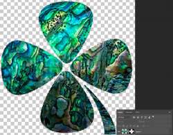
If your post was accompanied by your layers panel, it would have given me a better understanding of your flow and we would be able to guide you better.

Please bow to Cleopatra and adopt Egyptian.👁👀🐍
 
These are the steps I followed:

1) Open Red Fender Image,
2) select the outline,
3) apply layer mask so only the red fender is visible.
21.png
4) at this point, if you want, you could tidy up the image by removing all surface scratches, finger prints, other blemishes, etc.

5) Open Shamrock image
6) select the outline,
7) apply layer mask so only the Shamrock is visible.
22.png

7) Move the Shamrock with its layer mask onto Red Fender image. The composite image with the layer panel should look like this:
23.png
8) Next, you could add the Text layer if you want.

Note: If you could procure a better quality Shamrock Picture, it would suit the resolution of the Red Fender image.
 
Everyone has a preferred or best learning style. If your is textual, there are many books available on Photoshop compositing and also all the Photoshop Training videos on Lynda.com (now part of Linkedin.com have a complete word for word manuscript for each tutorial. Both approaches have an expense yet they may best meet your learning needs. I personally am not an English Professor and I bet not many forum members are either. The ability to describe in text without any ambiguity of what you will see visually would be not small task for the average person since the Photoshop interface is very visual in nature with tools, icons, panels, etc, etc, etc. A parallel might be is trying to type out English instructions on how to write Kanji without using pictures or audio/video instructions. Easy to get lost in translation.

I think your idea of where you are getting stuck to get some tips might be a good compromise.
Just some suggestions an hope that helps
John Wheeler
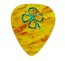
John, thanks, appreciate your insights. Yes, text works better for me.

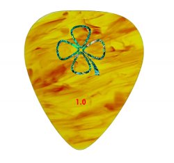
I was able to find some articles through Google searches that had step-by-step textual instructions along with screen captures. I didn't do it exactly the way it was done here, but here are two I did last night. I haven't centered the logo or the numbers yet, so this is still a rough cut.

Any critiques or suggestions are welcome. I'm not sensitve. Just learning.

BEST thicker Shamrock.jpg

good one flame teardrop with MOP and number.jpg
 
Assuming you changed your plan from the original post to open up the cloverleaf in the middle, all that is needed is to center it and size it the way you want and you are done. Kudos to IamSam and Polarwoc for their detailed instructions and patience.
 
Any critiques or suggestions are welcome.
I thought you were trying to get the whole Shamrock image solid and not just the outline as per your initial plan - has this changed to outline only?
If this is what you wanted to achieve, it looks good. The pattern on the Yellow Pick and the one on the Shamrock outline are kind of similar and that means there is little or no contrast. To make it stand out, a little contrast is essential, I think. Also the number at the bottom needs some shadow or glow or bevel sort of style or a background to pop it out. It is highly subjective though.
 
Assuming you changed your plan from the original post to open up the cloverleaf in the middle
I thought you were trying to get the whole Shamrock image solid and not just the outline as per your initial plan - has this changed to outline only?
Yes, this changed in a PM that he sent me. I offered two different versions of the edited cloverleaf/Shamrock for him. I have since re-directed him to keep everything within an appropriate thread.

This thread has gone way off track as the OP is not responding to direct questions and making random posts. I'm opting to close this thread.

@What the Heck - Please, if you have specific questions then please start an appropriately titled thread pertaining to your exact question.
 
Status
Not open for further replies.

Back
Top