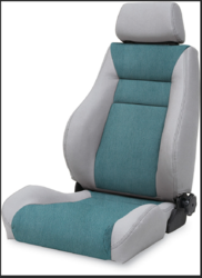
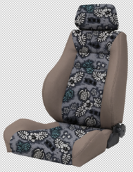
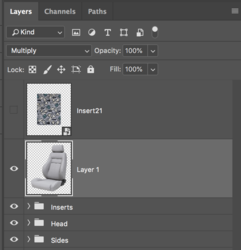
okie dokie!It appears like in the file Test.jpg the layers are cut to shape correctly but the blending modes were not applied. Check at around 7:24 where the blending mode is changed from Normal to Multiply - I think you missed that step.
Photoshop Gurus Forum
Welcome to Photoshop Gurus forum. Register a free account today to become a member! It's completely free. Once signed in, you'll enjoy an ad-free experience and be able to participate on this site by adding your own topics and posts, as well as connect with other members through your own private inbox!
You are using an out of date browser. It may not display this or other websites correctly.
You should upgrade or use an alternative browser.
You should upgrade or use an alternative browser.
Trying to figure out an easier way to change fabric samples! help!
- Thread starter Turnt4834
- Start date
honestly im a bit weary uploading it because i don't want competitors to see lol. but im pretty damn proud of myself and any critic is welcome, im just running out of time now. the only part im not too happy with is the bottom seat and the side parts....but for my first go i think it's good. i have so much to learn with all these new features!!!The seat you chose is much better than the other. It's a larger file.
when i do multiply on the seat, it makes some of the fabrics look weird/darker. That's why I didn't do the multiply on that part. Plus it shows the sttiching on the original seat which I didn't want.....however, mine does lay weird.You have to have the Chair layer above the groups of smart objects and it needs to be set to the "Multiply" blending mode.
View attachment 87975
View attachment 87976
damn, let me play with them again.
see, the turtle fabric is much lighter. on your image it's much darker. we want to emphasize the design. that's why i didn't go with multiply
Mod edit: Please upload images directly to PSG. Only use an offsite host if the images are too big for the forum.
Mod edit: Please upload images directly to PSG. Only use an offsite host if the images are too big for the forum.
hi colleague! thank you so much for all your input. let me try to play with those layers. i think i need to buy an updated book on photoshop lol.you can make your seat lighter by using a level adjustment-layer or a curve adjustment layer on top
but i will be on here more i think. i am seeing so much more potential i can use it for.
- Messages
- 24,122
- Likes
- 13,708
Use the warp feature in Free Transform.my next question is, how can i adjust the bottom insert to like, contour to the shape a little more?
- Messages
- 24,122
- Likes
- 13,708
I will try to explain a concept. Without shading and highlights, you loose depth.
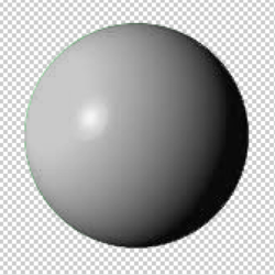
Here is a sphere....
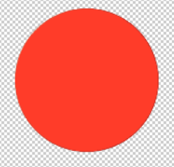
The sphere covered in fabric with the fabric layer above the sphere layer. Note that the shading and highlights are now missing.
The sphere becomes a flat surface without depth.
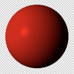
The sphere layer set to multiply above the fabric layer. (the color does change)
(Also note: You can place the fabric layer or fabric group above the sphere layer
and set it to multiply as well)
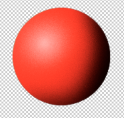
If you don't use the "multiply" technique, you will have to add in the shading and highlights yourself with the brush tool on a layer above the fabric layer.
(did this real fast so it's sloppy)
Here is a sphere....

The sphere covered in fabric with the fabric layer above the sphere layer. Note that the shading and highlights are now missing.
The sphere becomes a flat surface without depth.

The sphere layer set to multiply above the fabric layer. (the color does change)
(Also note: You can place the fabric layer or fabric group above the sphere layer
and set it to multiply as well)

If you don't use the "multiply" technique, you will have to add in the shading and highlights yourself with the brush tool on a layer above the fabric layer.
(did this real fast so it's sloppy)

YAAAAAAAS! OK!!! GOD i love you guys <3I will try to explain a concept. Without shading and highlights, you loose depth.
Here is a sphere....
View attachment 87980
The sphere covered in fabric with the fabric layer above the sphere layer.
View attachment 87981
The sphere layer set to multiply above the fabric layer. (the color does change)
View attachment 87982
If you don't use the "multiply" technique, you will have to add in the shading and highlights yourself with the brush tool on a layer above the fabric layer.
(did this real fast so it's sloppy)
View attachment 87984
revnart
Power User
- Messages
- 357
- Likes
- 327
Hi I made some template-mockup which looks like this:
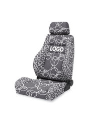
all you need to do is to edit template and save it
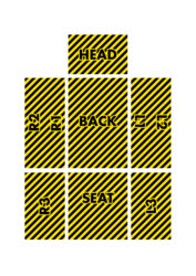
which outputs: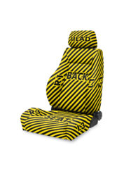
file is to heavy to post it so here is the link:
https://www.dropbox.com/s/yy84w1bgde9z5xt/CHAIR_01.psd?dl=0

all you need to do is to edit template and save it

which outputs:

file is to heavy to post it so here is the link:
https://www.dropbox.com/s/yy84w1bgde9z5xt/CHAIR_01.psd?dl=0
hey, thanks! i'm going to look over your template! i was playing around with mine and think it's good, but i'm always down for more input.Hi I made some template-mockup which looks like this:
View attachment 88084
all you need to do is to edit template and save it
View attachment 88085
which outputs:View attachment 88086
file is to heavy to post it so here is the link:
https://www.dropbox.com/s/yy84w1bgde9z5xt/CHAIR_01.psd?dl=0
but my current issue is that one of my designs isn't coming out looking too good. i am playing with layers and trying to adjust whatever i can before giving up and asking for you guys to help.

