Photoshop Gurus Forum
Welcome to Photoshop Gurus forum. Register a free account today to become a member! It's completely free. Once signed in, you'll enjoy an ad-free experience and be able to participate on this site by adding your own topics and posts, as well as connect with other members through your own private inbox!
You are using an out of date browser. It may not display this or other websites correctly.
You should upgrade or use an alternative browser.
You should upgrade or use an alternative browser.
ibclare
Queen Bee
- Messages
- 9,890
- Likes
- 4,028
well, this is take 2, so far so good, i might add a few more little bits on a i go along
took it's friggen time too! 6 hours on this! XD
And worth every minute. Beautiful! Mine took hours too. But I learned a lot. Also came away with a few questions. Don't know why it is that what works for others, I hit snags I can't get past.
thanks!
yeah i learned allot from that one too.
what snags be these? i hit a couple as well, like not knowing what layer blending to use, just made it up as i went along and skipped a couple of steps
sorry if my reply is late i be going to sleep soonish
your one is beautiful! the only two things i would suggest is a lense flare on the larger planet, the layer blending that's best is "screen" and "burn" the woman a little but that's just my humble opinion and completely optional it's your work, not mine.
and it's absolutely fantabulous!
yeah i learned allot from that one too.
what snags be these? i hit a couple as well, like not knowing what layer blending to use, just made it up as i went along and skipped a couple of steps
sorry if my reply is late i be going to sleep soonish
your one is beautiful! the only two things i would suggest is a lense flare on the larger planet, the layer blending that's best is "screen" and "burn" the woman a little
and it's absolutely fantabulous!
ibclare
Queen Bee
- Messages
- 9,890
- Likes
- 4,028
Girlie Girl, You are really good, creative, productive. All that stuff!  Just gorgeous.
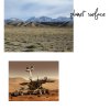
Just saw you want comments. Well, mostly the above. The only thing I would add, since you asked, is that the planet surface is a bit faint. I thought the rover was suspended in space at first glance. But then, I never claimed to have the best eyesight either. :mrgreen:
 Just gorgeous.
Just saw you want comments. Well, mostly the above. The only thing I would add, since you asked, is that the planet surface is a bit faint. I thought the rover was suspended in space at first glance. But then, I never claimed to have the best eyesight either. :mrgreen:
Last edited:
ibclare
Queen Bee
- Messages
- 9,890
- Likes
- 4,028
thanks!
yeah i learned allot from that one too.
what snags be these? i hit a couple as well, like not knowing what layer blending to use, just made it up as i went along and skipped a couple of steps
sorry if my reply is late i be going to sleep soonish
your one is beautiful! the only two things i would suggest is a lense flare on the larger planet, the layer blending that's best is "screen" and "burn" the woman a littlebut that's just my humble opinion and completely optional it's your work, not mine.
and it's absolutely fantabulous!
Snags, yes. I tried the lens flare. That was going to be one of my questions on my new post but I couldn't remember what it was! so tx. I tried and I guess I didn't direct it right. It kept going into the mask. Also I don't know if you used the same tutorial, but it involved putting the planet in a group and making the layer mask on the group folder itself. I could not get it to merge as one layer. With my smaller planet I just made a jpeg and popped it in. My levels problem I started a new thread for. So, time to try a new technique.
Thanks for the critique. The woman I purposefully left brighter, but since it obviously stands out too much, I will take your advice and tone her down. I think if there were more fantasy elements that followed the same brighter tone theme, it would work, but I guess she just looks weird. Maybe I'll make one where a spaceship beam is shining on the person! Cheers, Clare
$1r_M4x1mu$
Guru
- Messages
- 1,487
- Likes
- 294
well, this is take 2, so far so good, i might add a few more little bits on a i go along
took it's friggen time too! 6 hours on this! XD
Awesome job Zeealex
Great stuff
$1r_M4x1mu$
Guru
- Messages
- 1,487
- Likes
- 294
Love your melting earth! Here's what I've been working on. Had a little trouble knowing whether my color balance and saturation levels are artistic license or just plain wrong! I'll take any and all comments (what am I saying?) :mrgreen:
Just noticed a rather large cropping error. Can't use my eyes anymore tonight. It has to wait till tomorrow.
Great Job Clare
I really love this piece.
- Messages
- 4,657
- Likes
- 990
I tried one of the tuts, was fun.
That looks amazing! Nice job tmiya88, I think it looks even better than the example in the tutorial on Abduzeedo.
Space Lighting Effects in 10 Steps - Photoshop Tutorial | Abduzeedo | Graphic Design Inspiration and Photoshop Tutorials
I think I might give that one a try myself
luna
Well-Known Member
- Messages
- 84
- Likes
- 73
well, this is take 2, so far so good, i might add a few more little bits on a i go along
took it's friggen time too! 6 hours on this! XD
You're on the right track, the planets are very good!
On right planet outer glow is read,but planet is colord blue(meake planet red it will fit better hue/saturation colorize and pick some red color or change color of iner glow)
On the ring you have to too much noise(use Levels to fix this)
Tray to use sam Photo filter(cold or warm)
Sory for bead english
ibclare
Queen Bee
- Messages
- 9,890
- Likes
- 4,028
ibclare
Queen Bee
- Messages
- 9,890
- Likes
- 4,028
You're on the right track, the planets are very good!
On right planet outer glow is read,but planet is colord blue(meake planet red it will fit better hue/saturation colorize and pick some red color or change color of iner glow)
I agree with the color of the planet and the ring might be closer in color family, but it's still great.
$1r_M4x1mu$
Guru
- Messages
- 1,487
- Likes
- 294
ibclare
Queen Bee
- Messages
- 9,890
- Likes
- 4,028
I do not understand how you think "suspended in space"?
Sorry, I just saw this. I mean because I didn't see the ground at first, it looked to be floating. Till I looked closer.
ibclare
Queen Bee
- Messages
- 9,890
- Likes
- 4,028
That looks amazing! Nice job tmiya88, I think it looks even better than the example in the tutorial on Abduzeedo.
Space Lighting Effects in 10 Steps - Photoshop Tutorial | Abduzeedo | Graphic Design Inspiration and Photoshop Tutorials
I think I might give that one a try myself
It is really beautiful tmiya. I tried it too and it's easy to follow except for one thing: in the years I've been using Photoshop, I've never needed to use multiple colors on gradient layer effects. I don't know how to get anything but the foreground/BG colors already specified. HELP? :redface:
I found out why my star field attempts weren't working by using this tutorial. Abduzeedo specifies the percent of noise at 10%, not 100% and that is the big, HUGE, difference. He also specifies Gaussian, not uniform. Got the hang of it now.
:mrgreen:
Attachments
Last edited:
$1r_M4x1mu$
Guru
- Messages
- 1,487
- Likes
- 294


