What's new
Photoshop Gurus Forum

Welcome to Photoshop Gurus forum. Register a free account today to become a member! It's completely free. Once signed in, you'll enjoy an ad-free experience and be able to participate on this site by adding your own topics and posts, as well as connect with other members through your own private inbox!
McVeighDesigns Thread


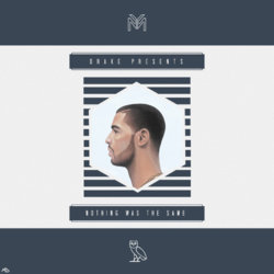
I assume you're asking for critique on this. It's a good composition. My one suggestion would be to make the circle a different tint so that it really highlights the man in profile. I wouldn't make it so it changes the vertical lines too much. But I was thinking of a lighter circle and that might make a difference in their visibility. Maybe even a slightly altered color? But I still think the tint (paler variation on the color in this case) would bring out the contrast. It might be a bit of a challenge to keep the lines visible so it would take a creative solution on your part.

The only other observation I want to make after looking at it longer is that the circle and the man might be larger, giving less emphasis to the background and more to the real subject.

IMHO!
 
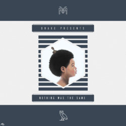
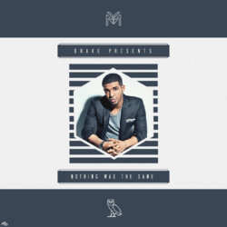
Nope, entirely different I think. Sure you could bring ore attention, but in this case, they fit into the frame and the surrounding graphic, IMO, will be more or less relevant as it relates to the cover and contents. I like the second one first with direct eye contact and shadowing. Seems more composed and easier to look at and comprehend. If I were to use profiles, I would do that in combination with, say, another profile, or BG to some foreground subject. Just my thoughts. Good work; thoughtful.
 
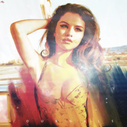
IDK how I missed the June posts, but I did. This one is incredible to me, maybe it's my wrped sense of humor. But it is really eye catching and if a person doesn't have a strong reaction to it, one way or another, they're dead inside!

Also, the one from 8/31 . . . I like it. One small critique: I think the II should be moved higher, otherwise the upper half of the image looks like dead space. Well, you know, just IMHO. :mrgreen:

I really admire the compositions and the effort you make!
 
First attempt at a logo. The blue was a green before but the "client" wanted a shade of blue.

e_drill_logo__colour_change__by_smcveigh92-d6xkkua.png


e_departure_poster_micka_mex_by_smcveigh92-d6yozs0.jpg


the_departure_micka_mex_by_smcveigh92-d6yp087.jpg
 

Back
Top