What's new
Photoshop Gurus Forum

Welcome to Photoshop Gurus forum. Register a free account today to become a member! It's completely free. Once signed in, you'll enjoy an ad-free experience and be able to participate on this site by adding your own topics and posts, as well as connect with other members through your own private inbox!

Paid Make color and shape changes to 3 logos


Status
Not open for further replies.

WhoSentYou

Active Member
Messages
43
Likes
11
Price
35
Hello!

I'm working on a meaningful personal project. My wife and I had a 7-year correspondence long ago, when we first met, and I've edited our letters down into a 400-page book I'll have bound for her birthday.

Now I just need three logos for it (one for the slipcase, one for the cover, and one for the full-color title page). All I know how to use is MS Paint, haha, so I'm really outdated when it comes to design. I'm in a time crunch now with the bookbinder, so I'm hoping for the logos as fast as possible, hopefully within 24 hours or less (if I can send it all to the binder by Saturday the 28th, that would be amazing), but by Sunday 5:00 pm PST at the latest.

For each project, I'm putting my crappy, MS Paint "idea" of what I want (they have watermarks from before I got the images), an image with the instructions, and the high-quality non-watermark files to work with.

I'm putting the JPG images below, but also have vector files if you need them. I don't know what a vector is, exactly, and have no way of opening them, but they're available if needed. I'm offering $35, but honestly have little idea of what's fair or how much time this entails. I want to compensate you fairly for your time and skill, so I'm open to negotiation if you need more (within reason).

For all 3 logos, I'd love the delivery to be...I'm not sure what this is called, but the kind of logo where you can place it over any background. Meaning, if the background is white or blue, the logo will still paste on it without carrying a blob of background color that doesn't match with it. Does that make sense?

The instructions for each project are in the images, and of course, I'm available for any questions or clarifications! But the summary is as follows:

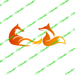
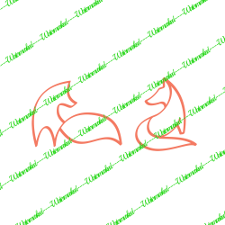
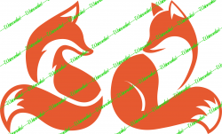
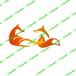
Logo 01: Basically, a color change. Join the foxes into a single logo and change the color of the second fox to match, either gradient similar to the first one (my preference), or at least tone down the orange atop the second fox. Files are here:
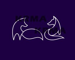
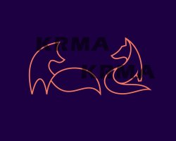
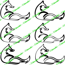
Logo 02: Join the two foxes into a single logo, changing a few details: eliminate an eye, take away some detail from the tail, close two gaps, make the color consistent. I'm asking for two variants of this shape - one orange, one white. Files are here:
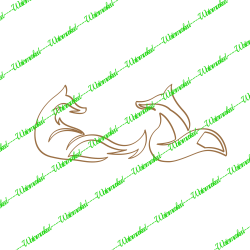
Logo 03: Take Logo 01 and try to make a silhouette of it in a different color, as shown in an example I found. Files are here:
Above all, I'd be grateful for your guidance and expert judgment. Meaning, if you think there's anything extra I haven't thought of that might make something look better or whatever, I'm super open to whatever you think, even if it costs more. For instance, I'm aware that the legs of the foxes in Logo02 don't match, and that the head shape could match a little better. So, open to your suggestions...again, I'm flexible on price for the right expert assistance.

Thanks so very much, I've been lost and realized I can't do this myself, so I enormously appreciate any assistance!
 
Message for members.

Since the OP provided images for an edit, do not send a PM and do not post PM sent!!!!

Per our rules, just perform the edit and post a watermarked version here in this thread. If the OP likes your version, the OP will contact you.

The only time you post "PM Sent" is if the OP requests privacy and DOES NOT POST IMAGES.
 
What a wonderful project brief!
I was drawn to the project brief and undertook the task to a degree. Colour changes, location movements of elements, etc can be done as required. All images are shown at 25% with watermarks and on transparent backgrounds, so they suit placement on any book background or texture.

Logo 1:
I would have preferred the Fox 2 to be closer to Fox 1 such that the tail of Fox 1 is on top of Fox 2 with their eye level being same, giving the impression they are looking at each other and hence in love. I used similar colours for Fox 2 as Fox 1 but realised the two of them look similar despite having different outlines, so altering the colours slightly would be better.
1737-Logo1@0,25x-WM.png
Logo 2:
As requested, two versions - one with White outline and another with Orangish outline. You may not be able to see the White outline picture below due to transparency showing as White, but it is there.
1737-Logo2@0,25x-WM1.png1737-Logo2@0,25x-WM.png

Logo 3:
With Brownish outline.
1737-Logo3@0,25x-WM.png

I would be online next in about 10 hours from now should you need to request for changes.
 
Hi, everyone!

Thanks so much for the excellent options you've provided; I appreciate it. Polarwoc, I love what you did (e.g., playing with the thickness of the lines on Logo 02, which hadn't occurred to me that way) and would like to work with you.

Let me gather my thoughts and 'll be PM'ing you in a little bit with some specifics, okay? I'll need a few modifications and we can figure out how you'd like to be compensated accordingly. Thanks so much.
 
Polarwoc, I love what you did (e.g., playing with the thickness of the lines on Logo 02, which hadn't occurred to me that way) and would like to work with you.
I must mention to you that I am only available for the next 12 hours or so after which my working week starts and I may not be able to give much time through the week until next weekend. Having said that, unless there are fundamental changes involving retracing the shapes using pen tool, other modifications should not take more than an hour or two of interactions and work.
 
Hi Polarwoc,

Thanks so much for your patience and the clarification on your availability. I was just trying to figure out what I would request, exactly.

I have to confess that when I posted, I was panicking that I would not be able to find assistance in time (e.g., before Monday at the latest) and miss my wife's birthday. When I saw that I was pending moderator approval after a couple of hours, I worried the process might take a day or more, so I sought help elsewhere and got the work done. By the time I made a deal and came back to call off my request here, my post had been approved and kind folks like yourself had already offered their assistance. My mistake for jumping the gun.

However, I loved your approach and perspective, so as I said, I'd be keen on tweaking a few things. I'd be happy to pay you $50 US to make up for the time you spent on the original bits in vain, along with the details below if it's no trouble. Here's what I'd ask for:

1. I jettisoned my idea for Logo 02 because no matter how much they tried to adapt it, the minimalist foxes still seemed like they were designed differently and didn't quite "fit" (e.g., the tail of the left one is way thicker, the feet are markedly different). That said, I loved the way you didn't make the lines equally thick to suit the first fox, or equally thin to suit the second. You applied a twisty sort of effect on the lines where they vary in thickness.

I'm wondering if you would be able to apply something similar to the lines of Logo 03, which you'll find here:


(it looks terrible in the embed, but fine when you go to the link)

As you can see, the lines are thicker, but I'd love to have that kind of stylish variance/curvature to the outline. Actually, in the original concept I saw for the silhouette, they seem to play with the thickness as well:


I trust your judgment on how/where to do it, and am likewise open to any modifications/suggestions you may have, since you seem really creative, but the main thing is just the line variability.

2. This is the logo I'm using instead of the original logo 02. I'd love it if the right-hand ear on the right-hand fox could have a similar detail to the ear of the left-hand fox, so that they match a little better (they were also from different designs). I'd like to have PNG files (now I know what they're called!) in both the current color and white.


3. Here's the two options I had made for Logo 01. It sounded like you had some good ideas; feel free to modify it as you please or offer suggestions:


and


Even though the original logos I wanted are done now, I like your style and creativity, so I figured you could do some cool details as above, since this is a meaningful project for me. As far as time, I'm flexible as long as I have the files by 9:00 pm PST on Sunday.

Thanks so much. Sorry again for jumping the gun, I was scared that I wouldn't make the bookbinder's deadline and didn't know how many days approval might take. I hope I've been clear, but feel free to ask questions. As far as payment, would Paypal work? You can send me the details in private.
 
Hi and thanks for the kind appreciation.

I am trying to understand the task now at hand and gauge the scope of project to see if it fits into the time I can spare. Please let me know your thoughts and clarifications below.

I jettisoned my idea for Logo 02
I can try to make the two images similar, but it would take several passes between us to arrive at the final product. As I mentioned, I am about 16 hours ahead of you and have only about 8 more hours. If you have definitely chucked the idea of Logo 2, we can direct available time to something else.

didn't make the lines equally thick to suit the first fox, or equally thin to suit the second. You applied a twisty sort of effect on the lines where they vary in thickness.
I used an Oval brush to get those variations in line stroke. Idea was to get those sharp pointy ears and tail but the side effect was having contours of varying width. If you have liked it that way, it is wonderful and I do not have to search for a different brush shape.

As you can see, the lines are thicker, but I'd love to have that kind of stylish variance/curvature to the outline. Actually, in the original concept I saw for the silhouette, they seem to play with the thickness as well
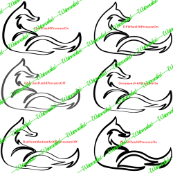
Here is where I need clarification. The image for Logo 3 you posted has thicker lines with rounded edges and a constant width through out - that is because a Round, Thick, Hard Brush was used to make the stroke. You said you liked the variation in thickness of contours. So, if I increased the sizes of some brushes and stroke lines below. I wanted to know if any of these are what you are seeking? If not, please put me on the right path.
1737-Logo3@0,25xWM-Options.png

I am publishing this post so you can process the information so far and respond. Meanwhile, I move on with dealing with rest of your post.
 
I'd love it if the right-hand ear on the right-hand fox could have a similar detail to the ear of the left-hand fox, so that they match a little better
Is this similar to what you have in mind? I only worked on the current colour and gave a white background instead of PNG so the contrast helps in discerning better. On retrospection, maybe the white part of the ear can get a little smaller.
1737-Logo2-Other-UCCN4zw-WM.png
 
Hi there -

Thanks for your kind response.

Yes, let's definitively leave the previous version of Logo 02 behind. Ordinarily, I'd say, sure, let's play around and see what we get, but with time being of the essence, I'd rather stay on course.

I love what you did with the variations as shown. I like the ones on the top row, but my favorites are the two on the center row. Center right is probably my favorite. Just what I was looking for that I didn't know I wanted!

My least favorite is the bottom left. I feel like it's too thick in the wrong places, detracting from some of the "hand-drawn elegance" type effect some of the others have.

Would something like this be possible with the contours of Logo 01 as well? (edit: never mind, since they're filled in, what I said doesn't make sense for that version).

Thanks again for your expert assistance, I appreciate it. Hope this clarified things a bit.
 
Last edited:
About the ear detail on the orange foxes - yep, you're on the right track, but I agree with you that it can be a bit smaller.

My goal is for it to look like they were designed as a pair, without making it perfectly symmetrical or matchy-matchy, like mirror images. I'd like each fox to look like an "individual" from the same species/style. So feel free to vary the size of the white ear area as long as it's a similar style, if that makes sense.

Thanks again!
 
Last edited:
Here's the two options I had made for Logo 01. It sounded like you had some good ideas; feel free to modify it as you please or offer suggestions:
As far as I see it, the two variation images posted for Logo 1 are almost exactly identical except for the gradient colour shading. So, here is what I had in mind - I moved Fox 2 a little closer to Fox 1. Made Fox 2 a little smaller, giving the impression it is a female while Fox 1 remains same size, thus appearing larger. Lowered the base line of Fox 2 to get their eye gaze parallel. Changed the gradient direction. If needed, the colours used can be changed. I left a white background for better contrast. Here is what I have:
1737-Logo1@0,25x.png
 
I LOVE the overlap, which hadn't occurred to me! You were right. However, I'd prefer if they were kind of on the same plane, if you will. Right now, Fox 2 looks a little lower.

Also, on Logo 03 (the brown one with the brushstrokes), let's leave the distance as-is. Thanks so much.
 
Hope this clarified things a bit.
Yes, and no.
Yes, because we at the least have a design that you kind of like and fall back to in case others do not turn out as good.
No, because it looks like it might help you know better about what possibilities there are if I show you some more designs and you can find something that will better suit. In this set of designs, I will remove the ones you did not like and provide some more variations to consider. I am retaining only the Center row right one - calling it "OvalFlat60PressureOn". Also labeling the brushes used for ease of reference.


1737-Logo3@0,25x-WM2.png
 
Status
Not open for further replies.

Back
Top