What's new
Photoshop Gurus Forum

Welcome to Photoshop Gurus forum. Register a free account today to become a member! It's completely free. Once signed in, you'll enjoy an ad-free experience and be able to participate on this site by adding your own topics and posts, as well as connect with other members through your own private inbox!

in Need of Inspiration


Looking forward to your results again. On the second newer composition, I did mean hue/color balance but also curves/levels as he looks darker than the front guy. Since we're on totally opposite sides of the world, you're probably done with changes, but I'll bet you made good ones.
 
XD actually, i've been rather busy with RL again, so i haven't got around to doing anything spectacular :P
bf3-2tried fix.jpg
still a work in progress, but ATM i think it's best we both check it's going the right way :P
i have moved them a little to the left, i'm not sure if you will be able to notice
 
I did notice Zee. The positioning is good. There is something that troubles me about the BG figure. It's a perspective thing. Do you mean him to be standing higher or further back or your front figure kneeling. It's not clear to me. Either way, I think you should see what it looks like to lower him beneath the top of the frame and blur him just a bit for depth of field. I think I know what you're getting at having him top the pic. You could enlarge the foreground figure some maybe. IDK, maybe PM one of the gurus/moderators and ask for an opinion.
 
aah, i see what your getting at, i'll grab it tomorrow, my monster machine is off for now til the morning, thanks :D
 
yw. c u l8r.

You may be interested in taking a look at some classic composition principles based on the golden ration/golden section.
Art and applications of Phi, the Golden Ratio

It can get pretty complicated, so don't get bogged down; stay the visual artist. And, unless you're real mathematical, don't go to Wikipedia, :rolleyes:

Here are some images from a google search
 

Attachments

  • img golden section.JPG
    img golden section.JPG
    64.3 KB · Views: 0
Last edited:
bf32.jpg
there, changed the whole composition, the original image looked hideous in my eyes after taking a good look at other wallpapers, so, that's that, really, any more suggestions are welcome, but i may be a little snappy, sorry.
updated:
bf32update.jpg
 
Last edited:
@Zeealex: I'm the same way, but whenever I do gain the dedication to do something in Photoshop and I'm unsure of what I want to go for, I just type in the subject of what I want created in Google Images. So in your case you would type in something like "COD", "Call of Duty": And the majority of the images you will see are from people who do the same thing you do- Image editing... And you can see what other people have done, and collaborate all their styles into one (adding your own twist to it of course).

Here's a good one I found- Simple too.
cod4-wallpaper3.jpg

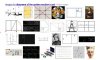
This wallpaper is really two Screen-Shots, or Art-Shots made by the game developers. So now, you go out and find two or more similar ones.
The first layer is more of a running and badass looking scene, and it is filtered by a heavy Gaussian Blur- Maybe you can do something like that.
The third layer is like a scratch/ swipe effect made by some brushes that create a like-effect for photoshop, get some and make one.
The fourth Image layer is the other Screen-Shots, or Art-Shot. So you do something like that and make it overlay or multiply or something.
The last layer is a dirt/ grime layer that you can make yourself, or you can troll google images for dirt textures of High-Res and Screen that layer or do something with it lol.

Then just add some color gradients over the entirety of the image, then some HDR Toning, and some logos and maybe some extra styling, etc...
N ur done.

Here's something I've done by looking at an Ad I saw on Youtube (gave me idea of buildings)
And some google searching that gave me the effects Idea.
http://fc01.deviantart.net/fs71/i/2011/141/1/b/fluorescent_city_life_by_dottgamma-d3gw4o1.jpg

Well, Hope I've helped in some way.
 
It seems you've found ample inspiration, but for anybody visiting in the future here's some simple and effective methods I use for creating grungy images. Most of them make use of a grunge brush - I use Ripe Grunge Extreme (search Ripe Grunge on DeviantArt; I can't post links) almost exclusively. It's got more than enough textures for variety.

First: Color / Texture layer on bottom, black fill layer above. Use eraser tool, set to a grunge brush, lower brush opacity to taste.
technique1.png

Second: Same technique as first, but use multiple layers of grunge.
technique2.png

Third: Same as first, but put the colored layer on top.
technique3.png

Fourth: Darkened borders with gradient tool. Check out the tool setup on top left. I used a new layer, gradient horizontal and vertical, then lowered the opacity of the layer. You can do this different ways (i.e. radial gradient tool) but I like this method.
technique4.png

Fifth: Put a texture over your color layer and play with layer blend modes and opacity. Check out screen/multiply/overlay mostly. I used a texture from VideoCopilot's RiotGear stock footage, but if you don't have that you can use any stock image from DA or cgtextures, etc.
technique5.png

These particular images don't have any production quality, but you can get a good effect with a little time. You can also mix and match techniques. Here's a replica of texture I did recently, that shows what's possible with a bit more time. This uses techniques 1, 4, and 5 (+a pattern fill)
result.png
 

Back
Top