What's new
Photoshop Gurus Forum

Welcome to Photoshop Gurus forum. Register a free account today to become a member! It's completely free. Once signed in, you'll enjoy an ad-free experience and be able to participate on this site by adding your own topics and posts, as well as connect with other members through your own private inbox!

Ideas on New Startup Logo


TechMansoor

Well-Known Member
Messages
80
Likes
5
I will be opening up the site AnimeBusters.org to do a pre-marketing campaign indeed.*Side Note* If anyone is heavily into anime and discussing quantifiable feats vs non and who would win type hypothetical ideas, please let me know..

anyway..

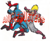
I wanted to get you guys opinions and possibly alteration ideas to the logo. I love the font that is posted on the top of the main image because its "comic-bookey"..but I guess it needs to be filled in perhaps as opposed to open so people can actually see the name AnimeBusters..I'd love if you guys could post some alteration ideas or if I could post the psd for help that would be awesome..

Thanks so much.
 

Attachments

  • logoabdraft1.png
    logoabdraft1.png
    558.2 KB · Views: 1
Whatever you come up with, I would not use the see-thru text, it's very hard to read. I would try the text above or below the characters.

Do you have an extended version of Ps? If so, you could use some real 3D.
 
Iamsam my great and wise sir..can you show me some examples of the 3d effect that would potentally resemble my logo?

I do have the 3d option in my install.


Thank you so much sir for any help you can give!!
 
Great and wise? I think not! :bustagut:

There are few limitations to what you could create!

I would assume that you're probably more in tune with what types of logos/fonts are being used on Anime sites than I would!

One thing I like to do is image searches for effects.
Try this SEARCH to see if any of the 3D text effects appeal to you!
 
Ok, I took a look at the .psd.....

You tried to use the original graphic to make the effect shown in the tutorial, which already possessed a 3D element and was not an actual text and was on a white BG from the start.

Screen Shot 2014-03-16 at 9.41.45 AM.png

You need to select a new font that does not have a 3D effect built in and start from the beginning.
 
I ran through the tutorial and there is one thing that is not made clear.

Create your background layer separate from your text layer. If you don't, you will be
stuck with the BG and wont be able to overlay the text layer on your characters.

Screen Shot 2014-03-16 at 10.03.46 AM.png

Screen Shot 2014-03-16 at 10.07.27 AM.png

But the effect works great.

Screen Shot 2014-03-16 at 10.05.53 AM.png

And you might rethink the colors for the entire logo, like a darker BG.
Here is the effect added to your characters.

Screen Shot 2014-03-16 at 10.12.39 AM.png
 
Logos are supposed to be simple and effective. if you have a logo like this you will need it to be on a big scale so people can see it clearly. You need to think about your logo long and hard bc depending on how well it takes off etc you might want to think about marketing and if you have a logo that doesnt work well on things such as business cards, fliers etc you will need to rebrand. so better off keeping it as simple as possible in my opinion.
 
Thanks Dope!

I certainly agree. I also suggest using Illustrator as well. However, I have learned to help the OP with their original request.

...I wanted to get you guys opinions and possibly alteration ideas to the logo....
 
This is going to sound really noobish Sam..but I'm having a hard time just merely grabbing the text and putting it on top of the logo similar to how you did. How do I grab the text without the black background including the effects, and placing them on top of the image similar to what you've done?

Or did you copy the image and place it with the text if I'm making sense?
 
Hey TM, did you create your text on a separate layer as I suggested in post #13?

Screen Shot 2014-03-22 at 8.52.42 PM.png
 
Sam my good sir, and other guru's, this is where I am with the logo project. I like where it is currently. I just want to do some fine tuning or not.

What can I do to fine tune this image or make small alterations. What would you guys suggest? I'm pretty much taking it to the printers on Monday to make a few tshirts. I noticed this logo looks even better with a black background.

officiallogo.png
 

Back
Top