What's new
Photoshop Gurus Forum

Welcome to Photoshop Gurus forum. Register a free account today to become a member! It's completely free. Once signed in, you'll enjoy an ad-free experience and be able to participate on this site by adding your own topics and posts, as well as connect with other members through your own private inbox!

How to Get this gradient effect?


dineshtendulkar

Well-Known Member
Messages
52
Likes
9
Dear All,

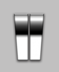
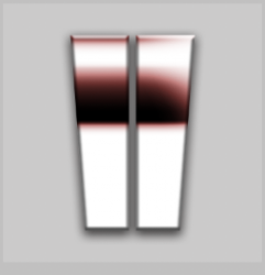
Please help how can i get this effect (attached image) in photoshop? Does a shape with a gradient overlay could do?

Someone please share a downloadable gradient file for this effect. Thanks in advance

watch hands.jpg
 
Is this a black and white shot of a watch dial marker?

Are you referring to the chrome look?

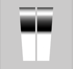
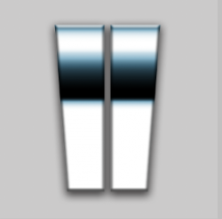
Something like this?
Screen Shot 2021-11-21 at 11.31.20 AM.png

Added a layer style.
Screen Shot 2021-11-21 at 11.34.23 AM.png

Lowered opacity on gradient.
Screen Shot 2021-11-21 at 11.39.16 AM.png
 
OK.
can i get the psd file plz
A PSD file won't help here. We are dealing with multiple effects.The first example and your second example are different.
Not to mention that the effect changes with each marker as their position changes on the dial in the same lighting. The gradients would have to be edited for each indicator, you could not use just one gradient for all.

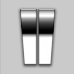
if you see from the top to the bottom in the image i shared , where the black shade ends, it has more depth and it creates a effect that the metal bends much till the end...
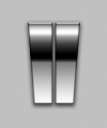
Ok............this is just a matter of adjusting the gradient until it looks right to you.
Screen Shot 2021-11-21 at 1.01.13 PM.png
Screen Shot 2021-11-21 at 1.02.27 PM.png

What you need to know is how to create the effect. I can give you a brief tutorial if you like?
 
This is what exactly i need, you nailed it... Thank you so much... If you could share the PSD file, i will go through the layer style to learn how you applied the effect...

Also, please share the brief tutorial which will be very helpful... if your brief, please include that plastic effect also...

:notworthy::notworthy::notworthy::notworthy::notworthy::notworthy::notworthy::notworthy::notworthy::notworthy::notworthy::notworthy:
 
See the first image i shared and you have done better than that (the chrome effect)... The second image i shared is also having watch dial marker, but it is not metallic, it looks like plastic (Shared the image highlighting the same), i meant that... You didn't shared the PSD..

Screenshot_20211121-223030_Chrome.jpg
 
First step is to create the dial marker.

Use the Shape Tools to create one half of the marker.
Screen Shot 2021-11-21 at 1.35.07 PM.png

Duplicate and position.
Screen Shot 2021-11-21 at 1.35.20 PM.png

Merge the two layers. Rasterize the resulting merged layer.
Create a new layer.
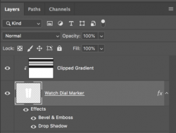
Clip the new layer to the marker layer.
Select the Gradient Tool. Begin to adjust the gradient to match the reference. I linked you to some videos on how to use the Gradient Editor in post #8.
Screen Shot 2021-11-21 at 1.36.58 PM.png

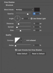
On the marker layer, add a drop shadow layer style.....
Screen Shot 2021-11-21 at 1.37.30 PM.png
Screen Shot 2021-11-21 at 1.38.12 PM.png

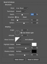
And a bevel and emboss....
Screen Shot 2021-11-21 at 1.38.03 PM.png
Screen Shot 2021-11-21 at 1.37.51 PM.png

Very simple once you have learned to use the Gradient editor.
 
I followed what you said, i get almost 75% result
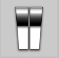
Not quite! I see where you used a gradient overlay in the layer style instead of a clipped gradient layer. Glad you found it!

This is a good technique that I would normally use, but I have become accustomed to smart objects and multiple clipped layers on these types of effects for edit-ability and masking in my daily work so that's why I chose the clipped gradient layer method. You can't mask a gradient overlay in a layer style (unless you create layers). You can also easily influence the gradients color with an adjustment layer without editing in the gradient editor when you use a clipped gradient layer. Sorry I did not explain this.

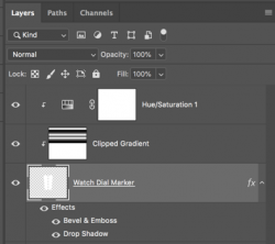
Normal black & white...
Screen Shot 2021-11-21 at 3.10.03 PM.png

With Hue & Sat Adjustment layer. Quick adjustments.
Screen Shot 2021-11-21 at 3.10.13 PM.png
Screen Shot 2021-11-21 at 3.10.35 PM.png
Screen Shot 2021-11-21 at 3.11.04 PM.png

Layer mask on the clipped gradient layer. Sometimes you need to mask...
Screen Shot 2021-11-21 at 3.28.14 PM.png
Screen Shot 2021-11-21 at 3.29.19 PM.png

But there's nothing wrong with using a gradient overlay in a layer style!! It's a very edit-able technique as well, maybe a bit more troublesome that's all!!
 
wow amazing... thanks for this and i understand the use in layers... will you also please open the gradient layer and show us the values...
 
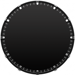
Mr. Sam, My Final output... What i should do to add more depth and looks like a real 3D?
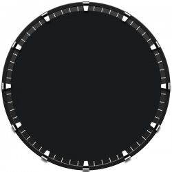
Also I tried to add a Hue Saturation layer to change the colour as you described, but it is not working?

Analog1.jpg
 
What i should do to add more depth and looks like a real 3D?
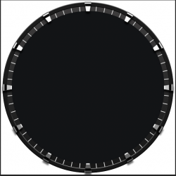
Proper lighting is always what makes 2D objects appear 3D.

The lighting of your dial markers is off. They are too uniformly bright all the way around. The rest of the dial has suggested lighting from top to bottom.
Analog1.jpg

With an added gradient and highlight on the markers below the horizontal midline.
Much more convincing!!
Screen Shot 2021-12-01 at 10.21.46 AM.png

Also, the lighting of the dial face will help once it's added...
Screen Shot 2021-12-01 at 10.41.29 AM.png

Also I tried to add a Hue Saturation layer to change the colour as you described, but it is not working?
Yep..................I suspect you used the layer style for the gradient effect on the markers. Adding a H&S layer wont work...............try using a color overlay in the layer style.
 

Back
Top