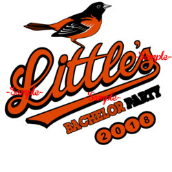
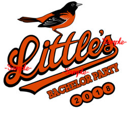
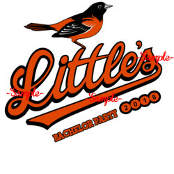
Can we make the top part less bold to match the other letters? The black border around all the other letters is very thin except for the bottom.The bird's foot are more firmly placed in this one. Bottom of the L has a thicker outline to match the rest.
View attachment 86808
Photoshop Gurus Forum
Welcome to Photoshop Gurus forum. Register a free account today to become a member! It's completely free. Once signed in, you'll enjoy an ad-free experience and be able to participate on this site by adding your own topics and posts, as well as connect with other members through your own private inbox!


