thebestcpu
Guru
- Messages
- 3,323
- Likes
- 3,071
HI Puppychew
The approach I am going to show you is like using a hammer for a screwdriver yet if all you have is a hammar then its one way to go at it.
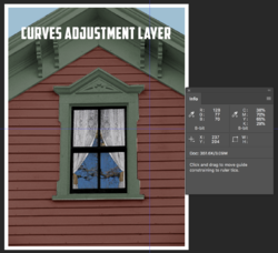
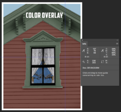
I am assuming you are starting with a base HEX color whose luminosity you want to duplicate while change the Hue and Color to get variations using the adjustment Layers with which you are familiar including the use of the Color Overlay in the Layer Styles panel.
First if you have a Hex number in sRGB color space you need to know the RGB numbers associated with it. These can be copied right form the Color Picker when you put in the Hex number. For Hex = 804D46 the RGB number are R=128 G = 77 and B=70
Mathematically the grayscale value you want for the Hex Number is calculated by Grayscale = .3 * R + .59 * G + .11 * B
Grayscale = .3 * 128 + .59 * 77 + .11 * 70 = 91.53
That means picking 91 or 92 would be quite close. We will use this number in the Layer Stack in just a bit
You start with you base image from your PSD with:
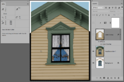
In the Layer where you use the Color Overlay
1) Open the Color Overlay Style and choose the color with the Color Picker inserting the Hex number and note the RGB numbers as well - both circled in Yellow
2) Also, it is important that you changed the Blend mode of the Color Overlay Blend to Color (not the default of Overlay) which is also circled in Yellow

This will yield a Layer Stack of:
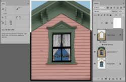
For the Layer with the Color Overlay, turn off the visibility icon for the "Effects"
Also Add the Hue, Sat Adjustment Layer as a Clipping Mask. Turn the Saturation to 0,
and then adjust the Lightness Value down until the Color Sampler value on the it is equal to 91 or 92 as we calculated before: (circled in yellow):
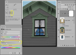
Now go back and select the Layer with the Color Overlay and turn the effects back on. Your color will now match very closely in the info panel with your original RGB desired numbers. In this case, the RGB numbers are only off by one bit each:
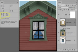
Now, all you have to do to try different Hues, and Saturation with the same brightness level is to go in and change the color of the Color Overlay.
Give it a try and hope this does the trick for you.
John Wheeler
The approach I am going to show you is like using a hammer for a screwdriver yet if all you have is a hammar then its one way to go at it.
I am assuming you are starting with a base HEX color whose luminosity you want to duplicate while change the Hue and Color to get variations using the adjustment Layers with which you are familiar including the use of the Color Overlay in the Layer Styles panel.
First if you have a Hex number in sRGB color space you need to know the RGB numbers associated with it. These can be copied right form the Color Picker when you put in the Hex number. For Hex = 804D46 the RGB number are R=128 G = 77 and B=70
Mathematically the grayscale value you want for the Hex Number is calculated by Grayscale = .3 * R + .59 * G + .11 * B
Grayscale = .3 * 128 + .59 * 77 + .11 * 70 = 91.53
That means picking 91 or 92 would be quite close. We will use this number in the Layer Stack in just a bit
You start with you base image from your PSD with:

In the Layer where you use the Color Overlay
1) Open the Color Overlay Style and choose the color with the Color Picker inserting the Hex number and note the RGB numbers as well - both circled in Yellow
2) Also, it is important that you changed the Blend mode of the Color Overlay Blend to Color (not the default of Overlay) which is also circled in Yellow

This will yield a Layer Stack of:

For the Layer with the Color Overlay, turn off the visibility icon for the "Effects"
Also Add the Hue, Sat Adjustment Layer as a Clipping Mask. Turn the Saturation to 0,
and then adjust the Lightness Value down until the Color Sampler value on the it is equal to 91 or 92 as we calculated before: (circled in yellow):

Now go back and select the Layer with the Color Overlay and turn the effects back on. Your color will now match very closely in the info panel with your original RGB desired numbers. In this case, the RGB numbers are only off by one bit each:

Now, all you have to do to try different Hues, and Saturation with the same brightness level is to go in and change the color of the Color Overlay.
Give it a try and hope this does the trick for you.
John Wheeler

