What's new
Photoshop Gurus Forum

Welcome to Photoshop Gurus forum. Register a free account today to become a member! It's completely free. Once signed in, you'll enjoy an ad-free experience and be able to participate on this site by adding your own topics and posts, as well as connect with other members through your own private inbox!

College club logo need suggestions


Angel Perez

New Member
Messages
4
Likes
0
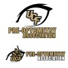
Hello Im working on my Pre-optometry club association logo and I came up with the image bellow. Im not very happy with it I would like to make it more smooth and also friendly for t-shirts and the website. what would you guys recommend? The logo needs to be a logo that will last forever as part of the club. I uploaded the PSD file just incase somebody want it to help and a screenshot of the website..

I love this forum by the way great job.
 

Attachments

  • ucfpreoptometry.jpg
    ucfpreoptometry.jpg
    135.5 KB · Views: 22
  • ucfpreoptometry.psd
    ucfpreoptometry.psd
    2.4 MB · Views: 4
  • Screen Shot 2014-05-26 at 10.09.54 AM.png
    Screen Shot 2014-05-26 at 10.09.54 AM.png
    739.9 KB · Views: 1
Hey Angel, welcome to PSG.

I'm not the best member to advise you on logo design. I will say that Photoshop is not the best program for logo design. Illustrator is vector based and a much better program for creating logos.

When creating logos, make them very large. Your document in your PSD is only 500 x 500 px! Way too small.
 
I second what IamSam is saying. I work with a screen printer that makes T-shirts. We get graphics sent to us that are not even remotely what is needed from a technical standpoint. (that's why they need me..lol) For a full front or back, you need to have a design that is 10-11" wide at 300 ppi. For just a pocket, 3.5" wide. Right now,you would have a 3 color design, assuming you wanted it on a garment other than white. Screen printers have the luxury of white ink, so if you have white in your image and you want it remain as white, that requires another screen and subsequently raises your cost. Just be aware of that when your designing.

Hey Angel, welcome to PSG.

I'm not the best member to advise you on logo design. I will say that Photoshop is not the best program for logo design. Illustrator is vector based and a much better program for creating logos.

When creating logos, make them very large. Your document in your PSD is only 500 x 500 px! Way too small.
 
Re-create it as a vector. You have made it as 300ppi but the image is only a little over an inch wide. Your getting a case of the "jaggies" when you stretch it. You can try resampling it with PS and maybe get it a little bigger. It appears your intent was just for use online as your profile is for Display. If your just going to use it online it will be fine I think, it's not bad at 100%. If your planning on printing it then that is another issue. Do you have Ai ? Use Live Trace?
you are Sam and thank you. Looking for ideas to make the logo smooth? the font etc thank you. happy to be here.
 
Last edited:
Yes, like Larry and I have both pointed out, using a better program for the task and making the image larger will sharpen the logo immensely.

Live trace in Ai is a great idea!
 
I don't quite get the knight in the eye. Am I understanding the situation correctly? The knights are the A-football team , and this is a university club which has no other association to the football team, other than the institution in which the two entities reside.

Why not incorporate the Uni logo into an eye?
logo eye.png
 
Dude I love the concept Im not very impress with the effect looking for something more flat and th color to match the school's color and you were right I dont know why did I use the knight but agaain I was just free styling looking for ideas.
I don't quite get the knight in the eye. Am I understanding the situation correctly? The knights are the A-football team , and this is a university club which has no other association to the football team, other than the institution in which the two entities reside.

Why not incorporate the Uni logo into an eye?
View attachment 45661
 
A concept is what I was showing, and surely you are able to use your imagination to know what it would look like flat and in a different colour. I wasn't trying to do it for you.
 

Back
Top