mywildflowers
New Member
- Messages
- 3
- Likes
- 1
Welcome to Photoshop Gurus forum. Register a free account today to become a member! It's completely free. Once signed in, you'll enjoy an ad-free experience and be able to participate on this site by adding your own topics and posts, as well as connect with other members through your own private inbox!
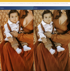
I didn't make any exposure or color adjustments to your photo, but even so, your original post seems more saturated than my edit. I'm not sure why that would be. Here's another version where I've increased the saturation.
Hi @JeffK and @Rich54Hi Rich -
You must have a great eye - I don't see much of a saturation difference between the two.
But I did see that the original image posted by the OP was a jpg image - your posted image was a png. Not sure if that's the difference you're seeing between the two and I don't think there's a saturation or gamut difference between them. Maybe @thebestcpu can jump in with his technical support.
It's that kind of a morning!
- Jeff
Hi @JeffK and @Rich54
The OPs original image and your first image posted Rich are indeed mathematically identical except for the cleavage edits you completed. They were both sRGB color space as well. In the same color managed application they look and are identical. If you see a difference, there is something else going on (e.g. viewing on different monitors/apps/browsers etc) yet the source of the issue is not the color data or color space being used for either. Could be pursed on a different posting if desired.
Very nice edits btw.
John Wheeler
Trying to get into the technology of images does make my head hurt. But I took a shot. Digging into this image comparison (jpg vs png) I can't come up with any definitive differences other than jpgs are better for images and pngs better for illustrations and linework. And the fact that pngs have transparency. What conclusion I did reach is that on your computer, both a jpg and png will look the same. I tried that - downloaded your image and the OP image, isolated the knee section as you mentioned, placed one on top of the other, and there was no discernible difference. Used eyedropper tool on both and only a few points difference which may be that I wasn't exact where I was taking the sample.When I view the OP's image and my edit in Photoshop itself, they are identical. It's only when I post them here to the forum that I see a difference. The small thumbnails look identical to me, but when I actually log-in and look at them enlarged, it still seems to me that the OP's image is more saturated than my first post. Her knees are a good example of where I see a big difference. Very strange. Even if my monitor was somehow badly calibrated, it should be the same bad calibration for both images. I have not noticed this problem with any other posts—only this one. The only unusual thing I did was to post my edit as a PNG rather than a JPEG. I wonder if that has any relevence.
HI @Rich54When I view the OP's image and my edit in Photoshop itself, they are identical. It's only when I post them here to the forum that I see a difference. The small thumbnails look identical to me, but when I actually log-in and look at them enlarged, it still seems to me that the OP's image is more saturated than my first post. Her knees are a good example of where I see a big difference. Very strange. Even if my monitor was somehow badly calibrated, it should be the same bad calibration for both images. I have not noticed this problem with any other posts—only this one. The only unusual thing I did was to post my edit as a PNG rather than a JPEG. I wonder if that has any relevence.

