Photoshop Gurus Forum
Welcome to Photoshop Gurus forum. Register a free account today to become a member! It's completely free. Once signed in, you'll enjoy an ad-free experience and be able to participate on this site by adding your own topics and posts, as well as connect with other members through your own private inbox!
You are using an out of date browser. It may not display this or other websites correctly.
You should upgrade or use an alternative browser.
You should upgrade or use an alternative browser.
Book Scene
- Thread starter gedstar
- Start date
- Messages
- 24,139
- Likes
- 13,717
Ged, this is an ambitious project. You've done a great job but I think there's still some work that needs to be done with the lighting and shading, especially on the flying papers and cat. Sorry for the honesty..........I am the bad guy ya know.
gedstar
Guru
- Messages
- 4,362
- Likes
- 4,530
Ged, this is an ambitious project. You've done a great job but I think there's still some work that needs to be done with the lighting and shading, especially on the flying papers and cat. Sorry for the honesty..........I am the bad guy ya know.
Hey Sam, I would very much appreciate your input on how I could improve the lighting and shading so don't be shy

I'm just getting back into this so any help/critique is really appreciated

- Messages
- 24,139
- Likes
- 13,717
No problem, I can only offer what I think might help and you can weed through and decide if it works or not. However, as you know I work on Saturdays and they're already calling me so I need to run for now. Will be back later this evening.Hey Sam, I would very much appreciate your input on how I could improve the lighting and shading so don't be shy
I'm just getting back into this so any help/critique is really appreciated
Eggy
Retired Moderator
- Messages
- 5,081
- Likes
- 5,063
@gedstar and @Pipsmom
What I mean by contact shadow can also be named ambient occlusion.
That is the part where an object touches the 'groundplane' or an other object and it is a physical phenomenon making that small part of the shadow the darkest.
There's even a 'shader' in Blender for reproducing that.
But the best way to apply shadows is in fact in layers and who can explain this better than Aaron...
Have a look at this:
- Messages
- 24,139
- Likes
- 13,717
Sorry Ged that it taken me so long. Very busy at work!
The first thing I want to point out is the overall lighting. Based on the light source of the BG image, it's coming from high, behind and from the left.
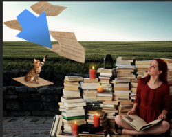
Based on the BG lighting, notice that you properly lit the stone wall in that you made it's front surface shadowed with the top of the wall brighter. The same lighting would be carried out in the book stack and the girl. This is very quick and dirty but something more like this....... a bit lighter though.

Notice that the Cat's lighting seems to be coming from it's front or our right when it should be similar to the BG lighting. The Cat's back should be llighter and the front darker or more shadowed like the wall.
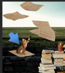
The floating papers would also share similar lighting as the BG image........something like this. You have to consider the folding of the papers.
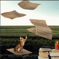
The first thing I want to point out is the overall lighting. Based on the light source of the BG image, it's coming from high, behind and from the left.

Based on the BG lighting, notice that you properly lit the stone wall in that you made it's front surface shadowed with the top of the wall brighter. The same lighting would be carried out in the book stack and the girl. This is very quick and dirty but something more like this....... a bit lighter though.

Notice that the Cat's lighting seems to be coming from it's front or our right when it should be similar to the BG lighting. The Cat's back should be llighter and the front darker or more shadowed like the wall.

The floating papers would also share similar lighting as the BG image........something like this. You have to consider the folding of the papers.

Last edited:
fredfish
Guru
- Messages
- 882
- Likes
- 1,247
Hi Ged - I love the revised version. IMHO you still need slightly more shadow under the cats paw (although I think it is a vast improvement over the original) and also the candle next to the girls right knee should be reflected in the glass globe above and behind it. But they are really picky points.
Cheers
John
Cheers
John
- Messages
- 24,139
- Likes
- 13,717
Excellent!Hey Sam, I made a few changes, is this better?


