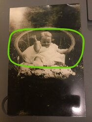
View attachment 131472
Hello
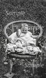
Think this is a better idea, the hedge as a background looks natural
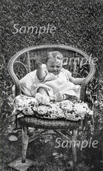
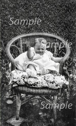
you managed to bring out a lot of chair detail. Could you remove the two lines shown by the arrows and improve the detail bottom right and left of the chair as shown, also make the the top of the hedge,, more like the rest, with better detail and definition thanks
Like this?


