Photoshop Gurus Forum
Welcome to Photoshop Gurus forum. Register a free account today to become a member! It's completely free. Once signed in, you'll enjoy an ad-free experience and be able to participate on this site by adding your own topics and posts, as well as connect with other members through your own private inbox!
You are using an out of date browser. It may not display this or other websites correctly.
You should upgrade or use an alternative browser.
You should upgrade or use an alternative browser.
Achieving a similar (but more complex) effect to this YouTube video?
- Thread starter Geelvis
- Start date
- Messages
- 23,906
- Likes
- 13,636
Hello.
I have a grey background for contrast, do not have a background.......make sure it's transparent!!!
Set up your guides and create a a 60 px circle with the Rectangle Tool
Duplicate until you have 7 copies.
Position the copies.
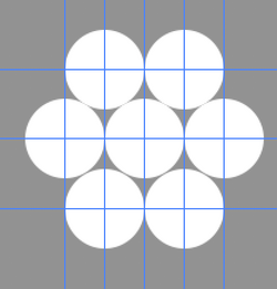
Highlight the copies and merge.
Invert the circles. (EDIT: Don't do this step! The circles should be left white!)
Rasterize the layer.
Make a selection with your Rectangular Marquis Tool
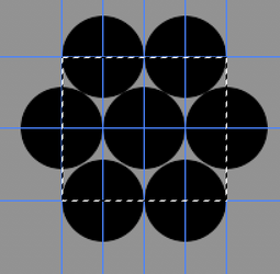
Hit Cmd + I to invert the selection.
Hit delete.
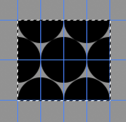
Hit Cmd + D to deselect.
This is what it should look like without the grey background!
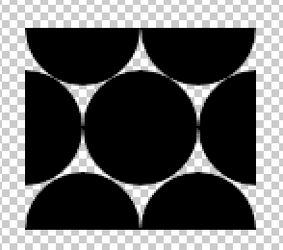
Go to IMAGE > TRIM
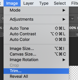
Trim transparent pixels.
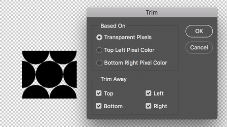
Should look like this.
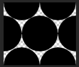
(EDIT: You can inverse these to make them white again!)
Go to EDIT > DEFINE BRUSH PRESET
Name it and save.
This should give you the tight pattern you're looking for.
I have a grey background for contrast, do not have a background.......make sure it's transparent!!!
Set up your guides and create a a 60 px circle with the Rectangle Tool
Duplicate until you have 7 copies.
Position the copies.

Highlight the copies and merge.
Invert the circles. (EDIT: Don't do this step! The circles should be left white!)
Rasterize the layer.
Make a selection with your Rectangular Marquis Tool

Hit Cmd + I to invert the selection.
Hit delete.

Hit Cmd + D to deselect.
This is what it should look like without the grey background!

Go to IMAGE > TRIM

Trim transparent pixels.

Should look like this.

(EDIT: You can inverse these to make them white again!)
Go to EDIT > DEFINE BRUSH PRESET
Name it and save.
This should give you the tight pattern you're looking for.
I did a lot of experimentation with this and eventually landed on exactly what @IamSam describes above. However, by making the dots more compact, it throws off the geometry of the original tutorial.
The tutorial takes great pains to make the dots the same pixel size as what was used in the Pixelate>Mosaic command. The reason for that is because the Pixelate command forces each square mosaic tile to be one pure color. When the round dots are exactly the same size and spacing, then each dot exactly matches-up to each mosaic tile, and each dot becomes one pure color.
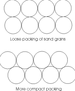
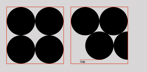
But... when you change the dot pattern to be tighter, the spacing of each dot is still 60 pixels apart in the horizontal direction, but less than 60 pixels apart in the vertical direction. You can see this in the mock-up I made below. On the left, the dots fit perfectly into a square. But on the right, there is a gap at the bottom where the dots no longer fill the square because they are spaced tighter. This means that the new, compacted dot pattern will no longer exactly coincide with the 60-pixel mosaic pixelation. Any individual dot will no longer be one pure color.
I'm still thinking about this, but I believe that it is geometrically impossible to simultaneously tighten the dot pattern while keeping each dot as a pure color.

- Messages
- 23,906
- Likes
- 13,636
I agree, at least as it pertains to this tutorial.but I believe that it is geometrically impossible to simultaneously tighten the dot pattern while keeping each dot as a pure color.
thebestcpu
Guru
- Messages
- 3,216
- Likes
- 2,963
Thanks guys, but as I should have mentioned (and both of you have realized), the difficulty I'm having is with correctly formatting the underlying image. The issue goes even deeper than described by Rich 54 above.
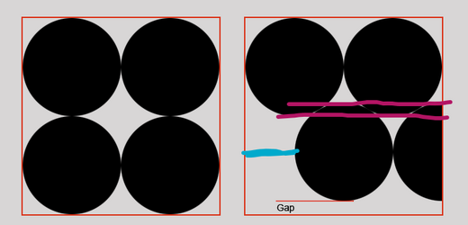
While the offset indicated in blue is an issue, it could be dealt with by slicing the image into rows and offsetting every second one. The bigger issue is the offset indicated by the pink lines. I believe this makes it impossible to achieve this effect ussing the mosaic filter and it would either need to be achieved through another method entirely or built in code.

While the offset indicated in blue is an issue, it could be dealt with by slicing the image into rows and offsetting every second one. The bigger issue is the offset indicated by the pink lines. I believe this makes it impossible to achieve this effect ussing the mosaic filter and it would either need to be achieved through another method entirely or built in code.
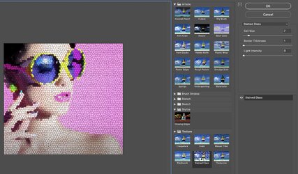
Thanks, i need the elements to be round specifically.Though this does not answer the specific question, there is a similar effect with Stain Glass Window effect per this screenshot:
John Wheeler
View attachment 146420
[ iLLuSioN ]
Power User
- Messages
- 414
- Likes
- 419
You could of course use a script...
If you can't script, however, you could create a basis with filters like "Filter Forge" and work with a corresponding mask...
If you can't script, however, you could create a basis with filters like "Filter Forge" and work with a corresponding mask...
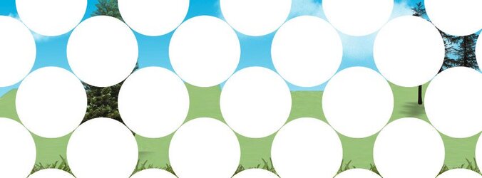
Yes exactly! What a champion. How did you do it?
[ iLLuSioN ]
Power User
- Messages
- 414
- Likes
- 419
- Messages
- 23,906
- Likes
- 13,636
Yes exactly! What a champion. How did you do it?
OK....this may not be the best approach but it's consistent with the video tutorial.
I used offset dot patterns and two image layers per the tutorial. I think you can do this using one dot as long as it's offset. I just used two to see if it would work.
When you get to the part where you create the corresponding dots, you need to use offset dots.
These are my dots (made just like my tutorial above). The red arrow indicates center.
I stacked two above center and two below for spacing and for placing the guide lines.
I turned off the dot layers I didn't need when making the pattern preset.
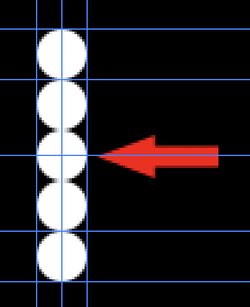
For Pattern 1, I offset the the dots and made the selection using the Rectangular Marquis Tool.
No need to trim anything, just make a selection and create a pattern preset.
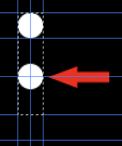
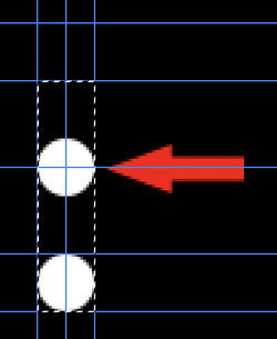
For Pattern 2, make the second dot pattern like this.
Save as pattern preset.
Per the tutorial, I just made two SO images with Smart Mosaic filter, and a filled layer mask. Pattern 1 for one image and Pattern 2 for the other.
I then selected the top layer mask and used the Move Tool to move the dots!
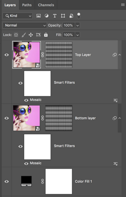
Your image will look like this and will have to be slightly cropped.
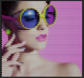
Amazing, thank you so much. This is perfect. It's almost midnight now and I got to get to bed. But I'll implement this tomorrow.OK....this may not be the best approach but it's consistent with the video tutorial.
I used offset dot patterns and two image layers per the tutorial. I think you can do this using one dot as long as it's offset. I just used two t see if it would work.
When you get to the part where you create the corresponding dots, you need to use offset dots.
These are my dots (made just like my tutorial above). The red arrow indicates center.
View attachment 146431
For Pattern 1, I offset the the dots and made the selection.
No need to trim anything, just make a selection and create a pattern preset.
View attachment 146432
Make the second dot pattern like this...
View attachment 146433
Per the tutorial, I just made two SO images with Smart Mosaic filter, and a filled layer mask. Pattern 1 for one image and pattern 2 for the other.
I then selected the top layer mask and used the Move Tool to move the dots!
View attachment 146434
Your image will look like this an will have to be slightly cropped.
View attachment 146435
- Messages
- 23,906
- Likes
- 13,636
You're welcome! Hope it works for you!Amazing, thank you so much. This is perfect.
Your method was pretty easy to implement, thanks. However, I only noticed when implementing it that there is a tiny vertical gap between each row. I would like to use this to map images and stack then with cylinders in the real world. The tiny gap is going to cause the vertical scale to be squashed during execution. I think I may have a workaround, will report back if it works out.You're welcome! Hope it works for you!
- Messages
- 23,906
- Likes
- 13,636
You will have to adjust the gap out when you create the dot pattern for the layer mask. May take some experimentation.However, I only noticed when implementing it that there is a tiny vertical gap between each row.
[ iLLuSioN ]
Power User
- Messages
- 414
- Likes
- 419
You can ask @MarshySwamp if he can write you a script.
Theoretically, you could work with selections to which you apply the Average filter.But you could also work with the Mosaic filter as before, but move the image not only horizontally but also vertically every second line (depending on the desired Mosaic/Dot size) - it's simple mathematics.
I scripted this years ago for a hexgrid - so it should also work with dots (same basis)
[ iLLuSioN ]
Power User
- Messages
- 414
- Likes
- 419
How was the problem solved?

