What's new
Photoshop Gurus Forum

Welcome to Photoshop Gurus forum. Register a free account today to become a member! It's completely free. Once signed in, you'll enjoy an ad-free experience and be able to participate on this site by adding your own topics and posts, as well as connect with other members through your own private inbox!

Your favorite color names and descriptions


ibclare

Queen Bee
Messages
11,033
Likes
4,638
What colors do you favor? What names do you give them or are they given?

Start with the color name, then the description and do this by giving percentages of the primary colors which comprise each color.

Remember on a multiple color wheel, shades of "grey" or other shades, tones, and whatnot are given different descriptive categories, such as polychromatic or triadic (sometimes given other descriptive terminology). Here is a Wikepedia article on color schemes.

So to demonstrate an example of some of the color names you might describe, there is indigo, scarlet, camouflage green (also sometimes known as shades of olive green), burnt umber, yellow ochre, burnt sienna, mint green, celadon, cerulean blue, magenta, and so forth. I won't describe any of these as you may want to do this if one is a color or part of a color schematic you frequently prefer to use.

I look forward to seeing your analyses, as well as the colors you like. Have fun.

HINT: you can find many color names on tubes of oil paint and acrylic paint. Paint store colors change with the season, maybe the time of day, so good luck if you choose one of those. You know, like a color called Comrade, sort of a tone of yellow ochre: yellow with a tad of purple, a bit more of white, and an advertising department with a warped sense of humor.
 
This might be of interest:

Here is another thing. On a color wheel, colors are arranged in concentric rows labeled primary, secondary, tertiary, and quaternary.

Quaternary are "are formed by mixing one primary that is at 100 percent saturation with any other primary that is at either 25 percent or 75 percent saturation. There are twelve quaternary colors: cherry red, red, red-orange, orange-yellow, yellow-green, warm green, cool green, blue-green, blue, ******arine blue, purple-mauve, and red-violet." From WIki Answers.

This basic color theory article may be of interest.

Even though I said house painting colors are romanticized, to say the least, this is an article with terminology for house painting and color theory.
 
Last edited:
Hi Clare -

I know this isn't exactly what you asked about, but if you like colors and color schemes and haven't yet tried Adobe Kuler ( https://kuler.adobe.com/create/color-wheel/ ) you are missing out on some great fun and a really useful tool to generate color schemes. It's also a great way to learn about the different types of color schemes that you mentioned in your previous posts.

After you open the above page, click on the icon of the camera in the upper RH corner. Select some suitable photo. For example, if you want to buy a new shower curtain to go with the wall color of your bathroom and the towels that you own, take a photo of the room (with the towels in place), and then click on the various color schemes.

If you find it useful and want to have it with you when you, say, go shopping, or are trying to analyze color schemes of places you visit and objects you might see (eg, an impressionist painting in a museum), Adobe has a free smart phone app that does pretty much the same thing as the on-line, web-based version.

Give it a try -- I think you'll like it.

T
 
PS - I guess that I'm being my usual self, but in all honesty, I don't think I have a favorite color in some abstract sense. If someone held a gun to my head and forced me to say something, I would probably say that I tend to like deeply saturated cool dark colors (eg, deep purples, blues, magentas, etc.), but I also like warm pastels for other situations.

T
 
Thanks Tom, I'll take a look at that later; it sounds interesting. I didn't start this thread because I'm asking for help. I was just throwing out a bit of a challenge for members to name a color and describe what colors are mixed together to make it. We have it so easy nowadays with creating colors - we let the software do the job - although, as your link points out, color schemes can still be a challenge.

What started me out on this was seeing a beautiful old t-bird on the freeway. It was a pale teal blue and I found myself trying to figure out why it wasn't quite teal and wasn't really green or blue, so I mixed in a touch of orange. And so on.

@fotograffiti, sorry I didn't know I was being so dense. Maybe I just come from a painter's POV - which I do. When I mix a color, I have to figure out what colors make that one up. Especially if I have to match it as perfectly as possible without the paint store software or Photoshop's. In Photoshop, all we have to do is find a color, use the info tool, sample, and we get a coded description of it. Would that make MIchelangelo, Cezanne, Rothko, laugh or cry? or shrug?

Anyway, like all threads, this one will get some takers or die an ignominious death, lol.
 
Hi Clare

I work in the printing business since 1970. Colors are specified here in CMYK mode in percentages. CMYK means Cyan, Magenta, Yellow, Key (for black). These 4 colors are printing inks of a printing press.
Examples:
The color white is C 0, M 0, Y 0, K 0
The color black is C 70, M 60, Y 60, K 95
The color royal blue is C 100, M 80, Y 0, K 50
Light skin color is C 3, M 22, Y 27, K 0
Dark skin color is C25, M 65, Y 75, K 21


What I want to tell you here is the following: Among professionals you can specify a color with 4 numbers. Then everyone knows what particular color it represents.


In Photoshop I measure these values ​​constantly and always have full control what I do. Of course I work in RGB mode in PS but I check the values in CMYK. Nothing is left to chance.


So for me, colors are always a combination of 4 numbers, the rest is done by my brain and I see the color that I will use in photoshop in my mind's eye.


Clare, my favorite color is C 40, M 98, Y75, K 50. Have you any idea what that might be?

CMYK %.jpg
 
Last edited:
Chris, only can I identify this color by using the color specs in Photoshop, lol. It looks to be a dark magenta or a burgundy. I will call it merlot! How am I doing? What do you call it?
 
Ah, so your present avatar describes your present condition quite accurately. Old drunk smoking orang-brown rings around his fingers and thumb. LMAO. I like Merlot a lot, but even better I like syrahs for their deep complexity. (redundant?)

My current avatar has just the slightest touch of something close to your color. One pixel in fact. Its CYMK is: 35/99/84/55 compared to your 40/98/75/50. Close. The larger red field is a much lighter version of either, but it does comprise a bit more field than one pixel . . .

merlot.jpg

I can't find the original psd - god I hate it when I file something and forget where - so talk about pixelated.
 
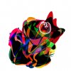
Here's another version of avatar (found the file) with very similar color to yours, marked by ugly white circle.

FreeformCMYK.jpg

(just realized that this version looks kind of like a cartoon character with a very large head and funny feet at the bottom)
 
Hey Chris - What color space do you tend to use as your working space? I ask because your CMYK numbers will depend on which one you are using.

T
 
Tom, my working space is sRGB, see the color setting screenshot below.

I always work in RGB mode on my jobs in Photoshop. To check my color values ​​I have set the info window to CMYK. I store my pictures always as a PSD with layers in RGB mode. Only when the job is ready to send to the customer (Printer) I flatten the image and do the conversion to CMYK according to customers specifications. Sometimes printers prefer RGB files, and do their own CMYK inhouse.

Info.jpg

Colorsetting.jpg
 
Thanks, Chris.

As usual, we do almost exactly the same thing. About the only difference is that for photos taken "in the wild" (ie, not under the controlled lighting conditions of a studio), I'll usually work in ProFoto until the very last step which, like you, would be conversion to the appropriate color space for the required type of output (eg, sRGB or CMYK for most printers; sRGB for web, etc.).

T

PS - BTW, FYI, a couple of months ago, I upgraded from a NEC PA 241 to a NEC PA 242 (wide gamut) and love the improvement it gives.

PS#2 - Sorry, Clare ... didn't mean to derail your thread. This is the end of our little side discussion.
 

Back
Top