What's new
Photoshop Gurus Forum

Welcome to Photoshop Gurus forum. Register a free account today to become a member! It's completely free. Once signed in, you'll enjoy an ad-free experience and be able to participate on this site by adding your own topics and posts, as well as connect with other members through your own private inbox!

Would like some critique on my photos


TBCobra

Member
Messages
14
Likes
0
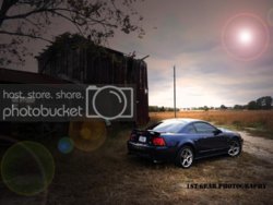
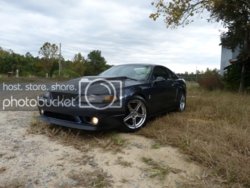
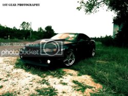
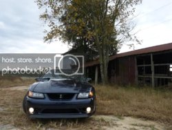
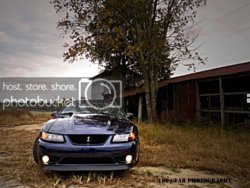
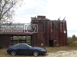
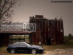
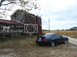
Hey guys and girls this is my second post here and I would like some feedback on a few of my pictures. I have only been seriously using PS for about a month or something. I have learned most of what I know by trial and error. Things like lighting effects I found on YouTube. Anyways let me know what you think. Too many effects, not enough or anything in general. I figured I would post the originals alongside the edited ones to get an idea of where I started

The last two I just learned how to use the sharpen filter and maybe I went a little over board. lol

Thanks!

OldBarnCobra7.jpg
OldBarnCobra7-2.jpg

OldBarnCobra4-1.jpg
OldBarnCobra4.jpg

OldBarnCobra3-1.jpg
OldBarnCobra3.jpg

OldBarnCobra15-1.jpg
OldBarnCobra15.jpg
 
I would edit my original post but I dont see where to do that.

I just realized there is a "Before and After" section that I should have posted this in. Feel free to move it there if need be.
 
Moved as requested.

Here are my thoughts. First of all, very good for one month doing Photoshop. Since you come from a photography background, I would say, engage your photographer's eye a bit more.

Post processing often needs to be subtle. But I can understand you are having fun playing with effects and that is how to learn what they are.

Your first image strikes me as being too dark in some areas. I like the atmosphere you created though. If you made your exposure, levels, or curves adjustment as a layer adjustment, you have a layer mask that you can use to delete to any degree the effect of that adjustment on the layer. So you might want to remove some of the darkness by softly brushing black over the mask to lighten the house. I'm not even sure what you did do there because it made the area flat and cloudy looking. The flares are indeed over done but like I said what the heck if it's just for fun.

A big thing to watch out in all your skies is that the highlights are washed out. You don't gain much when you darken them. It only gives them a bland grey cast. Just be careful how far you push them when you make adjustments. Or once you learn how to make selections and blend things, you might want to just change the sky. Or start out with multiple exposures. Just my opinion.

The second I don't like. All effect and the colors do nothing for me.

The other two with the sharpening filter? As you suggested, they are a bit overdone. Sharpening that much can blow out highlights and make some weird edges. This can create a useful effect in the right situation. And the way you are presenting the cars may be the right situation! Once again, the skies are pasty looking.

Crop . . . Most of them, especially the first and the last, would benefit from judicial cropping. Give your subject the spotlight it deserves.

Keep up the good work TBCobra, and welcome to PSG.
 
Thank you so much for the feedback. Being new to CS5 yes I am going a little crazy with the effects. lol

What I was trying to accomplish in these photos, except the greenish one, was to 1) highlight the car and 2) make it deep and rich looking. I wasnt simply trying to enhance the quality but more make the car pop.

All of them aside from the green one I honestly just played around with all the image adjustments including curves, hence how I made the greenish looking one. Everything was edited at once meaning I adjusted the whole photo and not parts such as the sky or barn. I didnt use any touch up tools because frankly I dont know how.

I wanted to use the sharpen feature to really make the car stand out.

What would you suggest I crop out?

Like I said I am still new at this and honestly some of your comments are going over my head. lol like brushing black over the mask and things like that but again thank you for your input.
 
I'm just gonna work the first image...And If I seem too rough...I apologize up front....I am looking as if it was mine. I love the exposure on the barn and car....the cloudsand foreground are washed out. Biggest problem needs removal, that is the pole mounted to the roof.( I shoot people with trees growing...) I might crop the tree and smaller barn to center the car. By using masks and curves you should be able to make it cleaner.... I'm not sure on your correction why you put flare into the sky....but I am gonna play a bit with this as I said above.:thumbsup:
 
That wasnt rough at all. lol Like I said I just recently learned about all of these effects and I liked the flare so I added it in. That is all. I look forward to see what you come up with.
 
a quickie...no filters...just masking and levels..did a bit of burning on the grass
I removed the post...still a few wires left

OldBarnCobra7a.jpg
 
You did say critique the photos so I won't talk about the edits.
If your camera can do it, you should be shooting in Raw, it has a better dynamic range.
Also in all your posted photos I would suggest under exposing a bit to save the detail in the highlights (sky).

I would crop a little tighter on the car in all the shots you can also try shooting up from a lower angle on your shots.

You have a pole or tree in image 1 that looks like a big old CB antenna in image one.
I'd edit that out, it's distracting.
 

Back
Top