What's new
Photoshop Gurus Forum

Welcome to Photoshop Gurus forum. Register a free account today to become a member! It's completely free. Once signed in, you'll enjoy an ad-free experience and be able to participate on this site by adding your own topics and posts, as well as connect with other members through your own private inbox!

Would appreciate some help please.


Messages
24
Likes
7
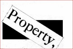
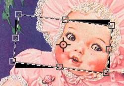
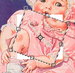
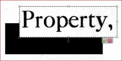
I am tidying up some very mis-aligned old text in JPEG format and have been using the Rectangulat Marquee tool to outline selections and then usually Image>Transform>Distort to straighten things up. Sometimes I just use the Free Transformation option if I just want a simple move of the text. Have been working on this for weeks now but suddenly today, whenever I move any text a black background appears where the selection box used to be. Please see images. Distort.JPGFree Transform.JPG Previously the selected square that contained the text would be moved to where I wanted it and the areas vacated would revert to the same colour as the rest of the page. I'm sure it's something simple like I have inadvertently clicked on something that I shouldn't have done but I have been trying options to get rid of this problem and thought I had fixed it once but it keeps happening. Could someone please help me and tell me what option is making this happen please ? All helpful replies will be much appreciated. Thank you. EDIT. Apologies, I should have said that I am using PSE8
 
Last edited:
I don't have PSE8 although I believe most controls are similar to regular PS..
Two questions:
- Why are you using the Distort tool to simply move an object - why not just select and use the Move tool?
- Is there another layer underneath the element you're trying to move?
If you have a fully merged image, ie working with an image where everything is all on one layer, moving any item should leave a transparent hole.
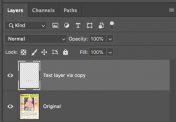
Can you give us a snapshot of your layers panel and exactly what you're trying to move?
- Jeff
 
Hello and welcome. I have one possible theory. If I'm wrong let me know. (Edit: Sorry I missed this, but same as @JeffK mentions above!)

If your text is on it's own separate layer, you shouldn't have this issue. The text will be the only item selected and positioned/re-positioned.
Screen Shot 2021-02-22 at 9.18.18 AM.png

If you have text that has been merged or rastorized with a white background......
Screen Shot 2021-02-22 at 9.07.18 AM.png
Screen Shot 2021-02-22 at 9.07.31 AM.png

....then any selection used in free transform would also select the white along with the text. It would be moved or rotated leaving a "hole" in that layer revealing the black layer beneath it.
Screen Shot 2021-02-22 at 9.09.39 AM.png

A solution would be to place a white filled layer beneath the text layer.
 
I don't have PSE8 although I believe most controls are similar to regular PS..
Two questions:
- Why are you using the Distort tool to simply move an object - why not just select and use the Move tool?
- Is there another layer underneath the element you're trying to move?
If you have a fully merged image, ie working with an image where everything is all on one layer, moving any item should leave a transparent hole.
Can you give us a snapshot of your layers panel and exactly what you're trying to move?
- Jeff
Thank you for your help.
I am using the Distort tool because usually I need to modify the "trueness" of the text. The documents I have are over 100 years old and are stapled together is a sale catalogue. I didn't want to de-staple it all so I photographed all 72 pages. I tried to do this in a way that didn't curve the pages but sometimes there were slight curves which results in warped text. And of course 100 years ago they would have been printed very differently than they would be today. Because I am using PSE8 I do not have the dewarping option as I was told in my previous topic but I have found that I can de-warp sentences if I split them into sections and in fact the Distort tool does actually permit a degree of de-warping. I am not just trying to move the text, if I was then indeed I would use the Move option.

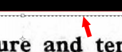
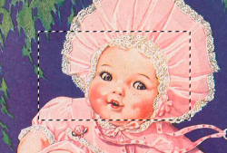
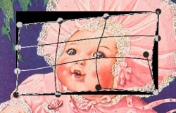
I am only using the Layers panel if for instance one character has become illegible and then I find a good example of the character elsewhere in the document and use Layer>New>Layer via Copy. I can then Move the copy of the good character and place it over the damaged character. I have Snipped an example in the following images. I have pulled a Guide line down to show that the text is out of line and I have been using the Distort option and in this case it would have been easy just to pull the left hand side of the Marquee box down as per the middle image but as can be seen it is leaving a black background where I have move the box from in the last image.

Distort2.JPG

Distort3.JPG

Distort4.JPG
 
Layer>New>Layer via Copy.
This would be the proper way to do this. The copy would be on it's own layer and you would then move it where you wanted it, distort it, and it should not produce a "black line"

Here is what should happen.....
Unruly text and guideline
Screen Shot 2021-02-22 at 11.05.18 AM.png

Free transform to straighten text, no warping or distorting needed in this example. But it could be used here if needed.
NOTE: NO MARCHING ANT SELECTION AROUND THE TEXT, JUST THE TRANSFORM BOX!
Screen Shot 2021-02-22 at 11.12.08 AM.png

Text is now straight with the guideline.
Screen Shot 2021-02-22 at 11.08.31 AM.png
Screen Shot 2021-02-22 at 11.21.24 AM.png

You have a marching ant selection around your text! Are you using the Marquee Tool to make a selection?
Screen Shot 2021-02-22 at 11.09.14 AM copy.png

Please post a screen shot of your layers panel!!!
 
@classictractor - I do remember your previous posts and now I understand why you're using distort in order to modify the layout of the type. In the above, you might still be able to use a tool like Move and rotate it to line up properly.

Getting back to the original question - duplicating a letter to overlay a damaged character works. The only thing I can think of is when you move/rotate the sentence section, you're revealing whats underneath that layer. In my head, there has to be a black element layer underneath that changed layer. Can you take a screen shot of your layer palette showing us at least the modified layer and the layer underneath?

- Jeff
 
If you are working on your original layer............you would produce a transparent deficit that would reveal an underlying layer. In this case, as Jeff states, a black element below the changed layer.

Screen Shot 2021-02-22 at 11.35.05 AM.png
 
This would be the proper way to do this. The copy would be on it's own layer and you would then move it where you wanted it, distort it, and it should not produce a "black line"

Here is what should happen.....
Unruly text and guideline
View attachment 119120

Free transform to straighten text, no warping or distorting needed in this example. But it could be used here if needed.
NOTE: NO MARCHING ANT SELECTION AROUND THE TEXT, JUST THE TRANSFORM BOX!
View attachment 119121

Text is now straight with the guideline.
View attachment 119119
View attachment 119124

You have a marching ant selection around your text! Are you using the Marquee Tool to make a selection?
View attachment 119123

Please post a screen shot of your layers panel!!!
Thank you for your help. It is very much appreciated. Yes, as explained earlier, I am using the Marquee tool and I am wondering if I have altered something within that tool that is now giving me the black areas when I alter the alignment/position of any text. I have been using this method for some weeks now (it is quite a large project !) and have been able to just draw a box around errant lines of text with the Marquee tool and distort/re-shape them as required. I only started to encounter this black box effect today. Just to recap. My problem is not about moving complete areas of text, cutting anything, or copying anything. I have been successfully altering the the alignment of text but suddenly today whenever I alter the shape of a section of text so that it sits nicely on the guide lines then the place where I have moved it from has started to appear as black.
 
@classictractor - I do remember your previous posts and now I understand why you're using distort in order to modify the layout of the type. In the above, you might still be able to use a tool like Move and rotate it to line up properly.

Getting back to the original question - duplicating a letter to overlay a damaged character works. The only thing I can think of is when you move/rotate the sentence section, you're revealing whats underneath that layer. In my head, there has to be a black element layer underneath that changed layer. Can you take a screen shot of your layer palette showing us at least the modified layer and the layer underneath?

- Jeff
In normal circumstances I only have just the one layer, the Background. I don't produce any more layers unless I want to copy a character and overlay it over a damaged character, which is quite rare, or sometimes if I want to cut a character completely although I usually do that with the Eraser Tool set to a small pixel size.
 
I still think you're revealing something underneath that exposes a black element.

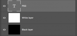
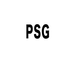
Here I created a layer with an image and text. It's a single layer.
Then I created a layer underneath that's filled with black.
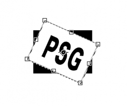
If I use the distort tool to move the sentence fragment, it reveals the black layer underneath.

1614016457911.png

I don't know of any setting on the Distort option that will fill a space with black. Unless your using something like a Patch tool, that area you moved the fragment from will either reveal what's underneath or show up as a transparent space. It's as if you're cutting a news article out of the newspaper and it leaves a hole to show the paper underneath.

I don't mean to minimize your issue in any way. I'm just completely stumped!

- Jeff
 
I am using the Marquee tool and I am wondering if I have altered something within that tool that is now giving me the black areas when I alter the alignment/position of any text. I have been using this method for some weeks now (it is quite a large project !) and have been able to just draw a box around errant lines of text with the Marquee tool and distort/re-shape them as required. I only started to encounter this black box effect today. Just to recap. My problem is not about moving complete areas of text, cutting anything, or copying anything. I have been successfully altering the the alignment of text but suddenly today whenever I alter the shape of a section of text so that it sits nicely on the guide lines then the place where I have moved it from has started to appear as black.
I will assume then that you are working directly on the original layer. You can't do this!

Anytime you make a selection of the original layer with the Marquis Tool and then try to transform, distort, or warp that selection, you will create deficits that will reveal underlying layers.

Screen Shot 2021-02-22 at 12.01.01 PM.png
Screen Shot 2021-02-22 at 12.01.29 PM.png

EDIT:
In normal circumstances I only have just the one layer, the Background.
Sorry I missed this!

This is making a selection made with the Marquis Tool directly on the background layer, and then moved using free transform (Distort). The black is there in the deficits by default.
Screen Shot 2021-02-22 at 12.14.55 PM.png
 
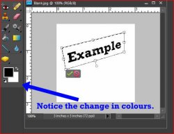
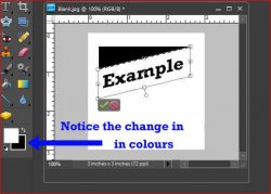
Gentlemen, thank you for your help, I genuinely have appreciated it all. But I have figured out what the problem is and it is so stupid that I am almost ashamed to admit to it. It is all to do with the palette colours. In the 1st image I have the foreground colour set to black and the background set to white as can be seen, I am acheiving what I want to do in my example of an imaginary Distort. In the 2nd image I have the Foreground colour set to white and the background set to black and as can be seen, when I distort the text the space that is left is black !

The examples are only very elementary Distorts, it is possible to do much more complicated stuff than that, even with my outdated PSE8. Thanks again to everyone.


Distort5A.jpg Distort5B.jpg
 
It is all to do with the palette colours. In the 1st image I have the foreground colour set to black and the background set to white as can be seen,
Yes, I vaguely explained this in post #11. "The black is there in the deficits by default." I just did not explain that black was in the background position in the tools panel.
Since we were discussing black being visible, this is what I referenced.

However, this does not solve a problem, it may only explain why you had not seen it before.

As you can see, black or white, either will be visible in the deficits. If black or white is not the color of the background of the original image, then it will be visible.

Screen Shot 2021-02-22 at 3.25.54 PM.png

If you are working on text that has a white background, it might be feasible to use this technique.

If the bqackground color of the original image is off white, then you will see the default white (default background) color in the deficit.
Screen Shot 2021-02-22 at 3.28.19 PM.png


You really need to use the technique described in post #5.
 
Using the technique I describe in post #5, you can make an entire edit non destructively.

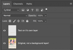
A selection is made of the text I want to alter. I hit Cmd/Cntrl + J to duplicate the selected are to it's own layer.

Screen Shot 2021-02-22 at 3.47.38 PM.png
Screen Shot 2021-02-22 at 3.53.49 PM.png

Now let's say we want to make the text smaller and shorter. We have a problem as we can now see the text on the original...
Screen Shot 2021-02-22 at 3.56.17 PM.png

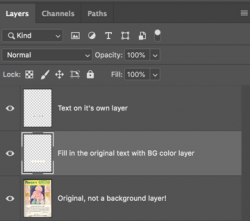
We can remedy this by sampling the background color of the original image.
We create a new layer between the duplicated text layer and the original image layer.
Then we make a selection around original text.
Fill the selection with the sample color.
Screen Shot 2021-02-22 at 3.49.36 PM.png
Screen Shot 2021-02-22 at 3.59.26 PM.png

The text is still there in the original image, it's just covered by a colored area we created with the selection.

Now we can go back to our duplicate text layer and make it smaller and shorter without seeing the original text!
Screen Shot 2021-02-22 at 4.02.08 PM.png

All changes were made without damaging the original or background layer.
 
If you are working on text that has a white background, it might be feasible to use this technique.

If the bqackground color of the original image is off white, then you will see the default white (default background) color in the deficit.
I actually cheated a little. The original text is on what looks like "creamy" coloured paper, that may be because of it's age (over 100 years old) although I don't that is the sole reason. And so I photographed all pages using a B/W setting on my camera and then the first time I went through all the images in PSE I took the Enhance>Convert to Black and White and then took the Newspaper option as a style and then adjusted the Contrast control to start to clarify some of the text which has deteriorated. I took the opinion that if anyone in future ever wants to print the pages they can use whatever colour paper they wish. Thank you again for your help. I have learnt a lot today.
 

Back
Top