Hi all:
In working with an OP's image, I saw that my edit was different in tone working in PS, but when posted, looked similar to the original OP version. Just in depth. I'll also mention that it was posted as a grayscale image.
What I noticed is that when I had opened the image in PS, it converted it to an RGB image. No longer grayscale. Another image posted to the message turned up as sRGB. I assume this is how the software is set up to open the image. Although that confuses me a bit since the original image was grayscale and when I test opened it again, it converted it to RGB.
That raised a few questions in mind:
- Should you work in the OP's assigned profile only?
- If OP's orgiinal file is grayscale, should you convert to sRGB and then back to grayscale when done editing?
- What is the best profile to start work with - I've read that sRGB shouldn't be considered the industry standard?
- Since we're working online, should we work only in sRGB?
- If the OP states at the outset that they're going to print the final, should you post in Adobe RGB for a wider gamut? Even though the display would convert to sRGB?
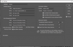
And finally, what are the best color settings for Photoshop? I'm now working in the latest version and here is how I've set it up:
View attachment 120198
Thank you for all help and guidance. Standards and practice can often be at odds...
- Jeff
Good questions
@JeffK and I don't know the "right" answers yet will share my thoughts and opinions (not necessarily in the order you asked). I also have Preserve Embedded Profile yet alert me when it is different that the default working space (I also check the warning for "Ask When Pasting". This way I get alerted in all cases and can choose which color space to use when there is not a match.
A couple modifications
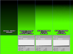
- I pay close attention to when I want the check box set for "Use dither (8 bit channel images). For 8 bit images, when you change color spaces, if checkbox is set, PS will add some low level noise to help mask the banding that can occur when converting among RGB color spaces. Not documented in their description is that when one is converting from 16 bit to 8 bit mode, if that checkbox is set, a small amount of noise is added again to mask banding that can occur when converting from 16 to 8 bit. I don't always want this low level noise added by default. Just need to be aware if you want that turned on or not
- Not covered by the Color Settings is if when saving an image is the ICC/Color profile embedded in the image. I always embed the profile in the image as I see and experience little downside and it helps avoid color management issues. Embedding is controlled when saving and if I am saving to JPEG, PNG, or GIF I always use the Save for Web approach as there are explicit controls there for converting to sRGB and also whether to embed the ICC/Color Profile
I prefer sRGB for most work on PS Gurus and other forums as there are still a lot of folks out there that
As far as color settings, I have mine set up the same way for most of the time yet have a few working space "profiles" from which to choose.
If I used Adobe RGB and especially with ProPhoto RGB I use 16 bit mode and not 8 bit mode. The wider gamut Color Spaces are much more prone to banding issues in 8 bit which can be avoided with 8 bit mode.
If the incoming image from the OP does not have an embedded profiel I usually assign sRGB. If the image coming in from the OP is in a wider gamut Color Space yet the image only has colors that are within sRGB, I either convert to sRGB or if the image does have colors that need the wider gamut and is in 8 bit mode, I keep the OPs profile and convert to 16 bit to help avoid the banding and other artifact issues that could occur staying in 8 bit mode. If I am posting I try (yet don't always) let the OP know if I have changed color space.
If the OP starts in grayscale, I have used both approaches of converting to sRGB and also remaining in grayscale. Sometimes it depends on if PS supports the needed functions I need in grayscale or not. There is a downside of being in RGB as PS rounding can introduce color noise for grayscale images yet is not very noticeable. So a tradeoff.
In my opinion the industry standard should be a color managed workflow so to the first order the color space should not matter so much as colors would be rendered well. However, given the huge number of forum members here and come across color management issues and really don't want to mess with becoming experts on the topic and doing the calibration and profiling etc etc. In those cases, they run into a lot less issues if they stick with sRGB as most of the monitors out there are still closer to sRGB than wider gamut monitors.
I think I have already covered about sRGB. I stick to sRGB unless the OPs image has colors that cannot be represented in sRGB or there is a special circumstance where it is needed.
As far as printing, again, if the image fits in sRGB (easy to check with soft proofing tools) it does not matter. If it does not fits in sRGB and they are in Adobe RGB or P3, yes staying in the OPs color space would be important. You have to be careful when editing Adobe RGB images on a monitor that is closer to sRGB. You basically have to use soft proofing tools to know where the out of gamut areas on the image in your monitor are located in the image. There are some other ways to get around this yet I don't use them cause you can get in trouble. You can have PS on purpose display images with lower saturation (its on the Color Settings Panel). I used that before until I accidentally left that checkbox on once and really messed up a lot of work. So this is a bigger topic yet it is the exception where I see an image on PS Gurus that have a lot of colors that don't fit in sRGB though it does happen.
Just some quick thoughts.
John Wheeler


