What's new
Photoshop Gurus Forum

Welcome to Photoshop Gurus forum. Register a free account today to become a member! It's completely free. Once signed in, you'll enjoy an ad-free experience and be able to participate on this site by adding your own topics and posts, as well as connect with other members through your own private inbox!

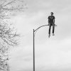
Wondering how I can make this composite more realistic


Hi, the posture is kind of odd but you can make it a little more realistic playing with the shadows in the streetlight.

Poor made example XD:

D45LLRK1.jpg

Cheers!
 
Not having the whole image loses reality for me, give it a base/floor and then it should look more realistic.
 
It looks like the person is leaning against the lamp post instead of sitting on it.
Also he's making fists were he should hold his hand palms down to support himself.
 
Hi sschrag

One common dead giveaway is the lighting and shadows. Subtle in the image yet the brain can tell and knows something is off.

The light direction on the lamp post is not the same as the individual.

Even more that stands out is that there are no associated shadows from the person on the streetlight. It should not be that bright on the lamp between his legs and there is not associated shadow on the street light itself to the viewers right of the individual. It is not a matter of just placing the object in a composition, it is placing the objects shadow in the composition as well (which can be a lot harder).

It was already mentioned that individual did not quite appear they were sitting on the lamp post and the hands were not supporting himself on the map post.

All of these items may seem subtle, yet the brain really catches those subtle items in knowing if something is off or not..

Just some quick observations and good skill with your project.

John Wheeler
 

Back
Top