Ok, you guys have been BEGGING ME to do a tutorial... well here is a quick one that I decided to put together to give you a peek into what I do.
The LineArt
When I usually pick a piece of line art, I look for cleanliness. Are the lines grey or are they fairly black? If the scan has a dirty look, then there are a few ways to clean it up. The easiest is to fire up Photoshop, set the picture's mode to grey scale and Auto Balance, or open up the Brightness / Contrast option and work the sliders till the lines seem black and the white is real white, without losing much of the line art detail.
The Picture

For this one, I had to change the pictures mode to greyscale, and go into Bright / Contrast, setting it to +21%. Then I switched the mode back to RGB. Yes, the picture is small and simple, but I do not want to eat up a lot of bandwidth on photobucket. I then saved the picture.
Step 1

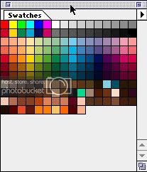
This is my skintone color pallette... (or what is left of it after that one night a month and a half ago.... but that is a whole other story..)

I create a new layer over the line art and set the layer filter to multiply. I start out with my darkest color, I consider it the shadow color. It is also my base color.
The fundamentals of coloring... all coloring goes in this order: Shadow - Dark Midtones - Medium Midtones - Bright Midtones - Highlights - Super Highlights. It also helps to read about color theory and light direction. The easiest light is single direct lighting. I continually observe skin tones too as a part of independant research.
Step 2

What I did here was add the values, using a combination of browns, peach colors, and even reddish - orange, using that color to round out the face. The orange is used on the sides of his cheeks. I use the medium and brighter midtones to define the finer features of the face. Areas like around the eyes, the nose, lips, and the cheeks. He is still a young boy so I give him more of a boy-ish look.
Step 3

Here I start adding in the highlights to round out the cheeks, using a peach-ish color. I then took the Blur tool with a large 45 point hard brush, set the blur opacity to 10 percent, and blended the face colors. For the red tribal mark over his nose, I created another layer, and set it to overlay. Then I took a fairly deep red, and filled in the mark.
Step 4 (Final)

Then going back to the face layer, I finish by adding the almost white highlights.
I have done this all with just the paintbrush tool and a few of the default hard round brushes. The opacity that I used ranged from about 35% - 15%. I colored in the shadow color at a full 100% opacity.
I am only posting this as a guideline. This is the rough skeleton that I go by when I experiment with my coloring. All the colors change from time to time. I hope this helps you guys.
The LineArt
When I usually pick a piece of line art, I look for cleanliness. Are the lines grey or are they fairly black? If the scan has a dirty look, then there are a few ways to clean it up. The easiest is to fire up Photoshop, set the picture's mode to grey scale and Auto Balance, or open up the Brightness / Contrast option and work the sliders till the lines seem black and the white is real white, without losing much of the line art detail.
The Picture

For this one, I had to change the pictures mode to greyscale, and go into Bright / Contrast, setting it to +21%. Then I switched the mode back to RGB. Yes, the picture is small and simple, but I do not want to eat up a lot of bandwidth on photobucket. I then saved the picture.
Step 1

This is my skintone color pallette... (or what is left of it after that one night a month and a half ago.... but that is a whole other story..)

I create a new layer over the line art and set the layer filter to multiply. I start out with my darkest color, I consider it the shadow color. It is also my base color.
The fundamentals of coloring... all coloring goes in this order: Shadow - Dark Midtones - Medium Midtones - Bright Midtones - Highlights - Super Highlights. It also helps to read about color theory and light direction. The easiest light is single direct lighting. I continually observe skin tones too as a part of independant research.
Step 2

What I did here was add the values, using a combination of browns, peach colors, and even reddish - orange, using that color to round out the face. The orange is used on the sides of his cheeks. I use the medium and brighter midtones to define the finer features of the face. Areas like around the eyes, the nose, lips, and the cheeks. He is still a young boy so I give him more of a boy-ish look.
Step 3

Here I start adding in the highlights to round out the cheeks, using a peach-ish color. I then took the Blur tool with a large 45 point hard brush, set the blur opacity to 10 percent, and blended the face colors. For the red tribal mark over his nose, I created another layer, and set it to overlay. Then I took a fairly deep red, and filled in the mark.
Step 4 (Final)

Then going back to the face layer, I finish by adding the almost white highlights.
I have done this all with just the paintbrush tool and a few of the default hard round brushes. The opacity that I used ranged from about 35% - 15%. I colored in the shadow color at a full 100% opacity.
I am only posting this as a guideline. This is the rough skeleton that I go by when I experiment with my coloring. All the colors change from time to time. I hope this helps you guys.


