What's new
Photoshop Gurus Forum

Welcome to Photoshop Gurus forum. Register a free account today to become a member! It's completely free. Once signed in, you'll enjoy an ad-free experience and be able to participate on this site by adding your own topics and posts, as well as connect with other members through your own private inbox!

WIP - Please help - Pagani Huyra


js2004

Member
Messages
11
Likes
7
I'm redesigning the Pagani Huyra but I need some help/ ideas.
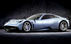
This is the BEFORE:
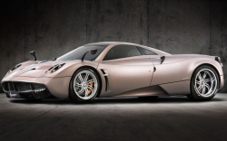

1601137599054.png


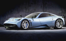
This is the AFTER:

1601137703123.png


what i've done mainly is moved the greenhouse backwrds to make this into a front-engined car. I've also done some other alterations (see if you can spot them).
This is still work in progress and i need your opinion on whether it is good so far.

Please comment.

Thank you.
 
Hi js2004
Nice changes. The color changes worked well.
Very tough to work on especially smooth flowing lines and gradients.
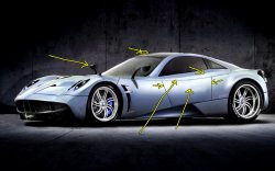
Here are the areas that visually popped up for me to consider in additional work with arrows in image below pointing to areas mentioned below.
Note the low resolution of the posted image makes it hard to look for real subtle areas.
- There is a small white horizontal dash near the top of the car
- The left door panel was not as smooth as the original giving impression of it being dinged. Along with this the lines right below the drivers window have a bit of a wobble. Thought subtle the eye is good at line detection.
- No door handle and also no consistent panel separations that would show how a door would open up on this side of the car. Such high end cars often have a unique door opening system so the curious mind would wonder how do you get in this car
- The mirror on the right side of the car seems set back a bit far compared to the original image. This did not stand out to much for me without comparing them side by side.
- Lastly, the shadow of the left side car mirror was not there in the first image yet as a standalone, does not look out of place with the rest of the image so I think it would be fine. The shadow is pretty sharp and all other shadows are a bit softer. I think any changes of this shadow is optional

You can sell me this car dings and all btw :)

Hope this feedback is useful
John Wheeler

adjusted-car.jpg
 
Hi js2004
Nice changes. The color changes worked well.
Very tough to work on especially smooth flowing lines and gradients.
Here are the areas that visually popped up for me to consider in additional work with arrows in image below pointing to areas mentioned below.
Note the low resolution of the posted image makes it hard to look for real subtle areas.
- There is a small white horizontal dash near the top of the car
- The left door panel was not as smooth as the original giving impression of it being dinged. Along with this the lines right below the drivers window have a bit of a wobble. Thought subtle the eye is good at line detection.
- No door handle and also no consistent panel separations that would show how a door would open up on this side of the car. Such high end cars often have a unique door opening system so the curious mind would wonder how do you get in this car
- The mirror on the right side of the car seems set back a bit far compared to the original image. This did not stand out to much for me without comparing them side by side.
- Lastly, the shadow of the left side car mirror was not there in the first image yet as a standalone, does not look out of place with the rest of the image so I think it would be fine. The shadow is pretty sharp and all other shadows are a bit softer. I think any changes of this shadow is optional

You can sell me this car dings and all btw :)

Hope this feedback is useful
John Wheeler

View attachment 115623
Thanks for the tips.
 
I added the changes that were recommended by @thebestcpu
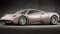
Here is the BEFORE:

1601220521705.png


And here is the AFTER:

1601220464165.png


(sorry about the low res)

What ive done here is i've moved the greenhouse (thats the windows and the roof) back to turn this into a front-engined car. I also moved some cut lines/shadows.

Thank you.
 

Back
Top