What's new
Photoshop Gurus Forum

Welcome to Photoshop Gurus forum. Register a free account today to become a member! It's completely free. Once signed in, you'll enjoy an ad-free experience and be able to participate on this site by adding your own topics and posts, as well as connect with other members through your own private inbox!

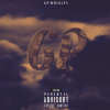
What y'all think about my CD cover art?


Hey Luuk, nice work. I think the cover art should reflect the style of music. I'm just not getting rap from this art. (I assume it's rap with the advisory)

I think the overall color is subdued and there's no contrast. When I think of rap I think of red or other bright and aggressive colors.

The text combined with the clipping mask effect is not a good combination. Images clipped in text is a dated effect and is just not seen much anymore. The text is a bit ambiguous, the G looks like a 6.
 
Everything Sam said, plus, if you're going to keep the money-within-the-letters motif, you should let the color of the money show through.

Agent
 
Personally i do not see what money has to do with the cover, the cover shows explicit content, and appears to be advertising yourself, my be i'm getting this the wrong way, but don't understand what the CD cover is for or what the money in the text is meant to represent.
 

Back
Top