What's new
Photoshop Gurus Forum

Welcome to Photoshop Gurus forum. Register a free account today to become a member! It's completely free. Once signed in, you'll enjoy an ad-free experience and be able to participate on this site by adding your own topics and posts, as well as connect with other members through your own private inbox!

Want to even out skin tone


SPWA

Power User
Messages
450
Likes
301
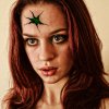
I'm out of my comfort zone when it comes to manipulations, but I'm busy experimenting to try & improve. I added an open skin flap to the forehead on this image, but the skin tone is very uneven after adding some effects. What would be the best way.

I have tried masking the face & blurring, and I also tried smoothing it out using the blur tool. I also considered brushing over it, but can't get that right.

before.pngafter.png
 
The effects you added have increased the local contrast everywhere in the image, including the skin. I presume this was intentional. However, it sounds like you do want some of the aspects of these effects, but (a) you want them only in certain areas (of your choosing), and (b) you probably don't want accentuation of the smallest details (eg, skin texture), only the larger scale ones.

If my interpretation of your post is correct (... and, I'm worried that it might not be, and you are really looking for completely different efx), then:

Issue (a) is best handled by appropriate masking.

Issue (b) is best handled by selecting more controllable appropriate effects (eg, for the grunge effect try Topaz Details not NIK Detail Extractor) , or more careful adjustment of the specific efx that you did use.

Trying to fix the problem after the fact can be difficult. About the best I could do without the skin becoming artificially smooth was a light application of Topaz Denoise (see below).

HTH,

T

after-tjm01_acr-ps01a_NR_topaz_details-00_orig.jpg

after-tjm01_acr-ps01a_NR_topaz_details-01.jpg
 
Thx Tom, I like it. The 2nd image you posted certainly looks a lot like what I would be after. My goal was to give the image a post apocalyptic feel to it, as the original is too soft & fluffy for me. Although I do like the overall look I got, the skin became a bit too blotchy. I wasn't sure how to fix that without losing the overall effect. I don't have Topaz, so is there a native tool I could run on a masked area of the skin that would give similar results to yours.
 
A couple of applications of large radius unsharp masking (1st with r ~ 100, the 2nd with r~15 px) will get you something like this, but you'll almost certainly want to tweak it with opacity and blendIF sliders ... maybe do another layer with even smaller radius if you want even more skin texture.

T
 

Attachments

  • before-tjm01_acr-ps11a-lg_R_usm-01.jpg
    before-tjm01_acr-ps11a-lg_R_usm-01.jpg
    286.1 KB · Views: 41
Final Image. Like I said, it wasn't for anything but fun & experience, and I picked up a couple of tips along the way. I'm still in single figures on the amount of manips I've actually done so.. early days.

Apocolyptic.png
 
I like to use smart objects to reduce effects of blur and sharpening, or any filters for that matter. With a smart object (smart filter), you are given a mask to use as you like, though the one mask is for all filters added. I find these very handy. You can rasterizwe the object then make it a sm. obj. again and add another filter. Just an idea. A light-handed use of the smudge tool might also be employed.

Beyond that, you've gotten plenty of advice above.

BTW, I like the image! And of course faestock offers a multitude of stocks.
 
Just as illustration of the above. For this, I used a smart object with a guassian blur of 1, based on copying your image. Then I used the mask to 100% erase the blur from the eyes (less so the eyelashes and brows, 40 or 50% I think), and a small amount around the noes and outside lips, about 50% or more on the lips themselves. I painted the blur at 30-50% from the hair, mainly the highlights and the roots. Then horror of horrors, I mad another layer and painted with a soft brush at .5-10%, picking colors from the face and blending them. In this instance, I left the blend mode at normal and opacity set to 90%. I tried other modes and some were interesting. Anyway . . . my interpretation:

SPWA.jpg
 
Last edited:
Cjay, I like what you did on the first. I mean they're both good; I just think SPWA isn't looking for the smooth version . . . But I like how you brought out the circuits inside and a great BG addition. And the eye! Probably the whole image needs curves or levels adjustments. I only focused on the skin. Nice going Cjay.
 
Thanks ibclare. Unfortunately I was working fast so its not perfect(note the right side of the mouth in cleaned up skin version),but it is a project that could have a great end result with a bit more time. I agree it needs a curve adj .
 
Thx for the input. I will improve over time, although this is my favourite so far that I've done. It's a case of experimenting & trying all the techniques & tweaks.
 
I won't say much about this, but I think Cjay missed the mark altogether. Changing the wound and the eyes was not what SPWA was asking about in his originally posted question/querry.

Sorry Cjay, you did a fine job, just not what was needed. Looking forward to seeing your work in your own threads.
 

Back
Top