Photoshop Gurus Forum
Welcome to Photoshop Gurus forum. Register a free account today to become a member! It's completely free. Once signed in, you'll enjoy an ad-free experience and be able to participate on this site by adding your own topics and posts, as well as connect with other members through your own private inbox!
You are using an out of date browser. It may not display this or other websites correctly.
You should upgrade or use an alternative browser.
You should upgrade or use an alternative browser.
wallpapers and whatnot
- Thread starter Zeealex
- Start date
-
- Tags
- wallpapers whatnot
Burned Ice
Power User
- Messages
- 476
- Likes
- 80
no 1 is defenitely your best 
Vafann
Guru
- Messages
- 1,362
- Likes
- 378
Hello Zeealex! I´m a bit confused about where this thread has gone..um, I really like your first picture the best, the second one is very good but the green and the red clash a bit I think, I think it would be better if you tried to blend the colors a bit. the All red one, looks kind of like it´s been fimed from behind a fire or something, very cool, but maybe you should make it just a little bit more orange for the fire effect. The solder with the halg geen face looks a bit off color too and it looks kind of choppy around the gun.
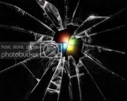
The last one with the broken glass is REALLY cool, and I would love to know how you did that!
The last one with the broken glass is REALLY cool, and I would love to know how you did that!
hey Vafann sorry iu didnt get back earlier still getting to know how this place worksHello Zeealex! I´m a bit confused about where this thread has gone..um, I really like your first picture the best, the second one is very good but the green and the red clash a bit I think, I think it would be better if you tried to blend the colors a bit. the All red one, looks kind of like it´s been fimed from behind a fire or something, very cool, but maybe you should make it just a little bit more orange for the fire effect. The solder with the halg geen face looks a bit off color too and it looks kind of choppy around the gun.
The last one with the broken glass is REALLY cool, and I would love to know how you did that!
for the broken glass one, sadly the glass bit is a brush but to put it into context put the broken glass brush onto a new layer above the windows 7 loading screen, make it white. then copy the starting windows bit onto an new layer and warp the copied one so it is warped to match the glass cracks, and that should be what you get, i'll try to get a visual tutorial made sometime in the future.
hey rambo, i will try to make you one for sureZomg omg omgomgomg...!!
Someone make me a signature ?
Text:Rambo
i'll get the link for you now, and yes, it's free, i see no reason in paying for something like thisOk Zeealex, where did you find the brush? is it free?
http://photoshopbrushes.eu/misc/broken-glass/
Last edited:
Vafann
Guru
- Messages
- 1,362
- Likes
- 378
i'll get the link for you now, and yes, it's free, i see no reason in paying for something like this
Broken Glass | Free Photoshop Brushes
Thank you Zeealex! I have downloaded the set, I can´t wait to put them to use in something!


