Photoshop Gurus Forum
Welcome to Photoshop Gurus forum. Register a free account today to become a member! It's completely free. Once signed in, you'll enjoy an ad-free experience and be able to participate on this site by adding your own topics and posts, as well as connect with other members through your own private inbox!
You are using an out of date browser. It may not display this or other websites correctly.
You should upgrade or use an alternative browser.
You should upgrade or use an alternative browser.
UneXplained
- Thread starter DBV
- Start date
-
- Tags
- unexplained
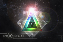
Very cool. When you get enough posts to give us a link, do that OK? I wouldn't add anything. It's well balanced and anymore would just be gilding the lily.As for the text, maybe it is just too large. Competes with the image.
Since you asked :mrgreen:
Haha.. good point actually. It should be smaller!
And I will link to my new works on DeviantArt account if that's allowed. I need one more post so I will be able to post links..
sprucemagoo1
Guru
- Messages
- 2,006
- Likes
- 1,187
It looks great, though I think I would have kept the text colour a bit more of a solid colour, and maybe a bit brighter. Excellent work!
"EDIT"
After playing around with it in Photoshop, I take back what I said about the text, it just needs more contrast. I hope you don't mind me showing you what I mean!
View attachment 10320
"EDIT"
After playing around with it in Photoshop, I take back what I said about the text, it just needs more contrast. I hope you don't mind me showing you what I mean!
View attachment 10320
Last edited:
$1r_M4x1mu$
Guru
- Messages
- 1,501
- Likes
- 296
Nice, What is the topic of the tutorial about ?, I don't really understand what you want to tell in this graphic art (tell me please, curious  )
)
IMO (if I may) the effects are great and looks like using complex technique, very nice, although the middle lights are too much, and about the text, yes it is bugging me because it's too big, I would be comfortable to resize it to around 35 or 50% ish to be putted on the left (or right) bottom of the picture and not touching the triangles / main object.
IMO (if I may) the effects are great and looks like using complex technique, very nice, although the middle lights are too much, and about the text, yes it is bugging me because it's too big, I would be comfortable to resize it to around 35 or 50% ish to be putted on the left (or right) bottom of the picture and not touching the triangles / main object.
sprucemagoo1
Guru
- Messages
- 2,006
- Likes
- 1,187
Just to let you know, this is the graphic design showroom, where people can show their work off, get critique and praise for well achieved effects and what not.
It looks great, though I think I would have kept the text colour a bit more of a solid colour, and maybe a bit brighter. Excellent work!
"EDIT"
After playing around with it in Photoshop, I take back what I said about the text, it just needs more contrast. I hope you don't mind me showing you what I mean!
Yup, definitely looks better! You and M4x1mu$ are right! I will change up the text too.
Nice, What is the topic of the tutorial about ?, I don't really understand what you want to tell in this graphic art (tell me please, curious)
IMO (if I may) the effects are great and looks like using complex technique, very nice, although the middle lights are too much, and about the text, yes it is bugging me because it's too big, I would be comfortable to resize it to around 35 or 50% ish to be putted on the left (or right) bottom of the picture and not touching the triangles / main object.
I've no idea what is this about lol
The original tutorial teaches how to make an aged poster. It's here:
Create a Colorful Aged Poster With Special Lighting Effects | Tutorial9
I'm just doing tutorials to see different techniques, make a lot of graphic work and then slowly come up with my own style.
ibclare
Queen Bee
- Messages
- 11,033
- Likes
- 4,638
Yes, this is good. Didn't think you could make it much "better," but the lighter BG with more of the smudgy cosmic effects is good. I can't really tell if it's sharpened a lot but I can see the lens flare more so it must be my eyes (which ain't what they used to be). I wasn't sure about the text but it doesn't obscure the design of the image now. That can be a useful effect but I don't think so in this case. The only suggestion would be to maybe increase the strength/contrast of the letters, or maybe just the X. Maybe use a gradient or brush with a clipping mask to increase the glow at the top but not change the rest too much. That's if you want to keep playing with it. At some point, it's just time to say, "good, it's done." IMHO it's good!

 Was following a tutorial and after finishing it I decided to play with it and add texture and text... Please critique and suggest what you would add. I'm having trouble with typography mostly in my opinion!
