Photoshop Gurus Forum
Welcome to Photoshop Gurus forum. Register a free account today to become a member! It's completely free. Once signed in, you'll enjoy an ad-free experience and be able to participate on this site by adding your own topics and posts, as well as connect with other members through your own private inbox!
You are using an out of date browser. It may not display this or other websites correctly.
You should upgrade or use an alternative browser.
You should upgrade or use an alternative browser.
$1r_M4x1mu$
Guru
- Messages
- 1,501
- Likes
- 296
ibclare
Queen Bee
- Messages
- 11,033
- Likes
- 4,638
Then you achieved it. I like it. And I stand corrected on the too subtle as I look at it again (several times in fact, it is quite lovely).
BTW, are you Irish? I mean an Irish immigrant to Raxacoricofallapatorius. And is there a way to pronounce Siodre and what would that be? If you don't mind sharing that is.
:mrgreen:
BTW, are you Irish? I mean an Irish immigrant to Raxacoricofallapatorius. And is there a way to pronounce Siodre and what would that be? If you don't mind sharing that is.
:mrgreen:
Last edited:
siodre
Well-Known Member
- Messages
- 147
- Likes
- 38
irish immigrant unfortunately born in america... shay-drah, although now that i think about it that exact pronunciation may have been jumbled by the circumstances in which it's uttered (siodre means cider in gaelic, not the apple sort either).BTW, are you Irish? I mean an Irish immigrant to Raxacoricofallapatorius. And is there a way to pronounce Siodre and what would that be? If you don't mind sharing that is.
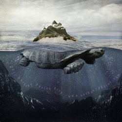
probably due to the lack of good directions/maps. it's almost as if the island keeps moving.I'm going to Malaysia, but am having a difficult time getting to Turtle Island without an expensive tour operator.
ibclare
Queen Bee
- Messages
- 11,033
- Likes
- 4,638
siodre;104269 probably due to the lack of good directions/maps. it's almost as if the island keeps moving.[/QUOTE said:And now we know why!
Cindy Grundsten
Power User
- Messages
- 276
- Likes
- 138
This is very beautiful done! I like the idea very much!
ibclare
Queen Bee
- Messages
- 11,033
- Likes
- 4,638
I like this ! Like the concept and the way you present it. Very well done.
The only issue I've got is the text being a bit disturbing and hard to read.
You could very well place it in a straight line along image bottom. Won't harm the image ...
I think O know why you made it this way Siodre, but now that I think of it, I did ignore since it does detract a bit. You probaly just wanted it to be subtle, which it is until your attention leaves the illusion and takes in the rest of the image. So, the decision is, do you take Jgraph's advice which is goo - you could even position small text left, right, or centered - leave it off altogether, or tell us all to go to . . . (figuratively of course, LOL).

