What's new
Photoshop Gurus Forum

Welcome to Photoshop Gurus forum. Register a free account today to become a member! It's completely free. Once signed in, you'll enjoy an ad-free experience and be able to participate on this site by adding your own topics and posts, as well as connect with other members through your own private inbox!

Tricky image fix


leocuellar

New Member
Messages
4
Likes
0
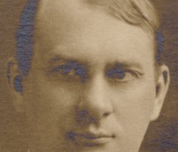
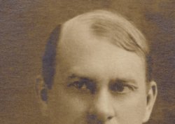
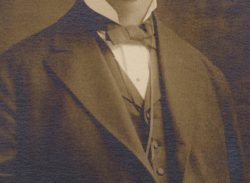
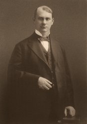
Hello, I have this image, someone took a photo of an old poster, but seems like a source of light was hitting the poster at an angle and it created an awful reflection in some parts of the image. I need to fix it but I've tried everything in my arsenal with no luck, looking for ideas on how to remove the glare/light reflection from it. Thanks in advance.
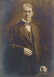
Rutherford thumb.jpgRutherford closeup.jpg
 
I dont know any technique to fix that automatically or in a fast way. For what I see looks more like a problem of texture, so what I would do is first remove all cyan and blue from the picture and then take the textures from the rest of the picture and add them to the problematic zones. Then adjust exposition (light)

made a fast example

1f.jpg
 
Hi @leocuellar
Not an easy image to work on. It appears to be silvering causing the issue yet that does not matter as I assume you don't have access to the original.
The information in the silvered areas is gone so basically needs to be replaced or disguised.
Here is an animation showing before and after of a portion of the image with the following technique.
- I used masking to isolate the silvered areas (I used an adjusted saturation mask as the silvered areas had low saturation)
- I did a slight Gaussian blur to reduce the texture to try and match the rest of the image
- Added a blank Layer set to Color blend and painted over the a similar color that was in the rest of the image.

Note that doing details around the face is a bit more delicate and would take a bit more time to get right by hand.
Just some quick ideas on appraoch
John Wheeler

Rutherford-thumb-adj.gif
 
1. I copied the blue channel into the green channel. That takes away most the blueish parts in the image.
2. The result is that the colors look wrong, but the modulation looks more natural.
3. Desaturated the colors completely.
4. Duplicated the image layer. I have now 1 layer to work for the background and 1 layer to work for the person.
5. Made a selection of the background and used it for a layer mask. The same applies for the person layer. I inverted the selection to use as a layer mask.
6. The Background was no good to do any retouching, so I made it new to look clean and natural . Just guesswork.
7. The retouching of the person layer was patient work. Can't really describe my workflow.
8. I added a little gaussian blur, then added a little bit of grain again. That smoothed out the look of the image.
9. With a curve adjustment layer I changed the black and white colors to a similar color like the original tones of the image.

Rutherford thumb chrisdesign.jpg
 
Thanks all for your suggestions, they all look very good, I will keep looking for more suggestions/ideas and I think I might use a combination of the techniques and ideas you have shared.
 

Back
Top