What's new
Photoshop Gurus Forum

Welcome to Photoshop Gurus forum. Register a free account today to become a member! It's completely free. Once signed in, you'll enjoy an ad-free experience and be able to participate on this site by adding your own topics and posts, as well as connect with other members through your own private inbox!

Tips for making this merge feel realistic?


UnhappyGrape

New Member
Messages
2
Likes
1
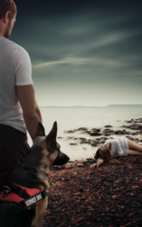
Hey all, newbie here. I'm making a book cover for my mother, and so I want it to look as good as I can get it. With the images I'm merging together into one picture I'm really struggling to make them all work together. It just looks extremely... Photoshoped haha. Does anyone have tips on why it looks this bad? What can I do?
Thanks so much.
CoverFinal.png
[Full Size]
 
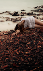
It looks to me that there is a a depth of field difference between the BG and the man with the dog.

The BG has one focal point that blurs as it draws closer to the viewer.
Screen Shot 2018-07-31 at 5.55.47 PM.png

This is in direct conflict with the sharpness of the man and the dog. For this composite to look "real" or not Photoshopped, the man and the dog would have to be as out of focus as the foreground is in the background image. Since this is not an option, try to select and sharpen the rocks on the beach including her arm and hand, that should help. I would copy the selection to it's own layer, convert it to a smart object, and add a smart filter........probably an unsharp mask.
 
Thank you for the advice Sam! I knew something was off, but I didn't realize it was the focus making it so wonky.

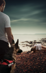
Doing as you suggested, it looks a lot better already. I think I managed to get away with blurring the characters in the foreground and the rocks in the background a bit as well. Let me know what you think, thanks again for your expertise!

CoverFinal.png
[Full size]
 

Back
Top