What's new
Photoshop Gurus Forum

Welcome to Photoshop Gurus forum. Register a free account today to become a member! It's completely free. Once signed in, you'll enjoy an ad-free experience and be able to participate on this site by adding your own topics and posts, as well as connect with other members through your own private inbox!

The Super Thrive Dilemma


E

elmo033057

Guest
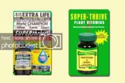
I got this assignment while I was working on my masters degree at Boise State. We were supposed to take an awful label and reconfigure it for a better and clearer message. Here is the image below. Does anyone have a better idea for this label? Please post your picture below. :mrgreen:

By the way, this is an actual package for "Superthrive" that was advertised for years.


superthrive.jpg
God Bless!

ELMO
 
When you say reconfigure do you mean you have to keep the same text that is already there and just move/format it, or can you completely delete/change some of it?

Not everything that sells is aesthetically pleasing. I believe that product was (or still is) actually quite successful. The ad may be ugly, but it might produce results. It's interesting to look at conversion rates when split-testing different ads online, sometimes the really awful looking ads convert the best.

Anyway as for suggestions, I would try to create a plant (or several) that looks like it's growing very fast. Maybe a sunflower or something similar. It's interesting that this is a product to boost plant growth but the pictures of plants are so tiny they are almost impossible to see.
 
We had to make a new package for this product. Here are my results. The Idea of the assignment was that you needed to simplify the message being sent. The idea being that if you have a cluttered message people get confused.

Yeah, there are pictures of plants on there. If you look at the tiny pictures of the farms in the lower left hand corner, there are plants on there somewhere. LOL!

Here is my solution sidebyside.jpg
 
Last edited by a moderator:

Back
Top