What's new
Photoshop Gurus Forum

Welcome to Photoshop Gurus forum. Register a free account today to become a member! It's completely free. Once signed in, you'll enjoy an ad-free experience and be able to participate on this site by adding your own topics and posts, as well as connect with other members through your own private inbox!

Text in a complex shape - hole in the middle


Maffu

Member
Messages
11
Likes
2
Hi all.
I'm no newbie to Photoshop but today I came across something that annoyed me as it should be easy, but I just can't seem to make it work.
Ok, so let's say I have a load of text - lorem ipsum x 200 words - and I want to put that text in a shape and have it fill the shape.
Now, I know that I can make a path and click within it with the text tool to fill that path. However, I want to fill a shape that has a complex hole in the middle of it, which I want the text to flow around and past.
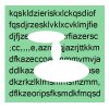
For example, let's say that I need to fill the area marked in green in the image below with text, leaving the white areas (there is also a white border) clear.
I have made a path but when I use the type tool it just fills in the rectangle and ignores the central area.
Any ideas?
pathText.jpg
 

Yes, but obviously where the text on the left of the image meets the shape it should carry on on the right of the shape rather than be obscured by it.

It's called text wrapping....
Take a look here: https://www.google.com/#q=Photoshop+text+wrapping
Thanks IAmSam - I am aware of text wrapping. However, if you loko at those examples on the google page you will see that it is simply text made to conform to an irregular left or right margin, which is not what I am after.
 
Actually, I did find a post in there that points to why what I want won't work - so thank you for your replies guy.
I'll have to have a rethink.
 
For the benefit of anyone who comes looking for a similar answer here's what I came up with...
You can use the text wrapping fill technique but you can't have an isolated central hole and still have the text flow around it as it treats the centre piece as a separate thing and ignores it - the paths have to cross.
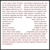
My solution was to take the rectangle tool, set it to Make Paths and Subtract From Path Area and just made a tiny (a couple of pixels across) shape that intersected the two existing paths. (the black line in the pic below)
After that it worked perfectly. Because the intersecting path was only a few pixels wide you can't see it in the block of text.
pathText2.jpg
 
Last edited:
Ahhhhhhhhh......

You beat me to the punch! I had just came up with a similar solution!
I was trying to get the text to fit better on the left side!

Glad you figured it out!

Screen Shot 2014-04-21 at 10.42.02 AM.png
 
You may have troubles getting it to form to the shape tightly, I tried all paragraph styles, with and without hyphenation.

Screen Shot 2014-04-21 at 10.54.42 AM.png
 
Also, place your intersecting path to the side and your text will not hyphenate.

Screen Shot 2014-04-21 at 11.04.37 AM.png

Screen Shot 2014-04-21 at 11.05.33 AM.png
 
SCTRWD - It seems you had the same question many years ago and solved the problem the same way we did. Great minds think alike! :thumbsup:
 
Well, yeah!

It's just that my solution included making a cutout in the path and then manually shifting the anchor points of one side of the cut to slightly overlap the other side.

This way PS seems to work OK. Without the problems of fitting the shape, paragraph styles, hyphenation, etc....

 
I took a look at your psd. I can't see that you did anything different with your paths. I must be missing something. I'm not following you on the manual shifting of the anchor points.

This is your path..
Screen Shot 2014-04-22 at 9.36.47 AM.png

Although I don't know what this is, it doesn't seem to do anything.

Screen Shot 2014-04-22 at 9.55.54 AM.png
 
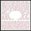
Here is the point I'm trying to make. This is the shape with cutout:

S1.png

You can clearly see the gaps in the text around the cutout region.

Now just grab Direct Selection Tool for Paths. Select two anchor points on the right side of the cut like shown on the image above and move them to the left(with Shift key pressed) so that they overlap the left side of the cut region:

S2.png

As you can see the text now flows perfectly well without any gaps or other artifacts:)
 
Last edited:

Back
Top