What's new
Photoshop Gurus Forum

Welcome to Photoshop Gurus forum. Register a free account today to become a member! It's completely free. Once signed in, you'll enjoy an ad-free experience and be able to participate on this site by adding your own topics and posts, as well as connect with other members through your own private inbox!

Text help needed


StatChris

Member
Messages
16
Likes
1
The online printer I use requires text to be converted to outlines. This is very easily accomplished by using "Convert to Shape" on the Type menu. For the piece I have created this time, I needed to use Faux Bold style and Superscript for the font because only the regular style is available for the fonts I have used. Apparently this is the first time I have used a faux style for a file to be sent to the printer, as I now find that they can't be converted this way! Working around the superscript will be quite simple, but the faux bold less so. Could I please get your suggestions as to the simplest/easiest way to accomplish this. Please keep in mind that I am "vector-challenged" - I have really never worked with vector paths because every time I have tried in the past I have quickly become confused/frustrated! I am using CS6 v13.0 in case it makes a difference.

Thanks, Chris.
 
I was asking because depending on the resolution of what you are printing, outlines can be raster or vector. Just saying "outline" may mean vector yet not necessarily. There are more options if raster for outline is allowed yet not worth going down that path if printer truly needs vector. (Vector does give the crispest edges). Vector options may mean fewer forum members will tackle your problem so worth making sure.
 
You're way over my head at this point! I was under the impression that "converting to outlines" was by definition converting to vector. Instructions provided by the printer are to use "Convert to Shape" mention in my original post - does that create vector or raster outlines?
 
Hi StatChris
I never had come across your problem before yet understand the issue. I thought there might be a quick solution online yet that did not pop up directly. So just tried an approach yet this works only if the pixel resolution is reasonable high for the text (there is also a workaround for that too I will mention below if the resolution is low)

1) Convert the text to faux bold and isolate from other Layers (no raster and not backgroun). You should now how your filled faux bold text surrounded by transparency
2) Select the transparent area with the magic wand
3) Invert the selection (to select just the text) using Shift+Cmd+I (Shift+Cntl+I for PCs)
4) Go to to the Path Panel and in the upper right corner drop down and select Make Work Path (don't use the shortcut icon at bottom of panel)
5) In the options box you can select "Tolerance". You can set this as low as 0.5 pixels. The higher the Tolerance the path will be simpler yet more rounded corners (unless more tedious editing)
6) Create new blank layer and turn off the prior faux path layer (you should see the Work Path with surrounding transparency)
7) Use Layer < New Fill Layer>Solid Colr (you have options for Layer name and it open Color Picker panel for you to select your color). When completed you will now have a shape layer of your faux bold font - TaDa

Now, if your resolution is not high enough you could pull the text out to a separate document, increase resolution, follow process above, then use Place embedded, and scale back down the shape to the resolution of your original image.

Hope that works for you. Worked for me to bypass the faux bold issue.
John Wheeler
 
Thanks John!

Sounds like a set of instructions I should be able to follow! I'll give it a try and let you know how I make out.
 
What we are doing is creating a selection (which is raster based) around the text, converting that selection to a path, and then filling the path to turn it into a shape Layer. That's the quick summary of what is going on. So effectively we go from vector to raster and back to vector. FYI
John Wheeler
 
Yes, I see that, thanks.

The piece I am working on has six different layers of text that use Faux Bold. Could I combine these into one layer before doing this, or is it necessary to do each layer individually?
 
Yes, if you just have the text Layers visible "and" only one of the text Layers selected, and the magic wand tool set to sample all layers, and oh by the way I forgot in the other instructions the Magic Wand should have the "Contiguous" box unchecked. It should work.
 
BTW - when you use the Magic wand tool, whether you have the "Anti-alias" box should also be checked when Tolerance values below 2 are used. Other wise you will not have smooth vectors.
 
I have tried this with various tolerance settings for the magic wand and creation of the work path but the resulting shape layer created is a) not smooth and b) loses some weight. Do you have any suggestions on where and how I should make adjustments to end up with a perfectly smooth outline that is the same weight as the original text layers?
 
Hi Stat Chris - I believe you are in the situation where the resolution is to low relative to the anti-aliasing associated with the selection. There may be other approaches that are different than the one I mentioned yet for the above mentioned approach. When I tried text of 8 pt font on a 8.5 x 11 inch 300 dpi canvas and used the above technique, I did get get rough edges and then became smooth when I scaled up 10x, selected, made shape, and scaled down. However that did not solve the weight issue.
So here is a modiification that I believe will solve smoothness and weight.

Start with non-faux-bold font, scale that text up by 10x (or more if you wish).
Apply a Layer style with a stroke of the same color as the text was set to your desired weight
Now do the selection, convert to path, then fill to create a shape, and then scale the shape down to 1/10th size.

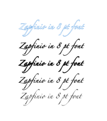
The example below shows Zapfino 8 pt on bottom
Next higher is same text with faux bold
Third up is faux bold with 1px stroke (still pretty rough)
Fourth up is using the technique a using the modified approach above (smooth and bold (relatively) and is also a shape
Top is the vector path associated with the shape so you can examine its characteristics.
So an alternate way to make bold instead of faux bold.

So this modified approach worked for me and hope you can make it work for you
John Wheeler
PS - below is screen shot so I could show the path.

Screen Shot 2019-05-21 at 4.30.45 PM.png
 
Hi Stat Chris - I believe you are in the situation where the resolution is to low relative to the anti-aliasing associated with the selection. There may be other approaches that are different than the one I mentioned yet for the above mentioned approach. When I tried text of 8 pt font on a 8.5 x 11 inch 300 dpi canvas and used the above technique, I did get get rough edges and then became smooth when I scaled up 10x, selected, made shape, and scaled down. However that did not solve the weight issue.
So here is a modiification that I believe will solve smoothness and weight.

Start with non-faux-bold font, scale that text up by 10x (or more if you wish).
Apply a Layer style with a stroke of the same color as the text was set to your desired weight
Now do the selection, convert to path, then fill to create a shape, and then scale the shape down to 1/10th size.

The example below shows Zapfino 8 pt on bottom
Next higher is same text with faux bold
Third up is faux bold with 1px stroke (still pretty rough)
Fourth up is using the technique a using the modified approach above (smooth and bold (relatively) and is also a shape
Top is the vector path associated with the shape so you can examine its characteristics.
So an alternate way to make bold instead of faux bold.

So this modified approach worked for me and hope you can make it work for you
John Wheeler
PS - below is screen shot so I could show the path.

View attachment 98768

Thanks John, unfortunately I won't be able to give this a try until Thursday. It certainly looks promising, but just as Faux Bold doesn't create usable results with some fonts, I suspect the same will be true with this technique. Of course if this does turn out to create an acceptable "bold" with the fonts I am using, could I not just apply the stroke and then use Convert to Shape?
 
Of course if this does turn out to create an acceptable "bold" with the fonts I am using, could I not just apply the stroke and then use Convert to Shape?

Quite possibly and its worth a try. That is what I did with the text line third from the bottom. A big more ragged on the edges and the amount of adjustment in stroke to fine tune it in is very small (that example use the minimum 1 pixel and 2 pixels looked pretty bad. If that looks great you can go for it yet if not, you can increase size and the stroke can be tuned in from 5 to 15 pixels so much more granularity and a bit more smoothness.
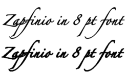
Here is an zoomed in view of the 8pt text with 1 pixel outside stroke on bottom and the top text is the the text scaled up by 10x, added much larger stroke, converted to Shape Layer and then scaled down back to original size. You can see the lower line of text is a bit rougher/pixelalated with some chunks taken out in a few spots. Yet backed up its not too bad.
At least there is a path to either get around the faux-bold font limits or attempt the same with strokes.
More could be done yet it might be editing the text vectors themselves and that is where the work would go up.
Hope some other forum member knows of another easier way.
John Wheeler

Screen Shot 2019-05-21 at 9.24.58 PM.png
 
I removed the Faux Bold, added a stroke and adjusted the tracking and it looks pretty good. I was then able to convert all text layers to shapes without a problem. When I print on my printer it certainly looks comparable to the original file, so I have gone ahead and sent it to our online printer. The file cleared their pre-flight process successfully, so I am very hopeful that the results will be satisfactory. Time will tell!

Thanks again for all your help John, Chris.
 

Back
Top