What's new
Photoshop Gurus Forum

Welcome to Photoshop Gurus forum. Register a free account today to become a member! It's completely free. Once signed in, you'll enjoy an ad-free experience and be able to participate on this site by adding your own topics and posts, as well as connect with other members through your own private inbox!

Sunset picture


Sphax

Member
Messages
12
Likes
0
Hello!

In a few days it is my girlfriend's birthday and I am in the opposite side of the globe. I wanted to send her a printed photo.
And then I would like this photo to be framed to put on a wall of our flat.

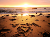
Here is the picture (this is raw: no editing):


I would like the
V + M
<3
to be more clean and visible without alterate too much the sunset's colors, and I have no idea how to do it.


Could you help me please?
Thanks in advance. :)
And sorry for my poor English.

http://img11.hostingpics.net/pics/537392P1000910.jpg
 
I tried to clean the sand with the Duplication stamp (I don't know if it's the actual word in English Photoshop) but the result is not really natural. :confused:
 
Oh yes I see! The result is much better! Thank you.
But what do you mean by "a mask" on the edges? For the edges I use the History Brush and it gives a good blending.
 
you can go to "layer - create layer-mask" and there paint with a brush
white reveals, black conceals
history brush is also ok
 
I got it! Your method is so easy when you know how to!

Merci beaucoup collègue. :)
Imma using your picture because I guess I can't do better, si tu me le permets.
 
Last edited:
I know you don't want to alter the colours too much, but in my opinion it looks way better with a different toning, I tried to edit it a bit, what do you think about this? (:

(resized smaller version)
sunset.png
 
:eek: This is marvellous! Thank you!
I never succeed to find the good tones so I don't try it anymore but if I could do something like that I would!

How do you manage to have these tones? You use the Image/Adjust/Levels or Curves or Exposure? Or you try them all and look what looks the better?
 
Oh actually I haven't done very much at all, I did the "HDR toning" option, and that actually does most of the job for you! :P But to add a little bit more light (hardly visible I think) around the heart and the letters I made a gradient that had a white circle which fades out to a darker gray'ish colour. I then set that gradient layer to overlay, and it should look a bit more bright at that spot :)! Sorry if it's dificult to understand, I'm terrible at explaining these things xD Here's some pictures :P

HDR_toning.png
gradient.png
 
A ok. But I have CS4 and there is no HDR Toning. :( I watched some demonstrations and tutorials and it seems to be a really handy tool!
Anyway, may I ask you a better resolution of the work you did so I can print it if it is tolerated on this forum?
Thank you a lot merlinman!
 
Ahh what a shame, I had no idea that it was a new feature, I'm sorry!
Oh of course, that's really no problem at all, but I think I have to ask Colleague if I'm allowed to his his edited version where he cleaned up some sand?

Well, here's a higher resolution, it should look quite the same as the smaller one I did! (:

Ohh by the way, if it needs to be even higher or you want a different filetype, I need to do the healing as Colleague did, gotta have dinner first though x)!
 

Attachments

  • Higher_resolution.png
    Higher_resolution.png
    3 MB · Views: 1
Last edited:
Oh wow, thanks alot Colleague! (:

Just because I'm bored, I tried to add in a "beam of light" as if the sun is sending out a big ray of light over the text, I don't know if it looks "overkilled" now xD

beam_of_light.png
 
I think it creates too many washed out highlights. I know there wasn't any detail to work with anyway but unless you can tone down the ray so that it shows up but doesn't brighten so wide a swath, it could work. Maybe try using hard light and overlay at different opacities and check the effect. Maybe even try multiply.
 
Yeaah, I think you're right it's being too bright and too much, I tried to mess around with it, but Hard light didn't really look all that good, nor did multiply.. I heard that's an important thing for a good artist to know when to stop adding more to the picture, and I think I've reached that point :P
 
Yes it looks less natural.
But it can be not a problem depending on what you want.

For me it's more like a holiday photo I would like to frame on my wall. So I look for something natural and realistic.
But for an advertisement or a fabulous tale or something like that, it would be good!
 

Back
Top