What's new
Photoshop Gurus Forum

Welcome to Photoshop Gurus forum. Register a free account today to become a member! It's completely free. Once signed in, you'll enjoy an ad-free experience and be able to participate on this site by adding your own topics and posts, as well as connect with other members through your own private inbox!

Suggestions for improvement solicited.


polarwoc

Guru
Messages
1,585
Likes
1,431
I attempted a work on this thread. Spent quite some time on it, but dissatisfied with the result. Has anyone got a suggestion on how I can improve the resulting image so that it looks better?
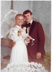
Essentially, the man in this pic:
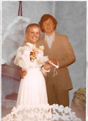
1367-After-IMG_4057.jpg
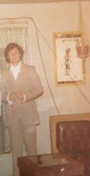
needs to be replaced with the man in this pic:
1367-Other-IMG_4054.jpg
and this is my progress so far:
1367-Before-IMG_4057.jpg
Please suggest.
 
Apologies!
I meant the man in this pic:
1367-Before-IMG_4057.jpg
needs to be replaced with this man:
1367-Other-IMG_4054.jpg
and this is my work so far (I placed the images wrongly earlier on):
1367-After-IMG_4057.jpg
 
This time it isn't so much the resolution that is the issue but the really poor faded quality.
The faded factor prevents any decent sharpening because there are simply not enough pixels to work with.
Without a 'reconstruction' (based on another photo) there is no way to achieve a credible result.
The OP mentions the horrible quality but that's an understatement...

When joining pictures with that amount of difference in quality there are two options:
- make the 'worse' one better to match the 'good' one, which in this case is not possible or
- match the 'good' one to the 'bad' one

Sometimes it is better to inform the OP that it will not be possible.

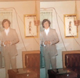
A quick test after using auto color/tone/contrast and nothing more gives this

test.gif
 

Back
Top