What's new
Photoshop Gurus Forum

Welcome to Photoshop Gurus forum. Register a free account today to become a member! It's completely free. Once signed in, you'll enjoy an ad-free experience and be able to participate on this site by adding your own topics and posts, as well as connect with other members through your own private inbox!

Strange Blending Mode


dg_

New Member
Messages
3
Likes
0
20121103_131513.jpg
I'm trying to duplicate a Brochure for the company I work for to make some changes. However, I'm having difficulties with the blending.
Does anyone know how I can have the foreground drawing/text (which is in white) blend into the background just like the image I've attached. Basically have the drawing/text be darker when the parts of the background are darker and vice versa.

Thanks
 
If I understand this correctly, I would overlay the text onto the image (separate layer for text) and then use a layer mask to get the desired effect. Maybe adjust the opacity of the brush you use on the mask, also try different shades of grey and go over the areas that are faded in the text above.

example.jpg

Here's a screen grab of Ps to hopefully show you how I done it.

screengrab.jpg
 
I used a pale blue text set on overlay. And while it didn't give me a perfect result, it was close. Other than that, maybe someone knows a solution but if it is in fact just a blending mode, that's the best I could do. Maybe the blue wasn't the right color . . .
 
Maybe put the two together. I don't have a chance to try it right now, but it could work. Overlay mode and masking to complete the effect. The overlay mode had the most problem on top of the browns. So you could mask out the effect.
 
Remote-Medic:
Thanks for your reply. I wasn't able to duplicate what your instructions.

I've attached an print screen of what I'm working with on PS. The layer labeled "Drawing 1" is the what I'm tying to blend into the background, which is not just a text layer.
 

Attachments

  • Help_PS.jpg
    Help_PS.jpg
    1.1 MB · Views: 5
Hope this helps mate, quick tut on how I masked the text out, will of course need some tweaking but hopefully you get the idea:


Also added the Gradient Overlay as suggested by Clare:thumbsup:
 
I'm not sure exactly what aspects of the blend of the original are the most important for you to reproduce, but see if this is close. If it is, I can spell out the details. Obviously, the opacities can be easily adjusted to taste.

-> First, a random base image, intentionally with a wide range of brightness.
-> Next, some random text
-> Finally, my 1st attempt at a blend like your example.

Tom M

PS - Sorry about the JPG artifacts. They aren't on the original, but seem to have popped up when I uploaded these three images.
 

Attachments

  • D7B_3842nef-acr-ps01b_800px_hi-01jpg-ps01a-01_just_bkgnd.jpg
    D7B_3842nef-acr-ps01b_800px_hi-01jpg-ps01a-01_just_bkgnd.jpg
    210.2 KB · Views: 0
  • D7B_3842nef-acr-ps01b_800px_hi-01jpg-ps01a-02_text_only.jpg
    D7B_3842nef-acr-ps01b_800px_hi-01jpg-ps01a-02_text_only.jpg
    119 KB · Views: 0
  • D7B_3842nef-acr-ps01b_800px_hi-01jpg-ps01a-03_blend01.jpg
    D7B_3842nef-acr-ps01b_800px_hi-01jpg-ps01a-03_blend01.jpg
    255 KB · Views: 0
This is really helpful Remote Medic.
However I still don't think that is how it was done originally. When I look at the previous brochure, it looks to me as if the foreground drawing blends into the background picture seamlessly from light to dark. Bright areas of the background have the foreground drawing remain bright and dark areas have the foreground drawing darker.
I think I can use your method to manually achieve the same result, but I think this was just some automatic blending option.
Here is a higher Res. image of the brochure.
 

Attachments

  • 20121104_080326.jpg
    20121104_080326.jpg
    2.5 MB · Views: 2
I think it's a case of there are many ways to achieve this result, each with very slightly different results. As long as you can figure a way to get as near as you can then that's the best you can do. Hope my vid etc has helped. Will keep an eye on this thread and am happy to help if I can.
 
When I look at the previous brochure, it looks to me as if the foreground drawing blends into the background picture seamlessly from light to dark. Bright areas of the background have the foreground drawing remain bright and dark areas have the foreground drawing darker.

Only that is not 100% true. Look at the white text over the dark brown area. That is contrary to the dark on blue and light on orange. So it seems to be specific to the pinkish orange and the bluish tones, almost like a channels manipulation of some sort.
 
I think I might have an answer for this. Perhaps it is only partial so far, but this is what I did.

It may take figuring out the right color (this is white), blurring the text of course and playing a bit more with blend modes and opacities, but this is what I have so far. It probably isn't too complicated, but the secret is clipping the BG image to the text. Then possibly masking that layer to remove the color from selected words or areas of the photo.

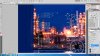
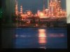
What I have is first the background layer. then the text merged into one layer and the layer at 77%, then the background layer above that, set to hard light, and clipped to the text layer.

textCHANGE.jpg

Here is what the text looks like by itself:

textONLY.jpg

Sigh, I know this isn't the whole story, but you can simulate it. You can use a mask on the clipped BG to brighten up some of the letters. Then you can make a top layer and softly paint some of the same blue at low opacity over the letters on the blue. I wish I had the straightforward answer. Maybe we'll hit on it. But in the meantime, we can help you reproduce the effect.

As for the font, maybe there is one out there with the blurred edges look to it already. There probably is. This next is with brightening some letters and the top layer of blue shading.

textCHANGE.jpg
 
Last edited:

Back
Top