Photoshop Gurus Forum
Welcome to Photoshop Gurus forum. Register a free account today to become a member! It's completely free. Once signed in, you'll enjoy an ad-free experience and be able to participate on this site by adding your own topics and posts, as well as connect with other members through your own private inbox!
You are using an out of date browser. It may not display this or other websites correctly.
You should upgrade or use an alternative browser.
You should upgrade or use an alternative browser.
Some photo restorations, manipulations etc.
- Thread starter Fatboy73
- Start date
ibclare
Queen Bee
- Messages
- 11,033
- Likes
- 4,638
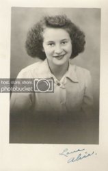
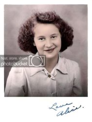
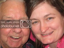
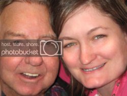
Nice work. My only real critique is on the first one. Too much sharpening creates the grain. I would add some blur to it. Make it a smart object so that you can add back sharpness to the features where you want it, such as the eyes. Apply a filter to a smart object and it is non-destructive with a filter mask. Works quite well.
Fatboy73
Guru
- Messages
- 613
- Likes
- 356
Good advice, thank you. I'll have to play around with what you said as my Photoshop experience is mainly as a comic colorist/digital painter/3D texture artist. I have more of a down and dirty, simplistic approach and I honestly have never dealt with smart objects and a lot of other PS features that an actual photo professional would be familiar with. 
DupreeStudios
Member
- Messages
- 9
- Likes
- 0
very cool.
ibclare
Queen Bee
- Messages
- 11,033
- Likes
- 4,638
Here is a really simple instruction for what I described. Just make a duplicate of your final result. Copy/merge your results to one layer.
Make this layer a smart object by right clicking on the layer and choosing convert to smart object (can also do this through layers>smart objects>convert). Don't worry about understanding smart objects at this time; you only want it to create a filter mask.
Apply a gaussian blur to the image.
Click inside the filter mask (see pic below) and paint with a soft brush, varying opacities and hardness. This will remove the blur by degrees and reveal the sharpness in the areas you want to sparkle.
I added a layer and soft brushed some white highlights and some pink on the cheekbones and set the blend mode to soft light with decreased opacity.
I put the pics side by side so you can judge the result. Even if you don't like it for this picture, it's a useful thing to know.

Fatboy73
Guru
- Messages
- 613
- Likes
- 356
Fatboy73
Guru
- Messages
- 613
- Likes
- 356
Third one defeats the object, having lost the originality.
Second one is good, though some of her hair could do with a feather through it.
Do you mean the third picture looks too processed? If that is what you mean I agree, it does have that Photoshopped look. I am working on keeping my work more organic and natural.
Not sure what you mean by "a feather through it" Do you mean more highlight accents or is it too blurry?
ibclare
Queen Bee
- Messages
- 11,033
- Likes
- 4,638
Do you mean the third picture looks too processed? If that is what you mean I agree, it does have that Photoshopped look. I am working on keeping my work more organic and natural.
Aussies sure talk funny, huh! JK Paul :mrgreen:
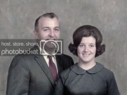
Yes, it is overshopped, but on a deeper, more symbolic level (let's not get carried away Clare) you have lost the character of the couple. They just are not a good choice for beautification. Their beauty is that of aging and optimism. OK, off the soapbox now, lol.
Not sure what you mean by "a feather through it" Do you mean more highlight accents or is it too blurry?
I think he means that you have cut the girl out so that her hair looks more like a cap. It is too smoothed out which makes it look unnatural. A feather might give it a bit of a fuzziness that normal hair would have. But we should leave that for Paul to say.

As for the masking, don't worry if you don't understand it. I avoided masks for a long time. Once I understood them, I couldn't figure out how I ever worked without them! So, just learn it and use it.
Fatboy73
Guru
- Messages
- 613
- Likes
- 356
They just are not a good choice for beautification. Their beauty is that of aging and optimism.
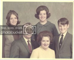
Now that's funny! The woman is my fiancee and the gentleman is her Grandfather. I'll have to show her this comment, she'll get a kick out of it.
ibclare
Queen Bee
- Messages
- 11,033
- Likes
- 4,638
Now that's funny! The woman is my fiancee and the gentleman is her Grandfather. I'll have to show her this comment, she'll get a kick out of it.
Color me embarrassed. At least I hope she laughed, not growled, when she saw it.

