jgphotgraphy
Member
- Messages
- 8
- Likes
- 0
Hey guys,
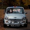
Looking for a little bit of help. First, a slightly longwinded explanation. Shooting the creative family Christmas card this year in a Mini-Cooper (original 60's one). Basically set my lighting up and then shot individual members in the car to post them together. The only snafu - my 20 month old son wasn't exactly cooperating, so the 'good' photograph I have of him is in the drivers seat, and I wanted to move him in between us.
There were a few difficulties here. First, the light changed between originally shooting my wife (windshield was clear), as skies were blue, and when I took the photo of myself nearly an hour later (cloudy skies cast a glare on the windshield. I had a black scrim set up to the side which helped, but wasn't able to knock it out all together. So i faded the clear windshield from my wife's side over to my side with the glare, but I feel that looks fairly natural (or at least good enough for the christmas card).
The trick comes with my son - I cut him out from where he was at the drivers seat (had to do some shoddy work on his shirt where the steering wheel blocked him), and put him in between us. However, it looks like his coloring is off from what we are - and I can't quite seem to get it right. Color balance is definitely not my strong suit in PS.
So that being said - can anybody offer suggestions, or if you'd like to take a crack at it, please do! It doesn't need to be perfect, it's only printing 4x4". FYI, the linked file is about 110 Mb.

