What's new
Photoshop Gurus Forum

Welcome to Photoshop Gurus forum. Register a free account today to become a member! It's completely free. Once signed in, you'll enjoy an ad-free experience and be able to participate on this site by adding your own topics and posts, as well as connect with other members through your own private inbox!

Specific Sharks Logo Edit


guyute0147

Member
Messages
18
Likes
0
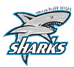
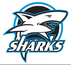
I'm wanting to make some changes to this shark logo but have no idea where to begin. I've messed around on paint to show everyone what I am looking to have done. So basically its the first Sharks logo but I want to remove black around shark and the white and blue ring. Make the shark a nice light gray. And add the words "Spanish River High" up top. I basically just wrote it up top horizontally just to give everyone an idea. I left out the word "High" also. I think a good placement for "Spanish River High" would be across the head. Maybe starting at fin and up to head getting a little larger as it goes up hugging the curves of the head. If you understand what that means. Don't know if that should be all black or same color combination as the word "Sharks" (white with black then blue outline). Maybe if someone can do it both ways to see which might look better. I would greatly appreciate if someone can help me with this. Thank you so much!
shark logo for app (2).jpg

shark logo for app 4.jpg
 
Hi guyute

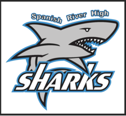
This is as far as I could get with my time today. It would take a bit more to do customer lettering. If you know the specific font you want I could easily change it to that font.

Hope this is a good start

John W/heeler

Shark-adj.png
 
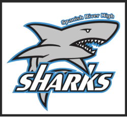
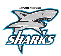
wow. that's what I was thinking when I mentioned text going along shark. Only thing is I don't know if I like it going down fin and then head. Is there a way you can do another one where Spanish River High is all over head? like where it says "River High" now. I'd love to see it that way. Otherwise this looks awesome man. Thanks
 
I know this is hand written but I was wondering if this was doable? Like same thing you have now but in this location and gradually getting bigger. If that's too hard then maybe just normal. Thanks a bunch again.
shark logo for app 5.jpg
 
I know this is hand written but I was wondering if this was doable? Like same thing you have now but in this location and gradually getting bigger. If that's too hard then maybe just normal. Thanks a bunch again.
No that's not that hard.............give me a minute or so.
 
Thank you so much! What would you suggest is the best format to be able to use this for something as small as a letterhead to as big as a poster or t shirt without losing pixels. Raster, Vector, etc? You can tell I know nothing.
 
What would you suggest is the best format to be able to use this for something as small as a letterhead to as big as a poster or t shirt without losing pixels. Raster, Vector, etc?
The original image is far too small and low quality to be used for poster or t-shirt art. You could use it for letterheads though.

Here's the full size image in a PNG. The BG is transparent.
SharkLogo_01.2.png
 
The PNG's are rastor files and won't enlarge well without aliasing.
If you hang around.............maybe one of our other members will re-create this in Ai. This will leave you with a vector file that could be used for artwork.
 
This size actually works out good for now as it’s only for a school app. It’s my wife’s school. She loved them but is worried it might be too small. Can you scratch “High” and make it just “Spanish River” and a little bigger. Doesn’t need to ascend. All same size is fine. Thanks a million.
 

Back
Top