Creativesnaps
Member
- Messages
- 16
- Likes
- 7
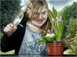
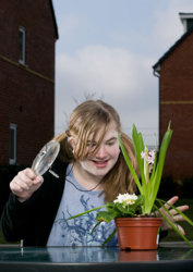
I have added a B&A so you can see how i more or less went about it. I did as much as i could in camera and at the time i couldn't find a garden to my liking. it was taken two years ago and edited the other week as I had some time on my hands and i also found the garden i wanted to use
 . I did an edit back then but it never worked due to the background i used. So don't just throw anything in and make do, it doesn't work as I have found out overtime.
It was a four light setup. The main light in this image was the one @ camera left and slightly behind her. The rim light @ camera right was set a lot lower as i wanted to create a rim but not overpowering the main. The other two were to the front for fill and to create highlights.
Post was mainly D&B, colour balance, Inverted surface blur for detail, added a painterly look using reduce noise and high pass, added a sky, garden, wasp, smoke and birds, added the tip of her finger on her left hand (it was hidden behind the leaf), removed sticker on plant pot and just did some free style to add the overall look i wanted at the time.
Hope you like it.
 Revenge by Creative-Snaps, on Flickr"]
 [/URL]
 2 by Creative-Snaps, on Flickr"]
 [/URL]
It was a four light setup. The main light in this image was the one @ camera left and slightly behind her. The rim light @ camera right was set a lot lower as i wanted to create a rim but not overpowering the main. The other two were to the front for fill and to create highlights.
Post was mainly D&B, colour balance, Inverted surface blur for detail, added a painterly look using reduce noise and high pass, added a sky, garden, wasp, smoke and birds, added the tip of her finger on her left hand (it was hidden behind the leaf), removed sticker on plant pot and just did some free style to add the overall look i wanted at the time.
Hope you like it.
 Revenge by Creative-Snaps, on Flickr"]
 [/URL]
 2 by Creative-Snaps, on Flickr"]
 [/URL]
