What's new
Photoshop Gurus Forum

Welcome to Photoshop Gurus forum. Register a free account today to become a member! It's completely free. Once signed in, you'll enjoy an ad-free experience and be able to participate on this site by adding your own topics and posts, as well as connect with other members through your own private inbox!

Restoration of a 1959 family photo


chitkaran

Guru
Messages
673
Likes
303
Hey Guys,

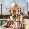
I have been busy in office work for along and haven't done any PhotoShopping since months. I digged deep in the old family photos and found this pic taken back in 1959. It was in a bad state.. thats where our digital editing comes.. right.. Lolz..

Before old-family-0.jpg

And here's how it looks after retouching
old-family-1.jpg

I didnt clean up the sky on purpose to keep the old photo spirit...


What do guys think ?
 
At first it looked like a good job. Then I saw this "irregular pattern". It shows in the the whole image, not just in the sky.

old-familybefore+afterDetail.jpg
 
Also the left side of the dome is blown out on the edited image, and not on the original. I would also straighten the horizon line if I was doing it.
 
@Chris: Yup , I did see that ir-regular pattern in the final image... but I was too tired of getting rid of it.. (lazy).. It was around 4am when i finished it so mind was already shutting down. Besides, it was just a practise image and i learnt a few new techniques in the process. But Yes, if this was a paid job or it was for printing - then I would have removed that pattern. Thanks for looking into it mate... I really appreciate it.


@hawkeye: The done got blown out in the process of filter applications.. I was planning to copy the right side and put it on top of the left side... but then I forgot to do it.. :confused: My Bad...


@ALB68: I did try somethign like this too - but then it was making those dot patterns more visible. So I didnt do it.
 
Looks great, the gentlemen's shirt looks a little smudged at first glance but that would be pretty difficult to repair. Maybe try adding that crinkled paper filter to that selection to give it some texture. (Can't remember the actual name)
 
Gee thanks..mighty nice of you to be so tactful.
Sorry Larry, this is worse than before.
And the funky stuff is the original photo paper texture.
 
Just to show another variant all out of shop, no real time spent on it just several different colour layers with blends added, more time better result obviuosly.
I went for the old slightly washed out print look.
another.jpg not even after realism just an idea.
 
The colored version looks nice Paul... thanks for bringing this up... I will try and make a colored version of this pic and see how it looks
 

Back
Top