Photoshop Gurus Forum
Welcome to Photoshop Gurus forum. Register a free account today to become a member! It's completely free. Once signed in, you'll enjoy an ad-free experience and be able to participate on this site by adding your own topics and posts, as well as connect with other members through your own private inbox!
You are using an out of date browser. It may not display this or other websites correctly.
You should upgrade or use an alternative browser.
You should upgrade or use an alternative browser.
Specific Resize and keep quality
- Thread starter Notlogan
- Start date
Do what you believe would be best. Just need it to stay in .png format for the transperant background.Do you want me to include the transparent pixels on all sides? taking those out would free some more space and make the images better, do you need the empty space on all sides?
Thank you. Would there be anyway to up the quality? The resize is perfect just the quality is a bit hindered which I didnt take into consideration.. if you could do that as well that'd be awesome. Initially intended to keep it the same but after I tested it the quality needs to be increased. Sorry for that.Ok. Im keeping the indexed color space so the images occupy less space. Don't know if you needed it, but yeah
Here you go!
View attachment 95134
View attachment 95135
View attachment 95136
View attachment 95137
View attachment 95138
View attachment 95139
View attachment 95140
View attachment 95141
View attachment 95142
View attachment 95143
View attachment 95144
View attachment 95145
fogo00
Power User
- Messages
- 279
- Likes
- 361
Can you explain what you are calling "the quality"? If you are talking about the black edges around the flowers, that could be fixed by converting the image into an RBG color space and just removing it, which would make the images a little bigger (in file size) but the're small anyway so I don't think that'd be an Issue. If you want to make details more perceivable, i could apply some sharpening to make the lines stand out.
By qua
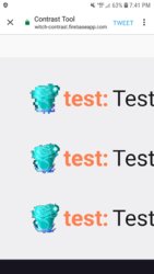
By quality I'm referring to the blur of the image. It's going to be used as a sub badge for me, with 18x18 as standard for mobile, 36x36 for tablets, and 72x72 for standard pc/laptops. This is the end result of the 18x18 36x36 72x72 using a mobile phone to view it. The quality of them is too blurry to be accepted as the badge. Was wondering if you could remove the blur that comes with the downscale of the image. Attached picture below to reference to.Can you explain what you are calling "the quality"? If you are talking about the black edges around the flowers, that could be fixed by converting the image into an RBG color space and just removing it, which would make the images a little bigger (in file size) but the're small anyway so I don't think that'd be an Issue. If you want to make details more perceivable, i could apply some sharpening to make the lines stand out.

fogo00
Power User
- Messages
- 279
- Likes
- 361
First off, nowadays PCs, tablets and phones have the same screen resolution (usually 1080p) so you should be using the same size for all of them (72x72 in this case)
And it's not possible to have an 18x18 image that has all the details of a 72x72 pixels. Each pixel can only have one color. By reducing the count of pixels by 4 (72x72 to 36x36 or 36x36 to 18x18) each pixel of the smaller image represents four pixels of the bigger image, so you basically lose 75% of the detail each time you do that.
I'm working on having the images looking less compressed, but consider that you should only be using the 36x36 or 18x18 versions if you need the same image to appear smaller in some place. If it's supposed to look the same on these platforms (mobile, tablet and PC) use the 72x72 version on all of them)
First off, nowadays PCs, tablets and phones have the same screen resolution (usually 1080p) so you should be using the same size for all of them (72x72 in this case)
And it's not possible to have an 18x18 image that has all the details of a 72x72 pixels. Each pixel can only have one color. By reducing the count of pixels by 4 (72x72 to 36x36 or 36x36 to 18x18) each pixel of the smaller image represents four pixels of the bigger image, so you basically lose 75% of the detail each time you do that.
I'm working on having the images looking less compressed, but consider that you should only be using the 36x36 or 18x18 versions if you need the same image to appear smaller in some place. If it's supposed to look the same on these platforms (mobile, tablet and PC) use the 72x72 version on all of them)
Thank you for the insight but the platform as to which I'm going to be using them require those 3 sizes. That's the only reason I requested them in that format. I would personally attempt to up the quality of the 72x72 to make it look less blurred and then scale it back down to size but i currently don't have my PC so I'm unable to do so. Hopefully you can figure it out though. I appreciate all your help so far.
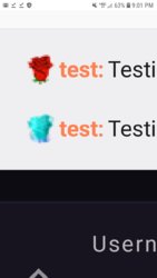
Yes, this, but when scaled down all image quality is lost. Trying to figure out a way to keep similar or same image quality after resizing if at all possible. Maybe with a gradient hex, gaussian blur or sharpening effect. Just haven't had any success making it a decent quality at the scale sizes provided which are required for this project. This is still the end result of the 18x18.I think this is what you wanted. If not, enlighten me.
View attachment 95164
View attachment 95165
View attachment 95166
View attachment 95167
fogo00
Power User
- Messages
- 279
- Likes
- 361
An 18x18 image can't look much better than that, man. If I sharpen it more, it will become pixelated, have a lot of alias or hard edges. If I try to soften it more, it's just gonna lose even more detail and look blurry.
Unless you want it to look like pixel art, in which case, very hard edges are used. It's way easier to understand the image, but it's not gonna look much like the other images.
I can give this another try tomorrow. If you need it before, try to contact someone else
Unless you want it to look like pixel art, in which case, very hard edges are used. It's way easier to understand the image, but it's not gonna look much like the other images.
I can give this another try tomorrow. If you need it before, try to contact someone else
Not in a hurry at all, and your effort is very much appreciated. Thank you for tryingAn 18x18 image can't look much better than that, man. If I sharpen it more, it will become pixelated, have a lot of alias or hard edges. If I try to soften it more, it's just gonna lose even more detail and look blurry.
Unless you want it to look like pixel art, in which case, very hard edges are used. It's way easier to understand the image, but it's not gonna look much like the other images.
I can give this another try tomorrow. If you need it before, try to contact someone else


