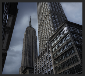
Anyway, I've started making a poster for Fant4stic and wanted to know if anyone had tips for replicating the look of the official posters.
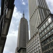
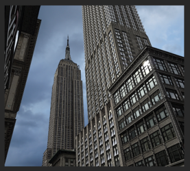
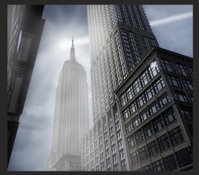
For example, how can I match the colour grading to make these buildings:
There are literally thousands of ways to create poster style imagery................it's highly dependent on the artisan and their own style, taste, and techniques. It would be impossible to replicate someone else's work or style without asking them directly how it was done. Far too many variations! Also, what appeals to you may not appeal to another. Having stated that, I suggest you just start experimenting with as many different techniques until you find the one that appeals to you. There are hundreds of video tutorials available on the net. Go through and try as many as you can until you find something that you like.
I do suggest that you learn about smart objects along with smart filters. Doing so will give you absolute editing over all involved layers. "Color grading".......not sure exactly what you mean.....but you can influence any image, or part of an image using Solid color adjustment layers along with their accompanying layer masks and blending options to overlay color variants.
Here's just a quick rundown of one (of thousands) technique that can be used.
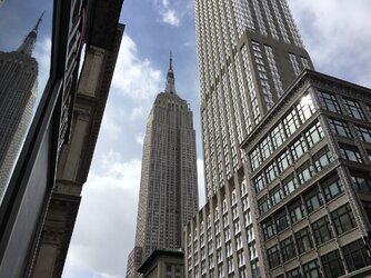
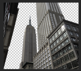
Original. Cropped. BG removed.

Convert building image layer into a smart object.
New clouds added.
It's hard to tell, but I have also added a smart filter to the buildings.......Poster Edges. This can easily be changed or edited at any time!

Clouds desaturated using H&S adj layer.
Added a Color Fill Adj layer set to multiply and used it's layer mask to block what I didn't want colored.

Next I used two different layers to add in white highlighting and the asteroid trail.
I also used selections created from the building layer to isolate certain areas.
I can also colorize these layers by clipping a Solid Color Adj layer to either.
Too many variations!!!!!

Of course the next step would be adding in the subject and the flying debris at the base of the image........but that's another story.
