Photoshop Gurus Forum
Welcome to Photoshop Gurus forum. Register a free account today to become a member! It's completely free. Once signed in, you'll enjoy an ad-free experience and be able to participate on this site by adding your own topics and posts, as well as connect with other members through your own private inbox!
You are using an out of date browser. It may not display this or other websites correctly.
You should upgrade or use an alternative browser.
You should upgrade or use an alternative browser.
Remake Appstore icon
- Thread starter Aviorrok
- Start date
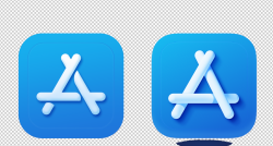
Sure, here's the PSD.Are you willing to post your PSD file so we can see what's going on?
edit: I made this one real fast just so I would know how to advise.
Click to enlarge.
View attachment 113744
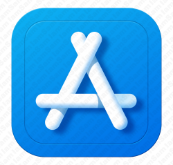
Can you make your icon more similar (better gradient and reflection like the original) and share your PSD so I can learn for it?
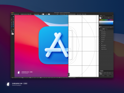
Also the creator of the original icon share the effects on the icon
Attachments
- Messages
- 23,872
- Likes
- 13,629
The only thing I can see is that you borrowed the (A) bars from the original image shown in your post above and you did not include the shadows.

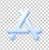
Or.....you borrowed from an entirely different image. Like this one from your layer 6

Either way, they don't look like this!

Without effects
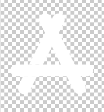
If my last image above is what you desire, then you need to create your own "bars" using the Rounded Rectangle Tool. You cant cutout the bars from another image.
Because of the masking effect, I had to "create layers" from the bevel and emboss layer style effects on the third bar in order to get the shadows and highlights separated to make the crossover effect with bar 1.
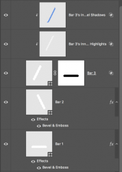


Or.....you borrowed from an entirely different image. Like this one from your layer 6

Either way, they don't look like this!

Without effects

If my last image above is what you desire, then you need to create your own "bars" using the Rounded Rectangle Tool. You cant cutout the bars from another image.
There's no need, your version is fine. The only thing I did differently than you was to create my own bars.Can you make your icon more similar (better gradient and reflection like the original) and share your PSD so I can learn for it?
Because of the masking effect, I had to "create layers" from the bevel and emboss layer style effects on the third bar in order to get the shadows and highlights separated to make the crossover effect with bar 1.

- Messages
- 23,872
- Likes
- 13,629
I could not find where this guy offers any instructions or shares any effects for this icon. Can you provide a link to this tutorial. NOT HIS DRIBBLE PAGE!Also the creator of the original icon share the effects on the icon
You seem to have just borrowed a screenshot in post #3.
- Messages
- 23,872
- Likes
- 13,629
Another problem that I see is that you have made all your bars blue and lowered the fill to 0%.
Then you made it white using layer style effects.
(Note: I added the layer mask for the crossover)

Why not just make the bars white? Then you can use less layers style effects.

You can also transfer the layers style effects to their own layers (right click the fx icon and hit "create layers").
This is your Group layer 1

All I did was to add a layer mask, turn the bar white instead of blue, remove unnecessary layer style effects, and separate/transfer the layers style effect to their own layers.
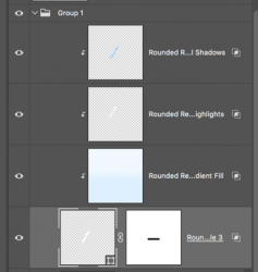
Then you made it white using layer style effects.
(Note: I added the layer mask for the crossover)

Why not just make the bars white? Then you can use less layers style effects.

You can also transfer the layers style effects to their own layers (right click the fx icon and hit "create layers").
This is your Group layer 1

All I did was to add a layer mask, turn the bar white instead of blue, remove unnecessary layer style effects, and separate/transfer the layers style effect to their own layers.

- Messages
- 23,872
- Likes
- 13,629
How do you add the drop shadow you might ask? (It wont work with the layer style effects!!)
Create a new layer below the bars layers.
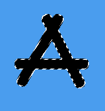
Make a selection of all the bars.
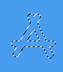
Fill with black or the dark blue (I used black for this example)
Convert the layer to a smart object.
Add a smart Gaussian blur filter.
Set to 30 or so.

Now you just move the shadow into position with the Move Tool.

Change the blending mode if needed and lower the shadow layers opacity to suit.

Create a new layer below the bars layers.
Make a selection of all the bars.

Fill with black or the dark blue (I used black for this example)

Convert the layer to a smart object.
Add a smart Gaussian blur filter.
Set to 30 or so.

Now you just move the shadow into position with the Move Tool.

Change the blending mode if needed and lower the shadow layers opacity to suit.


