Hello fellow Photoshoppers,
This summer I started a big project (PS CS6) where I wanted to make a collage of every player of our team. The blackground will be mainly black with a bit of white and red (red being the teamcolor). Now my final project is ready to get printed. Because it is a big photo (600mm x 900mm) and it is supposed to hang somewhere at the club I've wanted to be sure everything came out like I wanted. So I let a company make a testposter.
When looking at the testposter everything is good, except for the color 'Red'. All the red colors are more grey then red.
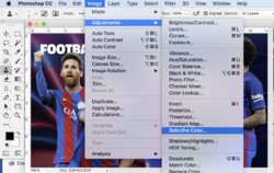
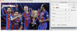
I want to make a new testposter, but I am not sure if just making the 'saturation' or the 'brightness' on the color red make a difference. What would you suggest I should do? I only have to improve the color red (I use PS CS6) . I don't know what technic the company uses.
With Kind Regards,
Niveus


