Photoshop Gurus Forum
Welcome to Photoshop Gurus forum. Register a free account today to become a member! It's completely free. Once signed in, you'll enjoy an ad-free experience and be able to participate on this site by adding your own topics and posts, as well as connect with other members through your own private inbox!
You are using an out of date browser. It may not display this or other websites correctly.
You should upgrade or use an alternative browser.
You should upgrade or use an alternative browser.
Portrait help
- Thread starter MikeMc
- Start date


iDad
Guru
- Messages
- 11,579
- Likes
- 4,468
Those images are in pretty good shape, if you're looking for a simple fix I would say duplicate the layer with the upper layer in overlay mode (that's what I would start off with) it may increase the detail a little bit and change the lighting slightly
you might even want to use gaussian blur at a .9/ 1.5 px range on bottom layer that may give you the softer look you're going for.
The selection process would be completely up to you though, but you could also do it to the whole image and see how you like that...... just a suggestion. I'm sure other members will have another 101 ideas for ya.
Tom Mann
Guru
- Messages
- 7,222
- Likes
- 4,343
Hey Mike - Nice looking lady and nice photo of her. I take it that the 2nd image you posted is just a crop of the 1st? Which crop do you want to use - full length, or head-and-shoulders?
A question - how stylized do you want the final product? At one end of the spectrum, you could have it look like it was taken using pro lighting, but is a realistic image. At the other end of the spectrum, you could have it be the same as the previous option, but add to that look a traditional soft portrait effect, maybe, to be printed on canvas, fade to white vignette at the edges, etc.
Tom
PS - Do you have a raw file for this image?
Last edited:
MikeMc
McGuru
- Messages
- 1,872
- Likes
- 1,202
Hey Mike - Nice looking lady and nice photo of her. I take it that the 2nd image you posted is just a crop of the 1st? Which crop do you want to use - full length, or head-and-shoulders?
A question - how stylized do you want the final product? At one end of the spectrum, you could have it look like it was taken using pro lighting, but is a realistic image. At the other end of the spectrum, you could have it be the same as the previous option, but add to that look a traditional soft portrait effect, maybe, to be printed on canvas, fade to white vignette at the edges, etc.
Tom
PS - Do you have a raw file for this image?
I would like to work on both And I did not shoot this so all I have is her jpeg :frown: I want to make it realistic, bring out the eye detail, soften and make HER happy.
This is not where I go, but I need to learn more of this.
She is using this as a image for her accounting business, in flyers and minor printings...So glamour is out.
Thanks for any ideas!
Tom Mann
Guru
- Messages
- 7,222
- Likes
- 4,343
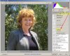
Mike - OK on your preferences. Is this moving the image in the direction you would like it to go? (pls ignore the lousy masking job - I just wanted to illustrate the general idea, not get it perfect).
If so, let me know and I'll type out a list of the changes I made.
T
If so, let me know and I'll type out a list of the changes I made.
T
MikeMc
McGuru
- Messages
- 1,872
- Likes
- 1,202
Yup Tom....Starting to look like her!
I didn't realize until after I posted that the head shot must be from the other full image :redface:
So I think I will work on the whole, and I can always make a head shot from that.
Her eyes are small due to how it was shot, but the exposure is pretty good so I'm hoping.
Thanks for steering me!
These are the two others..I don't like them as much, I am going to try to re-shoot these in raw, but don't know when our schedules work
Last edited:
Tom Mann
Guru
- Messages
- 7,222
- Likes
- 4,343
Hi Mike - I agree with you in that I wouldn't use either of the last two images of her that you posted. The first of these is taken from too low an angle and sunlight is raking over her face at a steep angle making hot spots. In the second (of the last two), she doesn't have a good expression and the background is much too confusing.
T
T
Tom Mann
Guru
- Messages
- 7,222
- Likes
- 4,343
Hi Mike -
Images like the first pair that you posted suffer from what amounts to completely uncontrolled lighting. They are extremely common with photos not taken by a pro. The photographer of these images picked a nice location and orientation, but didn't do anything to modify the light at that position. For example, the photographer could have used a scrim over the subject to soften the incident light, reflectors in front of the subject to fill in the shadows.
In fact, to make the subject brighter than the background, it is common for higher-end pros to use a full multiple flash/strobe setup (eg, a key light, a fill light, light modifiers such as grids, beauty dishes, etc.) even though it is the middle of the day. At minimum, even a simple on-camera fill flash would have helped tremendously. My guess is that not one of these techniques was used by the photographer of the photo you posted.
Keeping the above in mind will give you good direction in terms of simulating these effects in post processing. Specifically, here is a list of the goals I had in mind when I did my tweaked version:
1. In the version of the image that you posted, the background was as bright or brighter than the face of the subject, so the viewer's eyes weren't attracted to the subject. So, my first order of business was to brighten the subject and darken the background.
2. Make the background less noticeable by
- darkening,
- *greatly* reducing the extremes of tonal values as well as the midrange contrast,
- filling in fairly large patches (particularly on the RHS edge) of the frame where the trees were sparse,
- slight blurring of the background
3. Make the subject attract the viewer's eyes by brightening the face, bringing up the deep shadows in the hair, tame the hotspots on her jacket and the top of her hair.
4. In the version originally posted, the subject is looking towards viewer's right, but she is located closer to the (viewer's) right edge of the frame. This is another aspect of the original that distracts viewers. To fix it, I simply cropped away some of the LH edge of the frame.
5. Once the large-scale issues are dealt with, we can turn to smaller scale issues such as harshness and mottling of the subject's skin.
As usual, there are always many ways to work on any of the individual actions / issues mentioned above. Once can do amazing things within ACR, so my approach is almost always to start by bringing the image into ACR no matter if the image is a raw file or a jpg. Once that is done, I will move the image over to PS, and make one or more masks of the various areas of interest in the image. In this case, there were only two areas that needed to be distinguished: subject and background, so I made the mask immediately.
After that I used various PS tools to put final tweaks on the image.
If you are interested, I'll be happy to send you the ACR settings I used, and describe the final tweaks in PS. Let me know.
Best regards,
Tom M
MikeMc
McGuru
- Messages
- 1,872
- Likes
- 1,202
Tom, I agree and follow your points. I would always use the flash....these were shot by a autobody tech....great painter, lousy photog.
I also use ACR, and would love to see where I am out so far. Drop them in a PM so as not to clog this up .
Thanks for the advice, I will post up the results.
Mike
I also use ACR, and would love to see where I am out so far. Drop them in a PM so as not to clog this up .
Thanks for the advice, I will post up the results.
Mike