Photoshop Gurus Forum
Welcome to Photoshop Gurus forum. Register a free account today to become a member! It's completely free. Once signed in, you'll enjoy an ad-free experience and be able to participate on this site by adding your own topics and posts, as well as connect with other members through your own private inbox!
You are using an out of date browser. It may not display this or other websites correctly.
You should upgrade or use an alternative browser.
You should upgrade or use an alternative browser.
Poor Victorian Boy
- Thread starter markr
- Start date
I think the poor boy needs shoes or boots (his tootsies must be very cold) and perhaps a shadow between the feet area, all in all though, it is very Norman Rockwell_ISH
Hey iDad, thx for your input. I had the same feeling about the feet. They look a bit odd don't they? Maybe I should indeed give him boots. And you're totally right about the shadow. Forgot that one...
Tom Mann
Guru
- Messages
- 7,222
- Likes
- 4,343
Very nice job!
Ignoring the feet, to me, there is too much green and not enough contrast in the version you posted. I also felt it was a bit too bright.
With respect to the green, I suspect you wanted to show light spill from the (presumably) gas lights onto the scene, but I would confine their lighting, not have it spill onto so much of the scene.
I would also direct the viewers' eyes more to the subject by a combination of increased contrast and very soft vignetting.
I took the liberty to tweak your image to show you the direction I would go - see below.
Of course, these are just my personal preferences. I would also point out that if attempted to make final editing decisions (such as these) on an uncalibrated monitor, you will be seeing something different from everyone else in the world.
Again, other than my nit-picking suggestions, very nice work.
Regards,
Tom
Attachments
chrisdesign
Guru
- Messages
- 4,226
- Likes
- 6,238
It's a reallynice creation markr, though I don't like the greenish cast. But maybe that's just me.
One important thing in your image is not right. The dog shadow has a "strange" shape and is too big, but the boy has almost no shadow.
One important thing in your image is not right. The dog shadow has a "strange" shape and is too big, but the boy has almost no shadow.
chrisdesign
Guru
- Messages
- 4,226
- Likes
- 6,238
Thank you guys for all of your comments. Ok, so I tweaked it a little bit, taking all you guys comments into account. So, hopefully it's looking a little bit better. I also made a version without the snow. It's much cleaner then, but also less dramatic. What do you guys think? Oh, and I also removed the funny ornament. As iDad already suggested, it was a remaining of a street light from the original picture. Played around with the shadows, but I'm not really convinced. Pff, why did I had to bring in multiple light sources.


Hey chrisdesign, that looks nice. Can I ask how you got to this result?
chrisdesign
Guru
- Messages
- 4,226
- Likes
- 6,238
1. Curve tool, reduced red and blue channel in mid tones to get rid of the green cast.

2. I made a quick selection with a very soft edge and put it on a new layer. With the curves I reduced the red and increased the blue channel again to get a more golden color in these areas.

3. I masked the windows and put them on a new layer. I masked the lamps (very soft edge) and put it on a new layer. I masked the moon and put it on a new layer. Worked with the curves as before.

Finally I made a shadow on a new layer for the boy (soft brush), added some gaussian blur. In the BG layer I corrected the Dog shadow.
Sorry about my english, it is not my native language. I hope I could help with the screenshots.

2. I made a quick selection with a very soft edge and put it on a new layer. With the curves I reduced the red and increased the blue channel again to get a more golden color in these areas.

3. I masked the windows and put them on a new layer. I masked the lamps (very soft edge) and put it on a new layer. I masked the moon and put it on a new layer. Worked with the curves as before.

Finally I made a shadow on a new layer for the boy (soft brush), added some gaussian blur. In the BG layer I corrected the Dog shadow.
Sorry about my english, it is not my native language. I hope I could help with the screenshots.
ibclare
Queen Bee
- Messages
- 11,033
- Likes
- 4,638
Nice work; I also love the postcard effect. I like the different edits, especially the one by Chris. Tom's is great too, but as he says, he takes it in the direction of photography and I prefer the old-fashioned Norman Rockwell effect. Your choice of course. I do think you made the overall image too dark in your second version. I think the details were better when it was lighter. Somewhere in the middle would work for my tastes.
As to why you need multiple light sources, it's because there are multiple light sources. The one you first use is from the street lamp to the left of the boy. There is also the moon which you show as very full and very bright, so it too would cast a shadow. Maybe that shadow would not be as deep as you made it. I'd be interested in other opinions on that.
Anyway, it's a super concept and a good composition. If you wouldn't mind, we like to see the collection of source pictures you used. Hey, we can ooh and ah even more when we see the adjustments, selections, positioning, and so forth; all the work you did to put it together.
Hey ibclare,
You're totally right about the brightness. I'm looking at this picture on a monitor at work right now, and it's way too dark. I really have to calibrate my monitor at home. As for the original footage, you can always watch my speed art video to see how I made use of the original images:
https://www.youtube.com/watch?v=dvqxj4J4myQ
Normally I just google my images and use them directly into my work. Never keep a copy of them. But especially for you, I googled them again and found them back rather quickly. So here you go:
http://dcbellows.files.wordpress.com/2008/10/29-p-1-old-houses-aero.jpg
http://wallike.com/snow-wallpaper-widescreen.html
http://upload.wikimedia.org/wikipedia/commons/e/e1/FullMoon2010.jpg
http://www.flagshipfancydress.co.uk.../images/poor-victorian-boy-costume-2683-p.jpg
http://solidgoldcreativity.files.wordpress.com/2011/05/dog-gr.jpg?w=640
http://www.pet360.com/Content/Images/Cms/cms_resized_large/Scared_Cat.lg.jpg
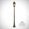
http://www.thevictorianemporium.com...ive_outdoor_ip44-bt5l-post_lantern__large.jpg
Hey ibclare,
I posted a bunch of links to the original footage, but I guess I'm not supposed to do that because the post did not showed up. So sorry about that, should have read the rules first :redface:. Anyway... Thx for your comment. You are absolutely right about the brightness. Looking at this picture on my monitor from work, it's way too dark. Really need to calibrate my monitor at home. As for the original footage, you can watch my speed art video to see how I made use of the original pictures:
And here is the complete collection of footage I used:


sprucemagoo1
Guru
- Messages
- 2,006
- Likes
- 1,187
The houses don't strike me as being Victorian in design, which isn't helped by the velux windows, and what looks to be a communications junction box outside the first house on the right. The moon looks too big, the guttering strikes me as being UPVC and finally, that's a very clean healthy dog, considering the boy is meant to be poor.
Sorry!
Did you even get permission to use these images?
Sorry!
Did you even get permission to use these images?
Last edited:


