What's new
Photoshop Gurus Forum

Welcome to Photoshop Gurus forum. Register a free account today to become a member! It's completely free. Once signed in, you'll enjoy an ad-free experience and be able to participate on this site by adding your own topics and posts, as well as connect with other members through your own private inbox!

Please give your opinions of my work


comment on my cd cover art work

  • What would you do to make these covers better

    Votes: 1 100.0%
  • Did i use the right text

    Votes: 0 0.0%

  • Total voters
    1
  • Poll closed .

rifraf115

Member
Messages
7
Likes
0
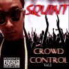
Whats good everybody,im new to the photoshop world. I made the the transition from Print Shop 23 to Photoshop Cs3 and Cs5,What a big difference.Im a music producer and Ceo of my own independent label and im basically here to get advice and learn how to make better Cd cover for some of the artist i work with.hopefully some of u professionals can help me step my graphic design game up,i have attached a few of my Cd cover designs,feel free to comment on them,i have thick skin so negative post will not bother me,its will be taking as motivation to do better work.
 

Attachments

  • Squint-Crowd Control copy.jpg
    Squint-Crowd Control copy.jpg
    178.4 KB · Views: 3
  • Black Rain-Apocalyptic Theory copy.jpg
    Black Rain-Apocalyptic Theory copy.jpg
    276 KB · Views: 3
In my opinion,The first one I'd have the man's shoulder fade into the crowd vs it just cut off. Maybe put a little of that blur you did on the text around the guy. I like that is says "squint" and when one does, the "crowd control" is easier to read. In the 2ND one I think the buildings should be a little burnt up from the asteroid and the man should be just a little darker to blend with all the effects.
 
Hi!

I would suggest keeping with one or two font styles that you like in each album cover. I would also narrow down on the effects and keep it simple yet to the point. If those are the singers of the album art, then they should be the center of attention (not literally at the center, haha). With the first album cover, the hand reaches for the word 'squint' and draws out all the attention from the person to the left. Just like in the second picture, the meteor draws attention more than the singer.

Like books, it only takes a few seconds for a person to either 'like' it or 'hate' it. With too much effects, it would do the complete opposite of what you expect for your audience's attention.
 

Back
Top