What's new
Photoshop Gurus Forum

Welcome to Photoshop Gurus forum. Register a free account today to become a member! It's completely free. Once signed in, you'll enjoy an ad-free experience and be able to participate on this site by adding your own topics and posts, as well as connect with other members through your own private inbox!

Output color difference


Lithia

Member
Messages
5
Likes
0
Hello,

Forgive me if there is a clear thread on this. I have tried a quick search,
but in all honesty I am not quite sure which terms to use to search for this...issue I'm having.

At the core of it all: "images from PSD exported as a .png, or a .jpg (commonly for me)
do not show the same...contrast or fidelity my photoshop-canvas shows me.
"

I think this is the best way to describe it.

I have been working on some stuff, and quite some time ago, I noticed that a certain piece of mine was not showing the subtle, noise-fog that I had added in PSD.
Now, on-canvas everything seemed fine and I thought: "Okay, This is what I want."
However, when I saved the image (as a .jpg and later as a .png as well), the fog was absent from the image, showing simply a "black" background.
Sometime later I found that, when I zoomed in, the noise was actually present, it was just VERY unclear. You could only notice it, just barely, whilst zoomed in. At default fit-to-view distance...there's nothing.

Now we come to present-time. I'm working on a little concept. It's in manga cell-shaded style, so the differences in color are easy to see (as shadows, for example, are not gradual. There's a clear line that separates the normal lighting from shadows)

Now, this 'character' has a black pair of pants (specific RGB-code: #100d11)
and the color of the shadow is #060506
The thing is: in photoshop, I can clearly see the difference and it looks the way I want to have it.
But when I saved the image to jpg (and to png) you can barely, if at all, see the difference. Someone who does not know there are two different colors, would not see it, and just see pure black.
You can see the difference if you zoom-in, but even then it's not as 'stark' as it is on-canvas.

I would like to know:

- Is this common / normal?
- If yes, is there something to fix this, so that what I see on-screen is what I get when I export the file?
- Could this be tied to my monitor, perhaps, and is Photoshop not to blame?
- Is there anyone else who "suffers" from this?

Initially, I thought this was a transparency- / blend-mode issue, but even after 'flattening' the image,
the result remained the same.

I would love to get around this issue, because there being a difference in what I'm seeing and what I'm getting is extremely frustrating.

Below are some final-note details about my current document, just to be sure,
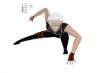
and the attachments has a jpg-image of the piece I'm working on (opening it in PSD, for me, shows the image, once more, that way I want it, but opening the image in windows image-gallery shows it how it should NOT be):

- Photoshop version: CS5, extended, 64-bit
- Document dimensions: 5488 x 4050 px
- Document img-type: rgb-8bit
- OS: W7, x64
(- Tablet: Wacom intuos5 Pen-pressure-size & pen-pressure-opacity are both enabled...for what it's worth)


Any help would be much appreciated.
Thank you.

- Lithia.

P.S. The work piece has been added purely as an aid, in hopes someone is able to replicate the problem, should they so wish, and hopefully shine some light on this. I would prefer anyone refraining from giving any feedback / critique on the actual piece. Thank you.
 

Attachments

  • Help.jpg
    Help.jpg
    180.8 KB · Views: 5
Hello,

first off: Thank you for your quick reply.

Second: While I had never really done ANYthing with color-spaces, or even the color-settings panel in general,
I took a look there and saw that sRGB-something-or-other 2.1 was already selected by default.
I changed color-management to "convert to work-space", in hopes that would fix anything,
but unfortunately the problem persists.
(at least I know I'm in sRGB, though :] )


- Lith.
 
I just want to check that we are talking about the same thing, so I tremendously brightened up your image and put pairs of arrows to places that I think your are talking about.

Are these correct?

Tom

Concept Pose-sketch-tjm01-acr0-ps01a-01.jpg
 
Looks like a color calibration issue.

1. Check Edit / Color Settings
2. Check color settings when you save the file


You're zoomed out in "fit-to-view", you will never see the same amount of details.

You see, that is the fun thing. When in photoshop, I can have a zoom-view of around 16%
and the difference is clear as day.
Also, I had previously checked the color-settings, like someone before you noted, but to no avail.
Thank you for your suggestion, though.

I just want to check that we are talking about the same thing, so I tremendously brightened up your image and put pairs of arrows to places that I think your are talking about.

Are these correct?

Tom

View attachment 37293

Yessir, those are exactly the areas I was talking about.
(By now this has increased to the area of his jacket as well, as I did continue t work on it,
despite the persisting problem. But the shading on the pants is what was initially bugging me)


- Lith.
 
First, just to be safe, I confirmed that your working color space is indeed sRGB, so, it's pretty clear we are not dealing with a color space issue.

this 'character' has a black pair of pants (specific RGB-code: #100d11) and the color of the shadow is #060506

Both of those colors are very dark. The shadow is so dark that unless one has a properly calibrated, high end monitor, and you are viewing it in a darkened room, it's going to appear totally black to 99% of all viewers. #100d11 is slightly brighter, but is still very, very dark, however, this color is starting to become visible on more modest (hardware calibrated) monitors. In the old days, quite a few people used to recommend that the minimum black level one should use should be around this level (ie, 10 or 15), because if it was any darker, no one would ever be able to see the difference.

So, in my mind, the question should not be "why are these colors so dark in other applications", but "why are they so easily visible to you, especially when you are viewing them in PS".

Since it is obvious that you are concerned about color/tonal accuracy, I assume that you have a good monitor and regularly profile and calibrate it with decent quality external hardware (eg, Color Munki calibrator or better). If your monitor is not hardware calibrated, the blacks that you see could easily be much too bright, and you would be constantly misled by what your monitor is telling you. Historically, Apple monitors have a bad reputation for doing exactly this. But the default settings of many other monitors are also much too bright, presumably to have them stand out in the computer store.

This problem can also arise if your color-management aware applications (like PS) are using an incorrect monitor profile, or if you are inadvertently working in soft-proof mode using a paper or display profile that boosts the blacks. This would explain your comment, "The thing is: in photoshop, I can clearly see the difference and it looks the way I want to have it."

I have one final question: When you say, "But when I saved the image to jpg (and to png) you can barely, if at all, see the difference...", how are you viewing these jpg and png images? Are you re-opening them in PS, or are you using different software to view them. If so, what software? If you re-open them in PS, how do they look? If you haven't tried the latter, please do so.

Cheers,

Tom

PS - I will be on an airplane or in an airport most of today, and away from my home computer for the next two weeks, so there's a good chance I won't be able to respond as quickly as usual.
 
First, just to be safe, I confirmed that your working color space is indeed sRGB, so, it's pretty clear we are not dealing with a color space issue.


Both of those colors are very dark. The shadow is so dark that unless one has a properly calibrated, high end monitor, and you are viewing it in a darkened room, it's going to appear totally black to 99% of all viewers. #100d11 is slightly brighter, but is still very, very dark, however, this color is starting to become visible on more modest (hardware calibrated) monitors. In the old days, quite a few people used to recommend that the minimum black level one should use should be around this level (ie, 10 or 15), because if it was any darker, no one would ever be able to see the difference.

So, in my mind, the question should not be "why are these colors so dark in other applications", but "why are they so easily visible to you, especially when you are viewing them in PS".

Since it is obvious that you are concerned about color/tonal accuracy, I assume that you have a good monitor and regularly profile and calibrate it with decent quality external hardware (eg, Color Munki calibrator or better). If your monitor is not hardware calibrated, the blacks that you see could easily be much too bright, and you would be constantly misled by what your monitor is telling you. Historically, Apple monitors have a bad reputation for doing exactly this. But the default settings of many other monitors are also much too bright, presumably to have them stand out in the computer store.

This problem can also arise if your color-management aware applications (like PS) are using an incorrect monitor profile, or if you are inadvertently working in soft-proof mode using a paper or display profile that boosts the blacks. This would explain your comment, "The thing is: in photoshop, I can clearly see the difference and it looks the way I want to have it."

I have one final question: When you say, "But when I saved the image to jpg (and to png) you can barely, if at all, see the difference...", how are you viewing these jpg and png images? Are you re-opening them in PS, or are you using different software to view them. If so, what software? If you re-open them in PS, how do they look? If you haven't tried the latter, please do so.

Cheers,

Tom

PS - I will be on an airplane or in an airport most of today, and away from my home computer for the next two weeks, so there's a good chance I won't be able to respond as quickly as usual.

Hello again.

Thank you for fiddling about a bit.
The longer I read into it, the more I got the idea that the issue was much less a color-space one,
and much more 'my monitor'.

I like to think that I do[/b] own a fairly high-end -esque monitor (BenQ XL2420t),
but I have never calibrated....ANY monitor, really. I always thought that if I'd do that,
the chances of me breaking something, rather than fixing something are rather high.

This monitor is designed to be used for gaming (which I do indulge in...heavily)
There are several 'preset profiles' to choose from and I went with the one that makes everything look how I like it best.

To tell you the truth: I'm not even sure how I would go about 'calibrating my monitor'.
How do I do it properly? What software to use...and to 'what' do I calibrate it?

The issue is likely to be somewhere in that field.

So, in summary:
"The colors are so dark, that the difference between them is almost minimal."
- I had figured this could be the case. I had hoped the difference would be as much as PSD shows me, but I suppose what I'm shown in my image-viewer is the actual coloring.

"Why are these colors so easily visible to me, especially in PSD."
- I think, at this point, we can conclude that my monitor - possibly with the aid of some game-related settings - give a good, perhaps unnatural, contrast of darker colors.

"How are you viewing images (jpg / png / bmp / etc.) on your PC?"
- 'Windows photo viewer' is what I commonly use to view basic images. I use programs like PSD only if I need to edit something in an image. If only for viewing purposes: I use Windows photo viewer.
On a sidenote: when I re-open a jpg in photoshop, it looks the way I had intended. I had tried this previously and the image, which shows so little contrast in windows photo viewer, looks "fine" in photoshop, once more.

I guess I can conclude that photoshop takes some monitor-settings into consideration...or something
(I like to think I know a thing or two about PCs, but color-calibration is by no means my forte.)


- Lith.
 

Back
Top