Photoshop Gurus Forum
Welcome to Photoshop Gurus forum. Register a free account today to become a member! It's completely free. Once signed in, you'll enjoy an ad-free experience and be able to participate on this site by adding your own topics and posts, as well as connect with other members through your own private inbox!
You are using an out of date browser. It may not display this or other websites correctly.
You should upgrade or use an alternative browser.
You should upgrade or use an alternative browser.
Newbie issue: Can't change color of layer in PS
- Thread starter jazz0001
- Start date
- Messages
- 23,106
- Likes
- 13,403
Hello and welcome. Sorry for the mix up!
When I try to duplicate your technique, all I get is an amalgamation of the two colors I have on my color layer. I don't think this is how match color should work.
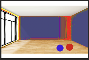
It "kind of" did it with only one color on my color layer. It's still not right!
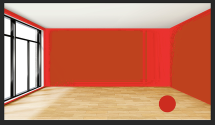
This is not how I would go about this process.
I would place a Solid Color Adjustment layer above my wall selection layer, set it to "Multiply", then clip it to the wall selection layer.
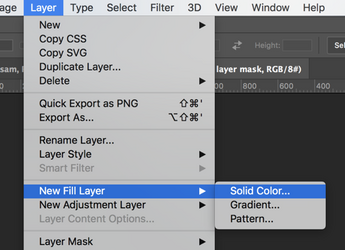
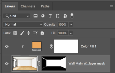
Before
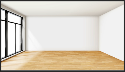
After
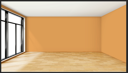
If you want to change the color to something specific, double click the Solid Color Adjustment layer, another color picker will open, enter the hex code of the color you want and click OK on your color picker. 5 to 15 seconds to change colors. Always editable!
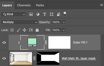
If you really want to be organized, you could also move this process to a smart object.
When I try to duplicate your technique, all I get is an amalgamation of the two colors I have on my color layer. I don't think this is how match color should work.

It "kind of" did it with only one color on my color layer. It's still not right!

This is not how I would go about this process.
I would place a Solid Color Adjustment layer above my wall selection layer, set it to "Multiply", then clip it to the wall selection layer.


Before

After

If you want to change the color to something specific, double click the Solid Color Adjustment layer, another color picker will open, enter the hex code of the color you want and click OK on your color picker. 5 to 15 seconds to change colors. Always editable!


If you really want to be organized, you could also move this process to a smart object.
JeffK
Guru
- Messages
- 2,537
- Likes
- 2,929
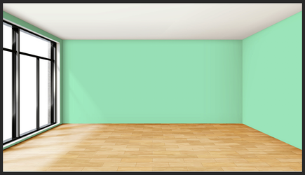
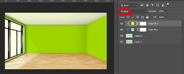
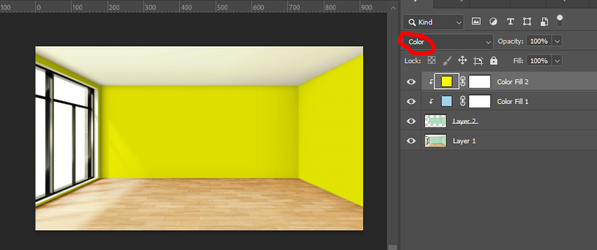
@IamSam - don't mean to go off topic but I'm curious as to why you would use the blend mode Multiply on the solid fill color layer and not Color? I'm thinking if you just keep adding solid color layers with the multiply mode you'll get a mix of colors rather than the color you want...unless I'm missing the point...
Using Multiply - wall turns green since colors are mixed...
Using color - wall retains color chosen...
Using Multiply - wall turns green since colors are mixed...

Using color - wall retains color chosen...

- Messages
- 23,106
- Likes
- 13,403
You missed my point. Your not adding new solid color fill adj layers to change color, you are double clicking the solid color fill adj layer to change the color. You can however use a solid color fill adj layer clipped to each part of the image you want to colorize.............again , setting them to multiply.I'm thinking if you just keep adding solid color layers with the multiply mode you'll get a mix of colors rather than the color you want...unless I'm missing the point...
You can stack/clip new color fill adj layers if you wish, you would just have to turn the one you are not using off.
When you stack color fill adj layers and you use "color" you get a mixture if you don't turn off the previous layer.
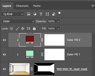
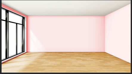
This is what it would look like if set to "color" and the first color fill adj layer is turned off. Does not work with color blend mode.
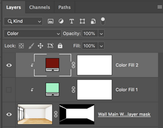

This is what it should look like set to multiply and one color fill adj layer turned off....
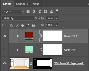
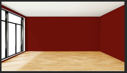
However, I was a bit confusing when I spoke of the foreground and background color picker and I have now edited that above! I wrote this because the OP shows a color pallet on layer 4 in his video. I was explaining a method of sampling those colors in his layer 4 with the foreground and background color picker, then transferring it to the solid color fill adj layer.
Thank you for the help, I created the solid fill layer and picked the color I want from my palette with the picker, however I'm not sure if the color I'm picking is being replaced on the wall or if its maybe combining with the original. The hex code is displayed as I hover over the color I want to pick, so am not sure where to enter it if it needs to be entered somewhere. I demo this in the video, and appreciate any further help.Hello and welcome. Sorry for the mix up!
When I try to duplicate your technique, all I get is an amalgamation of the two colors I have on my color layer. I don't think this is how match color should work.
View attachment 145366
It "kind of" did it with only one color on my color layer. It's still not right!
View attachment 145372
This is not how I would go about this process.
I would place a Solid Color Adjustment layer above my wall selection layer, set it to "Multiply", then clip it to the wall selection layer.
View attachment 145373
View attachment 145367
Before
View attachment 145368
After
View attachment 145369
If you want to change the color to something specific, double click the Solid Color Adjustment layer, another color picker will open, enter the hex code of the color you want and click OK on your color picker. 5 to 15 seconds to change colors. Always editable!
View attachment 145370
View attachment 145371
If you really want to be organized, you could also move this process to a smart object.
- Messages
- 23,106
- Likes
- 13,403
OK...this is actually a great point! Using this method you will get some very minor (if any) blending with the original color. What you are seeing is that the multiply setting allows the shading tones and highlights to show through making the wall with it's color change appear more realistic. But it will darken or lighten the exact chosen color for the wall.however I'm not sure if the color I'm picking is being replaced on the wall or if its maybe combining with the original.
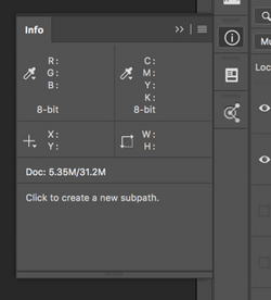
You can test this by using the Info Panel and any tool to go over the wall. You will see the RGB values change as you move across the wall. The closest you will come to the original color will be around or in a highlighted area.
Test this on the original photos wall and you will see that it's not the same color everywhere. If you want the natural lighting of the wall to remain, you will never have an exact color match!!!!
The only way to ensure an exact match would be to leave the blending option set to normal.
This is what you will have. Does not look natural.
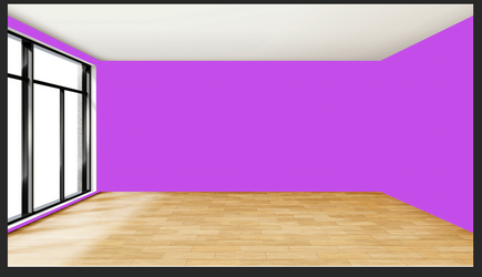
You will then have to add the shading and highlights which will again cause the exact color to lighten or darken no matter what technique you use to replace it!
- Messages
- 23,106
- Likes
- 13,403
The video was a bit confusing. I changed it somewhat by using the H&S layer set to colorize. I matched the RGB the same as the HSB was matched in the video.......at least close enough!! Turned out great!! No blend mode, just normal. Shading is a bit saturated, but looks acceptable. You can teach an old dog a new trick!!
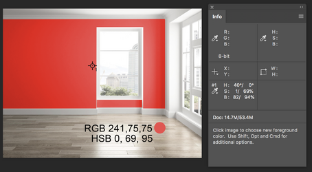
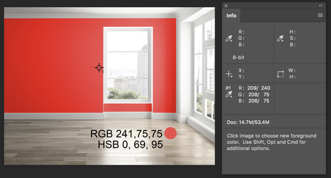
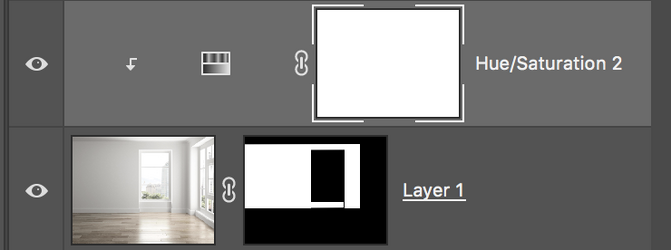
This method is a bit more involved but way more accurate if that's what you need!


This method is a bit more involved but way more accurate if that's what you need!
OK...this is actually a great point! Using this method you will get some very minor (if any) blending with the original color. What you are seeing is that the multiply setting allows the shading tones and highlights to show through making the wall with it's color change appear more realistic. But it will darken or lighten the exact chosen color for the wall.
You can test this by using the Info Panel and any tool to go over the wall. You will see the RGB values change as you move across the wall. The closest you will come to the original color will be around or in a highlighted area.
Test this on the original photos wall and you will see that it's not the same color everywhere. If you want the natural lighting of the wall to remain, you will never have an exact color match!!!!
View attachment 145390
The only way to ensure an exact match would be to leave the blending option set to normal.
This is what you will have. Does not look natural.
View attachment 145389
Okay thank you. Will check it out. I was hoping for more accuracy when picking different colors from the palette using the previous method so I could compare them on the fly in the image. But I guess there is no free lunch,The video was a bit confusing. I changed it somewhat by using the H&S layer set to colorize. I matched the RGB the same as the HSB was matched in the video.......at least close enough!! Turned out great!! No blend mode, just normal. Shading is a bit saturated, but looks acceptable. You can teach an old dog a new trick!!
View attachment 145408
View attachment 145409
View attachment 145407
This method is a bit more involved but way more accurate if that's what you need!
- Messages
- 23,106
- Likes
- 13,403
Your welcome. You had me very interested in finding a method for setting the "exact" color for a wall and I have been watching several vid tuts. I was not very surprised to see that there's really not a simple way to accomplish an exact match other than what I found in post #10. However, I'm still looking! I'll let you know if I find anything!
- Messages
- 23,106
- Likes
- 13,403
Just a quick note for peace of mind.
When I had a specific color sample swatch....
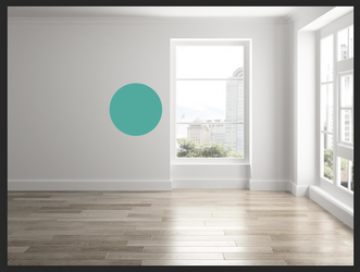
I added it to the wall using the clipped Solid color fill adjustment layer set to multiply..........it was dark!
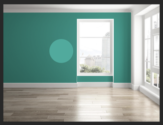
I then clipped a Brightness & Contrast adjustment layer at the top of the stack.
I raised the brightness until I made the right hand side of the color sample blend......closest to the lightest area.
This looks to be very close to what I think the wall would look like if it were that specific color.
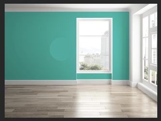
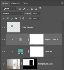
When I had a specific color sample swatch....

I added it to the wall using the clipped Solid color fill adjustment layer set to multiply..........it was dark!

I then clipped a Brightness & Contrast adjustment layer at the top of the stack.
I raised the brightness until I made the right hand side of the color sample blend......closest to the lightest area.
This looks to be very close to what I think the wall would look like if it were that specific color.


thebestcpu
Guru
- Messages
- 3,019
- Likes
- 2,797
Hi @jazz0001
There are many ways to change the color of the wall, as shown in prior posts.
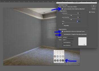
I just wanted to point out the fundamental error in your approach (and the fix) when using the Match Color command. I have drawn a screenshot below and put arrows at the essential points.
First, you cannot just use the eyedropper tool. You need to make a selection around the sample color you want to match in Layer 4.
Setting the correct checkboxes is also essential.
- You want to check ignore Selection when applying Adjustment (because you want the Adjustment to be made over the whole image as only defined by the location of pixels
- Do check the box to Use Selection in Source to Calculate Colors - that picks the selected color with which to match color
- You want to uncheck the Selection in Target to Calculate Adjustment, where I assume you want to ignore the original color
The screenshot below shows the result when I selected a darker gray color in your palette.
Hope this helps
John Wheeler

- Messages
- 23,106
- Likes
- 13,403
@thebestcpu Interesting..............
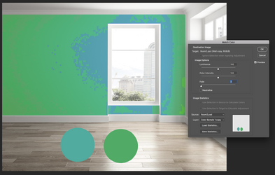
When I originally tested this theory with multiple color samples on one layer, I got this. Note that the target ignore option is greyed out.
Next, I tried it with a single color sample and I got this. Which worked but the OP had a multi colored sample layer. Again, the target option is greyed out. **Step 2
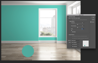
WOW!!
Now your suggestion worked......note the target layer Ignore is now available...............where in the world did you find this??????? I searched everywhere looking for a solution to using "match Color" but nowhere was it ever mentioned to make a selection of one color on the multicolored sample layer!!!!! How did you figure this out???
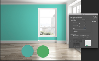
Also, just in case it matters, the color of the wall is not an exact match to the sample. This sample point was the closet I could get to the actual color anywhere on the wall. But it is definitely close enough for me anyway!
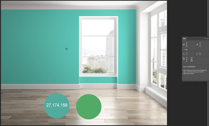
**Step 2- My final opinion here is that "Match Color" with a single color sample layer is the best way to go about producing the most easy and consistent results based on specific color samples. I would just do a repeat process for each color by duplicating the wall layer as many times as needed for the number of samples I had. These could be grouped and easily turned off and on. I don't feel as though the "Match Color" process is what I would call editable as it is destructive and the process would have to be repeated. It could be slightly editable as long as you maintain a "Main Copy" of the original wall layer. I have not played with "Match Color" as a SO.
Now that I'm fascinated with the coloring of walls...............OCD.............I will still look for another technique that may work better!
When I originally tested this theory with multiple color samples on one layer, I got this. Note that the target ignore option is greyed out.

Next, I tried it with a single color sample and I got this. Which worked but the OP had a multi colored sample layer. Again, the target option is greyed out. **Step 2

WOW!!
Now your suggestion worked......note the target layer Ignore is now available...............where in the world did you find this??????? I searched everywhere looking for a solution to using "match Color" but nowhere was it ever mentioned to make a selection of one color on the multicolored sample layer!!!!! How did you figure this out???

Also, just in case it matters, the color of the wall is not an exact match to the sample. This sample point was the closet I could get to the actual color anywhere on the wall. But it is definitely close enough for me anyway!

**Step 2- My final opinion here is that "Match Color" with a single color sample layer is the best way to go about producing the most easy and consistent results based on specific color samples. I would just do a repeat process for each color by duplicating the wall layer as many times as needed for the number of samples I had. These could be grouped and easily turned off and on. I don't feel as though the "Match Color" process is what I would call editable as it is destructive and the process would have to be repeated. It could be slightly editable as long as you maintain a "Main Copy" of the original wall layer. I have not played with "Match Color" as a SO.
Now that I'm fascinated with the coloring of walls...............OCD.............I will still look for another technique that may work better!
thebestcpu
Guru
- Messages
- 3,019
- Likes
- 2,797
@thebestcpu Interesting..............
When I originally tested this theory with multiple color samples on one layer, I got this. Note that the target ignore option is greyed out.
Hi @IamSamNext, I tried it with a single color sample and I got this. Which worked but the OP had a multi colored sample layer. Again, the target option is greyed out. **Step 2
WOW!!
Now your suggestion worked......note the target layer Ignore is now available...............where in the world did you find this??????? I searched everywhere looking for a solution to using "match Color" but nowhere was it ever mentioned to make a selection of one color on the multicolored sample layer!!!!! How did you figure this out???
Also, just in case it matters, the color of the wall is not an exact match to the sample. This sample point was the closet I could get to the actual color anywhere on the wall. But it is definitely close enough for me anyway!
**Step 2- My final opinion here is that "Match Color" with a single color sample layer is the best way to go about producing the most easy and consistent results based on specific color samples. I would just do a repeat process for each color by duplicating the wall layer as many times as needed for the number of samples I had. These could be grouped and easily turned off and on. I don't feel as though the "Match Color" process is what I would call editable as it is destructive and the process would have to be repeated. It could be slightly editable as long as you maintain a "Main Copy" of the original wall layer. I have not played with "Match Color" as a SO.
Now that I'm fascinated with the coloring of walls...............OCD.............I will still look for another technique that may work better!
I had never used the match color adjustment before, so I was mostly curious about why it did not work well. I heard mention of it a long time ago that it had issues, in particular with low-saturated target colors. I did not find anything online by doing a few experiments and deductions.
I personally do not like tools when I don't understand how they work (from a technical standpoint), and the Match Color tool was one of them. It tries to do so much, and when it works, it's great, but when it doesn't, it can be terrible without any real clues or advice on what to do differently. So, I observed a few things.
- It tries to determine "all" the source colors and then, with some unshared algorithm, adjust the hue and saturation (i.e., color) of the target image. So, it is definitely not set up to choose just one sample color to match and tries to use all the sample colors.
- I deduced that this does not work well in many situations, so I suspected they gave the option to use selections to choose one or a limited number of colors to use from the sample.
- Adding to the confusion, it can control if the same selection controls where you apply the colors. I did not explore that one and just turned it off. All the selection options won't show unless a selection is turned on in the Layer Stack (that is a bit confusing yet makes sense as a default)
- I did begin to understand why it has problems with low-saturated images for the target. In many images (especially ones with lossy compression), there are subtle differences in saturation and hue in the low-saturation areas. That is where it hides the compression. The Match Color tool, when used with such images, will significantly amplify those compression artifacts when trying to match multiple colors.
Using the image you used (I sourced from online), here is the original image:
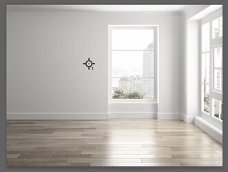
Yet when you extract out the Hue component of this image at max saturation, it reveals the areas for artifacts:
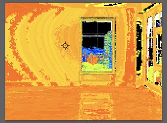
You will notice that the patterns match a bit of what you were seeing. The Match Color tool sees these small variations and assigns colors with very poor results.
I chalk this up to a very, very early-made tool by Adobe, which was not up to the same quality as tools they build today (in my opinion)
I did not try to learn any more subtleties of the Match Color tool as I think I had enough to determine the root cause of the OP. I also learned that I personally need to use great caution with this tool, and I may never use it.
So that brings me to an approach I used for matching single colors.
First, when matching colors, one must use the color space associated with the numbers one is given. Hex numbers are typically only associated with sRGB. sRGB is often the assumed color space when given RGB, HSB, etc yet that is not a given.
Second, when given an RGB or HSB number to match a color, that set of numbers specifies a solid singular color. That is fine if you want one solid identical, Hue, Saturation, and Brightness. Yet, in other cases, that set of numbers is to match the Hue exactly and Saturation as best one can while having the originating image guide the luminosity. Otherwise, you end up with a flat result and no depth. Note that the Match Color tool tries to do just that. So, we need to be a bit careful about matching a specific RGB or HSB set of numbers as in these later cases; at best, this can be done only for one area of the image. That is not bad and, in fact, is a lot more natural for many images.
Note that in Photoshop Blend modes, the Hue and Saturation equate to Color and do not include the Luminosity component.
My approach separates the Hue and Saturation (Color) settings from the Luminosity. I use Photoshop's Color Blend modes and Luminosity Blend modes.
Starting from the image @IamSam used and I repeated above, I first added a solid color adjustment Layer clipped to the lower layer and masked to adjust the Color (Hue and Sat) for the original image. This solid color Layer is set to the Blend mode of "Color." With this blend, the Luminosity of the original image is used/preserved.
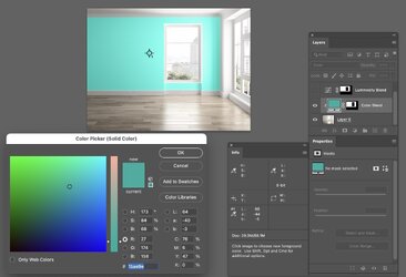
The next step is to adjust the Luminosity of the image while preserving the Hue and preserving Saturation as best as can be done while adjusting the Luminosity.
I added a masked Curves Adjustment Layer clipped again to the lower layer with the Blend set to Luminosity.
I placed a color sample tool set to HSB and noted that HSB numbers were used when the color picker was used (one could also have set the Color Sampler point to Lab mode and noted the Lab numbers when the Match color was set.
In this case, I simply brought down the white point until the Color Sampler Point met my needs. From there, I bent the curve to the tone that seemed desirable to me.
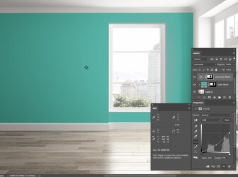
Just another approach to consider
John Wheeler
thebestcpu
Guru
- Messages
- 3,019
- Likes
- 2,797
You're welcome @IamSamExcellent!!!! Thanks for sharing!

